Introduction
The layout to introduce today is a new layout introduced after Android 4.0. It is somewhat similar to the TableLayout learned earlier, but it has many features that the former doesn't, and it is more user-friendly,
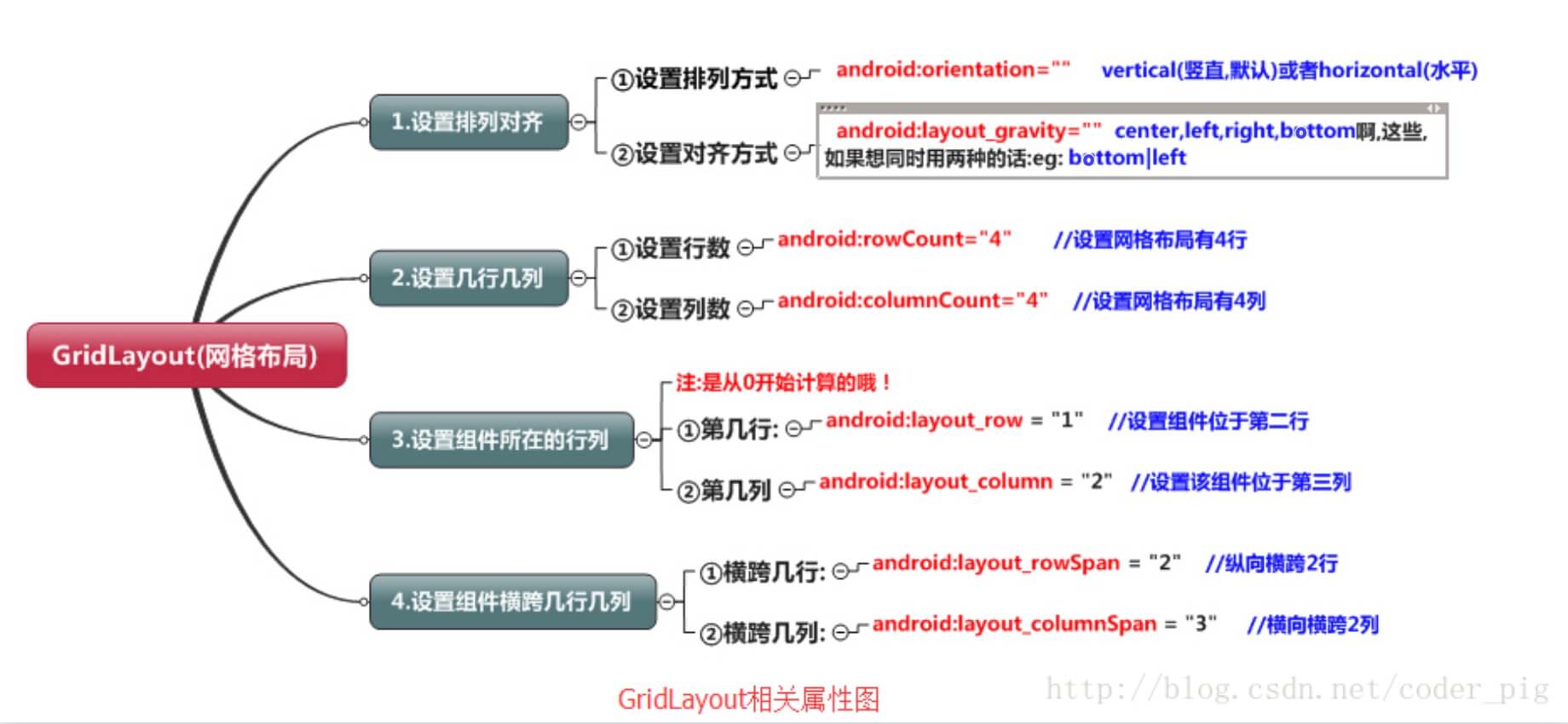
- You can set the arrangement of components in the layout by yourself
- You can customize how many rows and columns the grid layout has
- You can directly set a component to be at a specific row and column
- You can set a component to span several rows or columns
In addition, besides the above, this section will also cover problems you may encounter when using GridLayout, and how to solve the issue of using GridLayout with lower SDK versions! Now let's begin this section's course!
1. Summary diagram of related attributes
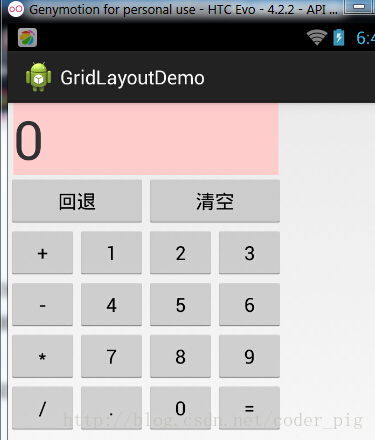
2. Example: Implementation of a calculator layout:
Running effect screenshot:
Implementation code:
<GridLayout xmlns:android="http://schemas.android.com/apk/res/android"
    xmlns:tools="http://schemas.android.com/tools"
    android:id="@+id/GridLayout1"
    android:layout_width="wrap_content"
    android:layout_height="wrap_content"
    android:columnCount="4"
    android:orientation="horizontal"
    android:rowCount="6" >

    <TextView
        android:layout_columnSpan="4"
        android:layout_gravity="fill"
        android:layout_marginLeft="5dp"
        android:layout_marginRight="5dp"
        android:background="#FFCCCC"
        android:text="0"
        android:textSize="50sp" />

    <Button
        android:layout_columnSpan="2"
        android:layout_gravity="fill"
        android:text="回退" />

    <Button
        android:layout_columnSpan="2"
        android:layout_gravity="fill"
        android:text="清空" />

    <Button android:text="+" />

    <Button android:text="1" />

    <Button android:text="2" />

    <Button android:text="3" />

    <Button android:text="-" />

    <Button android:text="4" />

    <Button android:text="5" />

    <Button android:text="6" />

    <Button android:text="*" />

    <Button android:text="7" />

    <Button android:text="8" />

    <Button android:text="9" />

    <Button android:text="/" />

    <Button
        android:layout_width="wrap_content"
        android:text="." />

    <Button android:text="0" />

    <Button android:text="=" />

</GridLayout>
Code analysis:The code is very simple: only the backspace and clear buttons span two columns, while the others are added directly. By default, each component occupies one row and one column. Another point to note: we use:android:layout_rowSpanandandroid:layout_columnSpanIf you set a component to span multiple rows or columns, you need to add the following attribute to make the component fill the spanned rows or columns:android:layout_gravity = "fill"!!! Just like the part of the calculator that displays numbers!
3. Usage summary:
1. GridLayout uses thin dashed lines to divide the layout into rows, columns, and cells, and also supports staggered arrangement across rows and columns. 2. Usage flow:
- step 1: First define the alignment of components with android:orientation, horizontal or vertical, and set how many rows and columns.
- step 2: Set the row or column where the component is located. Remember to start counting from 0. If not set, each component occupies one row and one column by default.
- step 3: Set how many rows or columns the component spans; after that, you need to set a fill: android:layout_gravity = "fill"
4. Points to note when using GridLayout:
Because GridLayout was introduced after 4.0, the minSDK version must be changed to 14 or above. Otherwise, when writing layout code, this thing will inexplicably fail, saying that this GridLayout cannot be found. Of course, if you need compatibility with lower versions, you should check the content below!
5. How to use GridLayout with lower SDK versions:
The solution is simple: just import the gridlayout package from the v7 support library! The v7 package is usually in the SDK at: sdk\extras\android\support\v7\gridlayout directory. If you don't have it, you can download it here:gridlayout_v7_jay.rar But when using it, the tag is written like this:
<android.support.v7.widget.GridLayout>`
Summary
That's all for the introduction to GridLayout~