Section introduction:
Today we introduce two button controls among the basic Android controls: Button, the normal button, and ImageButton, the image button. Actually, ImageButton and Button have basically similar usage, and image-related matters are the same as the later ImageView, so this section only explains Button. In addition, Button is a subclass of TextView, so many properties of TextView can also be applied to Button. In actual development, what we do with Button is nothing more than performing corresponding operations on several states of the button, for example: one color when the button is pressed, another color when it is released, or a color when the button is disabled. The above implementation is nothing more than throughStateListDrawableusing this kind of Drawable resource, that is, writing a drawable resource file. That's enough talk, let's start the content of this section directly.
1. Introduction to StateListDrawable:
StateListDrawable is a type of Drawable resource. It can set different image effects according to different states. The key node is< selector >We only need to set Button's background property to this drawable resource to easily implement different button colors or backgrounds when the button is pressed!
Properties we can set:
- drawable: The referenced Drawable bitmap, we can put it at the very front to indicate the normal state of the component~
- state_focused: Whether it obtains focus
- state_window_focused: Whether it gets window focus
- state_enabled: Whether the control is enabled
- state_checkable: Whether the control can be checked, e.g. checkbox
- state_checked: Whether the control is checked
- state_selected: Whether the control is selected, for cases with a scroll wheel
- state_pressed: Whether the control is pressed
- state_active: Whether the control is in an active state, e.g. slidingTab
- state_single: When the control contains multiple child controls, determines whether only one child control is displayed
- state_first: When the control contains multiple child controls, determines whether the first child control is in the displayed state
- state_middle: When the control contains multiple child controls, determines whether the middle child control is in the displayed state
- state_last: When the control contains multiple child controls, determines whether the last child control is in the displayed state
2. Implementing button press effects:
Okay, first prepare three background images. Generally, to avoid button stretching and deformation, we use .9.png as the button's drawable! Let's first take a lookRunning effect diagram:
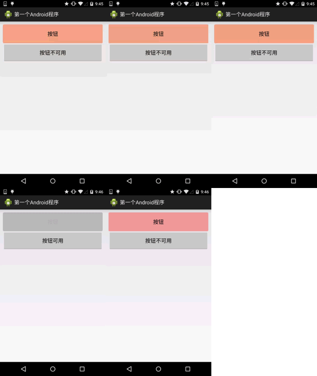
Code implementation:
<?xml version="1.0" encoding="utf-8"?>
<selector xmlns:android="http://schemas.android.com/apk/res/android">
    <item android:state_pressed="true" android:drawable="@drawable/ic_course_bg_fen"/>
    <item android:state_enabled="false" android:drawable="@drawable/ic_course_bg_pressed"/>
    <item android:drawable="@drawable/ic_course_bg_cheng"/>
</selector>
Layout file:activity_main.xml
<Button
        android:id="@+id/btnOne"
        android:layout_width="match_parent"
        android:layout_height="64dp"
        android:background="@drawable/btn_bg1"
        android:text="按钮"/>


    <Button
        android:id="@+id/btnTwo"
        android:layout_width="match_parent"
        android:layout_height="64dp"
        android:text="按钮不可用"/>
MainActivity.java:
public class MainActivity extends Activity {

    private Button btnOne,btnTwo;

    @Override
    protected void onCreate(Bundle savedInstanceState) {
        super.onCreate(savedInstanceState);
        setContentView(R.layout.activity_main);
        btnOne = (Button) findViewById(R.id.btnOne);
        btnTwo = (Button) findViewById(R.id.btnTwo);
        btnTwo.setOnClickListener(new OnClickListener() {
            @Override
            public void onClick(View v) {
                if(btnTwo.getText().toString().equals("按钮不可用")){
                    btnOne.setEnabled(false);
                    btnTwo.setText("按钮可用");
                }else{
                    btnOne.setEnabled(true);
                    btnTwo.setText("按钮不可用");
                }
            }
        });
    }

}
3. Using color values to draw rounded corner buttons
Many times we may not have an art designer, right? Or we don't know Photoshop or 毁Graph秀秀, or we are lazy and don't want to make images ourselves. At such times, we can write code ourselves as the button background, and have whatever color we want. Below, let's customize a rounded-corner button background. This involves another drawable resource: ShapeDrawable. We won't explain it in detail here; later we will introduce each drawable in detail. It's enough to know how to use it here. It's just a matter of modifying the Background property of EditText. Here we only post the drawable resource!
First look at the effect diagram:
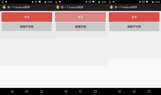
bbuton_danger_rounded.xml:
<?xml version="1.0" encoding="utf-8"?>
<selector xmlns:android="http://schemas.android.com/apk/res/android">

    <item android:state_pressed="true"><shape>
            <solid android:color="@color/bbutton_danger_pressed" />
            <stroke android:width="1dp" android:color="@color/bbutton_danger_edge" />
            <corners android:radius="@dimen/bbuton_rounded_corner_radius"/>
        </shape></item>


    <item android:state_enabled="false"><shape>
        <solid android:color="@color/bbutton_danger_disabled" />
            <stroke android:width="1dp" android:color="@color/bbutton_danger_disabled_edge" />
            <corners android:radius="@dimen/bbuton_rounded_corner_radius"/>
        </shape></item>


    <item><shape>
            <solid android:color="@color/bbutton_danger" />
            <stroke android:width="1dp" android:color="@color/bbutton_danger_edge" />
            <corners android:radius="@dimen/bbuton_rounded_corner_radius"/>
        </shape></item>


</selector>
color.xml:
<?xml version="1.0" encoding="utf-8"?>
<resources>
    <color name="bbutton_danger_pressed">#ffd2322d</color>
    <color name="bbutton_danger_edge">#ffd43f3a</color>
    <color name="bbutton_danger_disabled">#a5d9534f</color>
    <color name="bbutton_danger_disabled_edge">#a5d43f3a</color>
    <color name="bbutton_danger">#ffd9534f</color>
    <color name="text_font_white">#FFFFFF</color>
</resources>
dimens.xml:
<dimen name="bbuton_rounded_corner_radius">5dp</dimen>
4. Implementing Material Design ripple effect Button
If your Android phone has a system of 5.0 or above, I believe you are familiar with the following button click effect:
Implementation effect diagram:
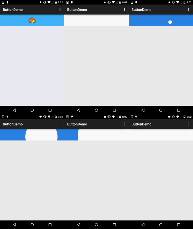
The fast one is the effect after pressing, and the slow one is the effect after long pressing!
Implementation logic:
1. We inherit ImageButton. Of course you can replace it with Button or View. Here the author wanted to put the turtle in the middle, so he inherited ImageButton.
2. First, create two Paint objects, one to draw the bottom background color, and one to draw the ripple diffusion.
3. Then calculate the maximum radius. The starting radius increases at intervals until it equals the maximum radius, then reset the state!
PS: This is roughly the core. When you are just learning, you may feel unfamiliar with custom View. That's fine; just understand it here. We will explain it later. Of course, you can dig into it yourself; the comments are quite detailed~
Implementation code:
Custom ImageButton:MyButton.java
package demo.com.jay.buttondemo;

import android.content.Context;
import android.graphics.Canvas;
import android.graphics.Paint;
import android.os.SystemClock;
import android.util.AttributeSet;
import android.view.MotionEvent;
import android.view.ViewConfiguration;
import android.widget.ImageButton;

/**
 * Created by coder-pig on 2015/7/16 0016.
 */
public class MyButton extends ImageButton {


    private static final int INVALIDATE_DURATION = 15;     //每次刷新的时间间隔
    private static int DIFFUSE_GAP = 10;                  //扩散半径增量
    private static int TAP_TIMEOUT;                         //判断点击和长按的时间

    private int viewWidth, viewHeight;                   //控件宽高
    private int pointX, pointY;                          //控件原点坐标(左上角)
    private int maxRadio;                             //扩散的最大半径
    private int shaderRadio;                        //扩散的半径

    private Paint bottomPaint, colorPaint;          //画笔:背景和水波纹
    private boolean isPushButton;                 //记录是否按钮被按下

    private int eventX, eventY;                  //触摸位置的X,Y坐标
    private long downTime = 0;                 //按下的时间


    public MyButton(Context context, AttributeSet attrs) {
        super(context, attrs);
        initPaint();
        TAP_TIMEOUT = ViewConfiguration.getLongPressTimeout();
    }


    /*
    * 初始化画笔
    * */
    private void initPaint() {
        colorPaint = new Paint();
        bottomPaint = new Paint();
        colorPaint.setColor(getResources().getColor(R.color.reveal_color));
        bottomPaint.setColor(getResources().getColor(R.color.bottom_color));
    }


    @Override
    public boolean onTouchEvent(MotionEvent event) {
        switch (event.getAction()) {
            case MotionEvent.ACTION_DOWN:
                if (downTime == 0) downTime = SystemClock.elapsedRealtime();
                eventX = (int) event.getX();
                eventY = (int) event.getY();
                //计算最大半径:
                countMaxRadio();
                isPushButton = true;
                postInvalidateDelayed(INVALIDATE_DURATION);
                break;
            case MotionEvent.ACTION_UP:
            case MotionEvent.ACTION_CANCEL:
                if(SystemClock.elapsedRealtime() - downTime < TAP_TIMEOUT){
                    DIFFUSE_GAP = 30;
                    postInvalidate();
                }else{
                    clearData();
                }
                break;
        }
        return super.onTouchEvent(event);
    }


    @Override
    protected void dispatchDraw(Canvas canvas) {
        super.dispatchDraw(canvas);
        if(!isPushButton) return; //如果按钮没有被按下则返回
        //绘制按下后的整个背景
        canvas.drawRect(pointX, pointY, pointX + viewWidth, pointY + viewHeight, bottomPaint);
        canvas.save();
        //绘制扩散圆形背景
        canvas.clipRect(pointX, pointY, pointX + viewWidth, pointY + viewHeight);
        canvas.drawCircle(eventX, eventY, shaderRadio, colorPaint);
        canvas.restore();
        //直到半径等于最大半径
        if(shaderRadio < maxRadio){
            postInvalidateDelayed(INVALIDATE_DURATION,
                    pointX, pointY, pointX + viewWidth, pointY + viewHeight);
            shaderRadio += DIFFUSE_GAP;
        }else{
            clearData();
        }
    }

    /*
        * 计算最大半径的方法
        * */
    private void countMaxRadio() {
        if (viewWidth > viewHeight) {
            if (eventX < viewWidth / 2) {
                maxRadio = viewWidth - eventX;
            } else {
                maxRadio = viewWidth / 2 + eventX;
            }
        } else {
            if (eventY < viewHeight / 2) {
                maxRadio = viewHeight - eventY;
            } else {
                maxRadio = viewHeight / 2 + eventY;
            }
        }
    }


    /*
    * 重置数据的方法
    * */
    private void clearData(){
        downTime = 0;
        DIFFUSE_GAP = 10;
        isPushButton = false;
        shaderRadio = 0;
        postInvalidate();
    }

    @Override
    protected void onSizeChanged(int w, int h, int oldw, int oldh) {
        super.onSizeChanged(w, h, oldw, oldh);
        this.viewWidth = w;
        this.viewHeight = h;
    }
}
<code>
<p><b>color.xml:</b></p>
<pre>
<?xml version="1.0" encoding="utf-8"?>
<resources>
    <color name="reveal_color">#FFFFFF</color>
    <color name="bottom_color">#3086E4</color>
    <color name="bottom_bg">#40BAF8</color>
</resources>
activity_main.xml:
<RelativeLayout xmlns:android="http://schemas.android.com/apk/res/android"
    xmlns:tools="http://schemas.android.com/tools"
    android:layout_width="match_parent"
    android:layout_height="match_parent"
    tools:context=".MainActivity">

    <demo.com.jay.buttondemo.MyButton
        android:id="@+id/myBtn"
        android:layout_width="match_parent"
        android:layout_height="64dp"
        android:src="@mipmap/ic_tur_icon.html"
        android:background="@color/bottom_bg"
        android:scaleType="center"/>

</RelativeLayout>
Source code download (it's an AS project):ButtonDemo.zip
Section summary:
This section introduces some usages of Button in actual development. There may be some things we haven't learned yet. Just know about them here; when we learn them later, they will be explained in depth. Thank you~