Introduction to this section:
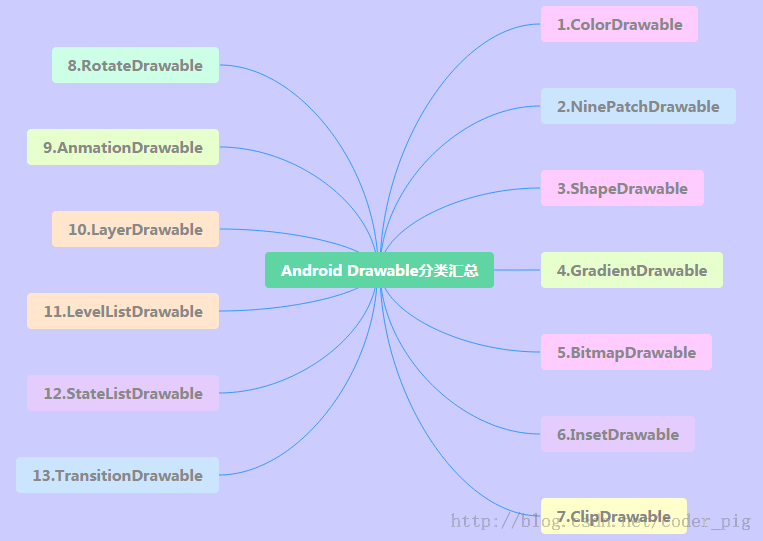
In this section, let's finish learning the remaining four Drawables. They are:LayerDrawable,TransitionDrawable,LevelListDrawable and StateListDrawable, Still post the mind map of the 13 Drawables:
1.LayerDrawable
A layer graphics object, contains a Drawable array, then draws them in the order corresponding to the array. The Drawable with the largest index value will be drawn on the topmost layer! Although these Drawables may have crossing or overlapping areas, they are on different layers, so they do not affect each other, with <layer-list> as the root node!
The related attributes are as follows:
- drawable: the referenced bitmap resource; if empty, there must be a Drawable type child node
- left: the left margin of the layer relative to the container
- right: the right margin of the layer relative to the container
- top: the top margin of the layer relative to the container
- bottom: the bottom margin of the layer relative to the container
- id: the id of the layer
Usage Example:
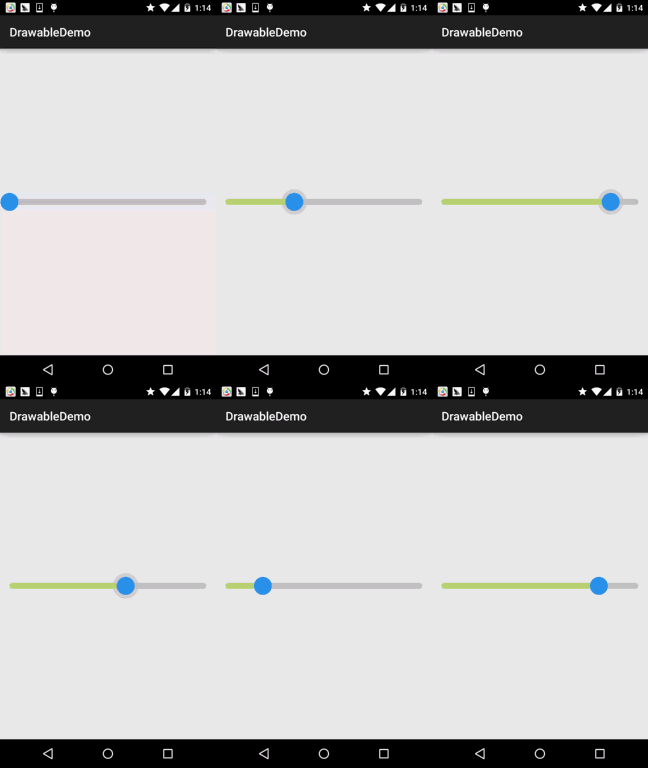
Running effect screenshot:
Code Implementation:
Very simple, combine the previously learned ShapeDrawable and ClipDrawable:
layerList_one.xml
<?xml version="1.0" encoding="utf-8"?>
<layer-list xmlns:android="http://schemas.android.com/apk/res/android">
    <item android:id="@android:id/background">
        <shape android:shape="rectangle">
            <solid android:color="#C2C2C1" />
            <corners android:radius="50dp" />
        </shape>
    </item>
    <item android:id="@android:id/progress">
        <clip>
            <shape android:shape="rectangle">
                <solid android:color="#BCDA73" />
                <corners android:radius="50dp" />
            </shape>
        </clip>
    </item>
</layer-list>
Then add a SeekBar in the layout file, the content is as follows:
<SeekBar
        android:layout_width="match_parent"
        android:layout_height="wrap_content"
        android:indeterminateDrawable="@android:drawable/progress_indeterminate_horizontal"
        android:indeterminateOnly="false"
        android:maxHeight="10dp"
        android:minHeight="5dp"
        android:progressDrawable="@drawable/layerlist_one"
        android:thumb="@drawable/shape_slider" />
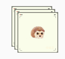
Wow, that's it? Yes, it's just that little~ Since it's a layer graphics object, we can also make astacked imageeffect:
Running effect screenshot:
Implementation Code:
layerlist_two.xml for the stacked image:
<?xml version="1.0" encoding="utf-8"?>
<layer-list xmlns:android="http://schemas.android.com/apk/res/android">
    <item>
        <bitmap
            android:gravity="center"
            android:src="@mipmap/ic_bg_ciwei.html" />
    </item>
    <item
        android:left="25dp"
        android:top="25dp">
        <bitmap
            android:gravity="center"
            android:src="@mipmap/ic_bg_ciwei.html" />
    </item>
    <item
        android:left="50dp"
        android:top="50dp">
        <bitmap
            android:gravity="center"
            android:src="@mipmap/ic_bg_ciwei.html" />
    </item>
</layer-list>
Then add an ImageView in activity_main.xml, the content is as follows:
<ImageView
        android:layout_width="wrap_content"
        android:layout_height="wrap_content"
        android:src="@drawable/layerlist_two.html"/>
 Simple and easy to use, what are you waiting for? Apply it to your project quickly~
2.TransitionDrawable
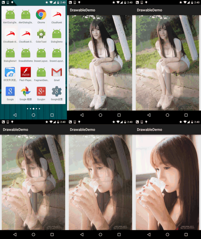
A subclass of LayerDrawable, TransitionDrawable only manages two layers of Drawables! Two layers! Two layers! And it provides an animation of transparency changes, which can control the animation effect of transitioning from one layer of Drawable to another layer of Drawable. The root node is <transition>, remember there are only two Items, more is useless, the attributes are similar to LayerDrawable, we need to callstartTransitionmethod to start the switching animation between the two layers; you can also callreverseTransition()method to play in reverse:
Usage Example:
Running effect screenshot:
Implementation Code:
Create a TransitionDrawable xml file in res/drawable
<?xml version="1.0" encoding="utf-8"?>
<transition xmlns:android="http://schemas.android.com/apk/res/android" >
    <item android:drawable="@mipmap/ic_bg_meizi1"/>
    <item android:drawable="@mipmap/ic_bg_meizi2"/>
</transition>
Then add an ImageView in the layout file, and set src to the above drawable. Then MainActivity.java content is as follows:
public class MainActivity extends AppCompatActivity {
    private ImageView img_show;
    @Override
    protected void onCreate(Bundle savedInstanceState) {
        super.onCreate(savedInstanceState);
        setContentView(R.layout.activity_main);
        img_show = (ImageView) findViewById(R.id.img_show);
        TransitionDrawable td = (TransitionDrawable) img_show.getDrawable();
        td.startTransition(3000);
        //你可以可以反过来播放,使用reverseTransition即可~
        //td.reverseTransition(3000);
    }
}
In addition, if you want to achieve: a crossfade effect of multiple images looping, you can refer to:Android Drawable Resource Learning (7), TransitionDrawablefor examples. Very simple, the core principle is: a handler periodically modifies the two images in the Transition!
3.LevelListDrawable
Used to manage a set of Drawables. We can set different levels for the drawables inside. When they are drawn, it will obtain the corresponding drawable according to the level attribute value and draw it onto the canvas. The root node is: <level-list> It does not have any settable attributes; all we can do is set each <item>
The attributes available for item are as follows:
- drawable: the referenced bitmap resource; if empty, there must be a Drawable type child node
- minlevel:level: the corresponding minimum value
- maxlevel:level: the corresponding maximum value
Usage Example:
Running effect screenshot:
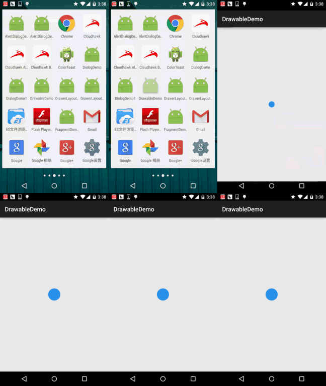
Code Implementation:
Draw circles with ShapeDrawable, make five copies, just change the width and height:
shape_cir1.xml:
<?xml version="1.0" encoding="utf-8"?>
<shape xmlns:android="http://schemas.android.com/apk/res/android"
    android:shape="oval">
    <solid android:color="#2C96ED"/>
    <size android:height="20dp" android:width="20dp"/>
</shape>
Then move to LevelListDrawable; here we set five levels:
level_cir.xml:
<?xml version="1.0" encoding="utf-8"?>
<level-list xmlns:android="http://schemas.android.com/apk/res/android" >
    <item android:drawable="@drawable/shape_cir1" android:maxLevel="2000"/>
    <item android:drawable="@drawable/shape_cir2" android:maxLevel="4000"/>
    <item android:drawable="@drawable/shape_cir3" android:maxLevel="6000"/>
    <item android:drawable="@drawable/shape_cir4" android:maxLevel="8000"/>
    <item android:drawable="@drawable/shape_cir5" android:maxLevel="10000"/>
</level-list>
Finally, write the following code in MainActivity:
public class MainActivity extends AppCompatActivity {

    private ImageView img_show;

    private LevelListDrawable ld;
    private Handler handler = new Handler() {
        public void handleMessage(Message msg) {
            if (msg.what == 0x123) {
                if (ld.getLevel() > 10000) ld.setLevel(0);
                img_show.setImageLevel(ld.getLevel() + 2000);
            }
        }
    };

    @Override
    protected void onCreate(Bundle savedInstanceState) {
        super.onCreate(savedInstanceState);
        setContentView(R.layout.activity_main);
        img_show = (ImageView) findViewById(R.id.img_show);
        ld = (LevelListDrawable) img_show.getDrawable();
        img_show.setImageLevel(0);
        new Timer().schedule(new TimerTask() {
            @Override
            public void run() {
                handler.sendEmptyMessage(0x123);
            }
        }, 0, 100);
    }
}
It is also very simple: a Timer, and a handler modifies the level value~
4.StateListDrawable
Alright, finally we come to the last drawable: StateListDrawable. The name looks unfamiliar, but actually we have used it before. Remember the < for setting different state drawables for a button?selctor>? That's right, what is used is this StateListDrawable!
The attributes available for setting are as follows:
- drawable: the referenced Drawable bitmap; we can put it at the very front, which represents the normal state of the component~
- state_focused: whether it gains focus
- state_window_focused: whether the window gains focus
- state_enabled: whether the control is enabled
- state_checkable: whether the control can be checked, e.g., checkbox
- state_checked: whether the control is checked
- state_selected: whether the control is selected, for cases with a scroll wheel
- state_pressed: whether the control is pressed
- state_active: whether the control is in active state, e.g., slidingTab
- state_single: when the control contains multiple child controls, determines whether only one child control is displayed
- state_first: when the control contains multiple child controls, determines whether the first child control is in the display state
- state_middle: when the control contains multiple child controls, determines whether the middle child control is in the display state
- state_last: when the control contains multiple child controls, determines whether the last child control is in the display state
Usage Example:
Then let's write a simple rounded corner button!
Running effect screenshot:
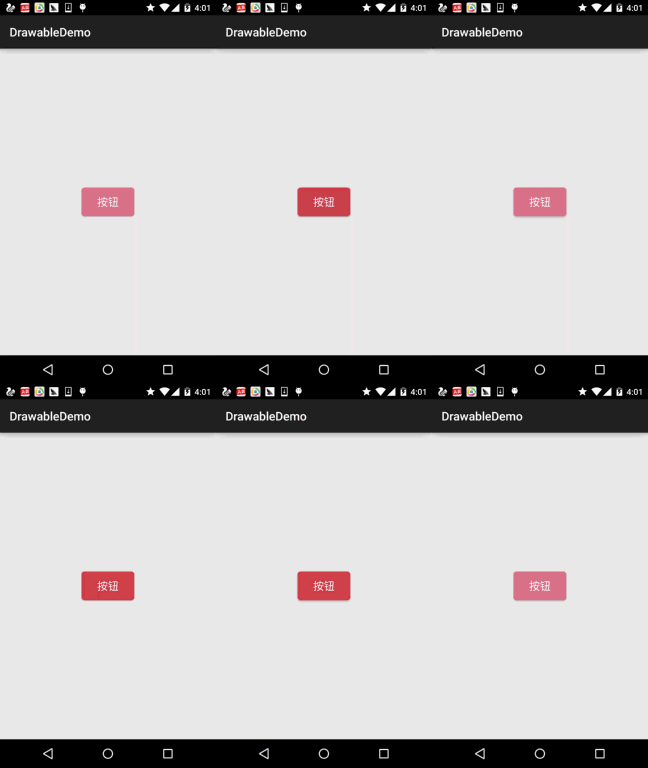
Code Implementation:
Then first use ShapeDrawable to draw two rounded rectangles, only the colors are different:
shape_btn_normal.xml:
<?xml version="1.0" encoding="utf-8"?>
<shape xmlns:android="http://schemas.android.com/apk/res/android"
    android:shape="rectangle">
    <solid android:color="#DD788A"/>
    <corners android:radius="5dp"/>
    <padding android:top="2dp" android:bottom="2dp"/>
</shape>
Next, let's write a selector:selctor_btn.xml:
<?xml version="1.0" encoding="utf-8"?>
<selector xmlns:android="http://schemas.android.com/apk/res/android">
    <item android:state_pressed="true" android:drawable="@drawable/shape_btn_pressed"/>
    <item android:drawable="@drawable/shape_btn_normal"/>
</selector>
Then set the button's android:background="@drawable/selctor_btn" and it's done~ You can change it to a rectangle, ellipse, circle, etc. according to your needs!
Summary of this section:
Okay, regarding the 13 different types of Drawables in Android, we have finished explaining them. Of course, this is only the basics. In actual development, there are definitely various high-end usages, which require everyone to expand upon. Here we are just providing guidance!
Well, due to time constraints, the above examples were all tried one by one, so the final demo is messy. Maybe you need these resources, so I'll still post them; download them yourself if needed:DrawableDemo.zipWell, thanks~ Have a nice weekend