jQuery EasyUI Data Grid and Tree Plugin -Datagrid Data Grid
 jQuery EasyUI Plugins
Extends from $.fn.panel.defaults. Override defaults with $.fn.datagrid.defaults.
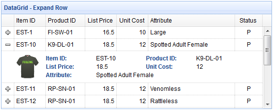
The datagrid displays data in a table format and provides rich support for selecting, sorting, grouping, and editing data. The datagrid is designed to reduce development time and does not require developers to have specific knowledge. It is lightweight but feature-rich. Its features include cell merging, multi-column headers, frozen columns, footers, and more.
Dependencies
- panel
- resizable
- linkbutton
- pagination
Usage
Create a datagrid from an existing table element, defining columns, rows, and data in HTML.
<table class="easyui-datagrid">
    <thead>
        <tr>
            <th data-options="field:'code'">Code</th>
            <th data-options="field:'name'">Name</th>
            <th data-options="field:'price'">Price</th>
        </tr>
    </thead>
    <tbody>
        <tr>
            <td>001</td><td>name1</td><td>2323</td>
        </tr>
        <tr>
            <td>002</td><td>name2</td><td>4612</td>
        </tr>
    </tbody>
</table>
Create a datagrid via the <table> markup. Nested <th> tags define the columns in the table.
<table class="easyui-datagrid" style="width:400px;height:250px"
    data-options="url:'datagrid_data.json',fitColumns:true,singleSelect:true">
    <thead>
        <tr>
            <th data-options="field:'code',width:100">Code</th>
            <th data-options="field:'name',width:100">Name</th>
            <th data-options="field:'price',width:100,align:'right'">Price</th>
        </tr>
    </thead>
</table>
You can also create a datagrid using JavaScript.
<table id="dg"></table>
$('#dg').datagrid({
    url:'datagrid_data.json',
    columns:[[
        {field:'code',title:'Code',width:100},
        {field:'name',title:'Name',width:100},
        {field:'price',title:'Price',width:100,align:'right'}
    ]]
});
Query data via some parameters.
$('#dg').datagrid('load', {
    name: 'easyui',
    address: 'ho'
});
After sending changed data to the server, update the frontend data.
$('#dg').datagrid('reload'); // reload the current page data
DataGrid Properties
The properties extend from panel. The following are properties added for the datagrid.
| Name | Type | Description | Default Value |
|---|---|---|---|
| columns | array | The configuration object for the columns of the datagrid. For more details, see the Column properties. | undefined |
| frozenColumns | array | Same as the Column properties, but these columns will be frozen on the left side. | undefined |
| fitColumns | boolean | If set to true, the column size will automatically expand or shrink to fit the grid width and prevent horizontal scrolling. | false |
| resizeHandle | string | Adjusts the position of the columns. Available values are: 'left', 'right', 'both'. When set to 'right', the user can resize the column by dragging the right edge of the column header. This property is available since version 1.3.2. |
right |
| autoRowHeight | boolean | Defines whether to set the row height based on the row content. Set to false to improve loading performance. | true |
| toolbar | array,selector | The header toolbar of the datagrid panel. Possible values: 1. Array, each tool option is the same as a linkbutton. 2. Selector, just a toolbar. Define the toolbar within a <div> tag:
$('#dg').datagrid({
    toolbar: '#tb'
});
<div id="tb">
<a href="../index.html" class="easyui-linkbutton" data-options="iconCls:'icon-edit',plain:true"></a>
<a href="../index.html" class="easyui-linkbutton" data-options="iconCls:'icon-help',plain:true"></a>
</div>
Define the toolbar via an array:
$('#dg').datagrid({
    toolbar: [{
        iconCls: 'icon-edit',
        handler: function(){alert('edit')}
    },'-',{
        iconCls: 'icon-help',
        handler: function(){alert('help')}
    }]
});
|
null |
| striped | boolean | If set to true, rows will be striped. (i.e., odd and even rows use different background colors) | false |
| method | string | The method type for requesting remote data. | post |
| nowrap | boolean | If set to true, the data will be displayed in a single row. Set to true to improve loading performance. | true |
| idField | string | Indicates which field is the identifier field. | null |
| url | string | The URL to request data from the remote site. | null |
| data | array,object | The data to be loaded. This property is available since version 1.3.2. Code example:
$('#dg').datagrid({
    data: [
        {f1:'value11', f2:'value12'},
        {f1:'value21', f2:'value22'}
    ]
});
|
null |
| loadMsg | string | The prompt message displayed while loading data from the remote site. | Processing, please wait … |
| pagination | boolean | If set to true, the paging toolbar will be displayed at the bottom of the datagrid. | false |
| rownumbers | boolean | If set to true, a column with row numbers will be displayed. | false |
| singleSelect | boolean | If set to true, only one row can be selected. | false |
| checkOnSelect | boolean | If set to true, when the user clicks on a row, the checkbox will be selected/deselected. If set to false, the checkbox will be selected/deselected only when the user clicks the checkbox. This property is available since version 1.3. |
true |
| selectOnCheck | boolean | If set to true, clicking the checkbox will select the row. If set to false, selecting the row will not check the checkbox. This property is available since version 1.3. |
true |
| pagePosition | string | Defines the position of the paging bar. Available values are: 'top', 'bottom', 'both'. This property is available since version 1.3. |
bottom |
| pageNumber | number | The initial page number when the pagination property is set. | 1 |
| pageSize | number | The initial page size when the pagination property is set. | 10 |
| pageList | array | The list of page sizes to select from when the pagination property is set. | [10,20,30,40,50] |
| queryParams | object | The extra parameters to send when requesting remote data. Code example:
$('#dg').datagrid({
    queryParams: {
        name: 'easyui',
        subject: 'datagrid'
    }
});
|
{} |
| sortName | string | Defines the columns that can be sorted. | null |
| sortOrder | string | Defines the sort order of the column, only 'asc' or 'desc' can be used. | asc |
| multiSort | boolean | Defines whether to enable multi-column sorting. This property is available since version 1.3.4. | false |
| remoteSort | boolean | Defines whether to sort data from the server. | true |
| showHeader | boolean | Defines whether to display the header. | true |
| showFooter | boolean | Defines whether to display the footer. | false |
| scrollbarSize | number | The width of the scrollbar (when the scrollbar is vertical) or the height of the scrollbar (when the scrollbar is horizontal). | 18 |
| rowStyler | function | Returns a style such as 'background:red'. This function takes two parameters: rowIndex: The index of the row, starting from 0. rowData: The corresponding record of that row. Code example:
$('#dg').datagrid({
    rowStyler: function(index,row){
        if (row.listprice>80){
            return 'background-color:#6293BB;color:#fff;'; // return inline style
            // the function can return predefined css class and inline style
            // return {class:'r1', style:{'color:#fff'}};
        }
    }
});
|
|
| loader | function | Defines how to load data from the remote server. Returning false cancels the action. This function has the following parameters: param: The parameter object to be passed to the remote server. success(data): The callback function called when data is retrieved successfully. error(): The callback function called when data retrieval fails. |
json loader |
| loadFilter | function | Returns the filtered data to be displayed. This function has a parameter 'data', which represents the raw data. You can convert the raw data into a standard data format. This function must return a standard data object containing 'total' and 'rows' properties. Code example:
// removing 'd' object from asp.net web service json output
$('#dg').datagrid({
    loadFilter: function(data){
        if (data.d){
            return data.d;
        } else {
            return data;
        }
    }
});
|
|
| editors | object | Defines the editor when editing rows. | predefined editors |
| view | object | Defines the view of the datagrid. | default view |
Column Properties
The Column of the DataGrid is an array object, each of its elements is also an array. The elements of the element array are a configuration object that defines the fields of each column.
Code example:
columns:[[
    {field:'itemid',title:'Item ID',rowspan:2,width:80,sortable:true},
    {field:'productid',title:'Product ID',rowspan:2,width:80,sortable:true},
    {title:'Item Details',colspan:4}
],[
    {field:'listprice',title:'List Price',width:80,align:'right',sortable:true},
    {field:'unitcost',title:'Unit Cost',width:80,align:'right',sortable:true},
    {field:'attr1',title:'Attribute',width:100},
    {field:'status',title:'Status',width:60}
]]
| Name | Type | Description | Default Value |
|---|---|---|---|
| title | string | The title text of the column. | undefined |
| field | string | The field name of the column. | undefined |
| width | number | The width of the column. If undefined, the width will automatically expand to fit its content. Not defining the width will reduce performance. | undefined |
| rowspan | number | Indicates how many rows a cell spans. | undefined |
| colspan | number | Indicates how many columns a cell spans. | undefined |
| align | string | Indicates how to align the data of this column. Possible values: 'left', 'right', 'center'. | undefined |
| halign | string | Indicates how to align the header of this column. Possible values: 'left', 'right', 'center'. If no value is assigned, the header alignment will be consistent with the data alignment defined by the 'align' property. This property is available since version 1.3.2. | undefined |
| sortable | boolean | If set to true, this column is allowed to be sorted. | undefined |
| order | string | The default sort order, only 'asc' or 'desc' can be used. This property is available since version 1.3.2. | undefined |
| resizable | boolean | If set to true, this column is allowed to be resized. | undefined |
| fixed | boolean | If set to true, it prevents adjusting width when 'fitColumns' is set to true. | undefined |
| hidden | boolean | If set to true, hides this column. | undefined |
| checkbox | boolean | If set to true, a checkbox is displayed. The checkbox has a fixed width. | undefined |
| formatter | function | The formatter function for the cell, requiring three parameters: value: The value of the field. rowData: The record data of the row. rowIndex: The index of the row. Code example:
$('#dg').datagrid({
    columns:[[
        {field:'userId',title:'User', width:80,
            formatter: function(value,row,index){
                if (row.user){
                    return row.user.name;
                } else {
                    return value;
                }
            }
        }
    ]]
});
|
undefined |
| styler | function | The style function for the cell, returns a style string to customize the style of the cell, e.g., 'background:red'. This function takes three parameters: value: The value of the field. rowData: The record data of the row. rowIndex: The index of the row. Code example:
$('#dg').datagrid({
    columns:[[
        {field:'listprice',title:'List Price', width:80, align:'right',
            styler: function(value,row,index){
                if (value < 20){
                    return 'background-color:#FFEE00;color:red;';
                    // the function can return predefined css class and inline style
                    // return {class:'c1',style:'color:red'}
                }
            }
        }
    ]]
});
|
undefined |
| sorter | function | The sorting function for custom fields used for local sorting, takes two parameters: a: The first field value. b: The second field value. Code example:
$('#dg').datagrid({
    remoteSort: false,
    columns: [[
        {field:'date',title:'Date',width:80,sortable:true,align:'center',
            sorter:function(a,b){
                a = a.split('/');
                b = b.split('/');
                if (a[2] == b[2]){
                    if (a[0] == b[0]){
                        return (a[1]>b[1]?1:-1);
                    } else {
                        return (a[0]>b[0]?1:-1);
                    }
                } else {
                    return (a[2]>b[2]?1:-1);
                }
            }
        }
    ]]
});
|
undefined |
| editor | string,object | Indicates the edit type. When it is a string, it refers to the edit type; when it is an object, it contains two properties: type: string, the edit type. Possible types: text, textarea, checkbox, numberbox, validatebox, datebox, combobox, combotree. options: object, the editor options corresponding to the edit type. |
undefined |
Editor
Override the defaults via $.fn.datagrid.defaults.editors.
Each editor has the following behaviors:
| Name | Parameters | Description |
|---|---|---|
| init | container, options | Initialize the editor and return the target object. |
| destroy | target | Destroy the editor if necessary. |
| getValue | target | Get the value from the editor's text. |
| setValue | target , value | Set the value to the editor. |
| resize | target , width | Resize the editor if necessary. |
For example, the text editor is defined as follows:
$.extend($.fn.datagrid.defaults.editors, {
    text: {
        init: function(container, options){
            var input = $('<input type="text" class="datagrid-editable-input">').appendTo(container);
            return input;
        },
        destroy: function(target){
            $(target).remove();
        },
        getValue: function(target){
            return $(target).val();
        },
        setValue: function(target, value){
            $(target).val(value);
        },
        resize: function(target, width){
            $(target)._outerWidth(width);
        }
    }
});
DataGrid View
Override the defaults via $.fn.datagrid.defaults.view.
The view is an object that tells the datagrid how to render rows. This object must define the following functions:
| Name | Parameters | Description |
|---|---|---|
| render | target, container, frozen | Called when data is loaded. target: DOM object, the datagrid object. container: The container of rows. frozen: Indicates whether to render the frozen container. |
| renderFooter | target, container, frozen | This is the options function for rendering the footer. |
| renderRow | target, fields, frozen, rowIndex, rowData | This is the options function that will be called by the render function. |
| refreshRow | target, rowIndex | Define how to refresh the specified rows. |
| onBeforeRender | target, rows | Triggered before the view is rendered. |
| onAfterRender | target | Triggered after the view is rendered. |
Events
These events extend from the panel. The following are events added for the datagrid.
| Name | Parameters | Description |
|---|---|---|
| onLoadSuccess | data | Triggered when data is loaded successfully. |
| onLoadError | none | Triggered when some errors occur while loading remote data. |
| onBeforeLoad | param | Triggered before sending the request to load data. If false is returned, the loading action will be canceled. |
| onClickRow | rowIndex, rowData | Triggered when the user clicks a row. Parameters include: rowIndex: The index of the clicked row, starting from 0. rowData: The record corresponding to the clicked row. |
| onDblClickRow | rowIndex, rowData | Triggered when the user double-clicks a row. Parameters include: rowIndex: The index of the double-clicked row, starting from 0. rowData: The record corresponding to the double-clicked row. |
| onClickCell | rowIndex, field, value | Triggered when the user clicks a cell. |
| onDblClickCell | rowIndex, field, value | Triggered when the user double-clicks a cell. Code example:
// when double click a cell, begin editing and make the editor get focus
$('#dg').datagrid({
    onDblClickCell: function(index,field,value){
        $(this).datagrid('beginEdit', index);
        var ed = $(this).datagrid('getEditor', {index:index,field:field});
        $(ed.target).focus();
    }
});
|
| onSortColumn | sort, order | Triggered when the user sorts a column. Parameters include: sort: The field name of the sorted column. order: The order of the sorted column. |
| onResizeColumn | field, width | Triggered when the user resizes a column. |
| onSelect | rowIndex, rowData | Triggered when the user selects a row. Parameters include: rowIndex: The index of the selected row, starting from 0. rowData: The record corresponding to the selected row. |
| onUnselect | rowIndex, rowData | Triggered when the user unselects a row. Parameters include: rowIndex: The index of the unselected row, starting from 0. rowData: The record corresponding to the unselected row. |
| onSelectAll | rows | Triggered when the user selects all rows. |
| onUnselectAll | rows | Triggered when the user unselects all rows. |
| onCheck | rowIndex,rowData | Triggered when the user checks a row. Parameters include: rowIndex: The index of the checked row, starting from 0. rowData: The record corresponding to the checked row. This event is available since version 1.3. |
| onUncheck | rowIndex,rowData | Triggered when the user unchecks a row. Parameters include: rowIndex: The index of the unchecked row, starting from 0. rowData: The record corresponding to the unchecked row. This event is available since version 1.3. |
| onCheckAll | rows | Triggered when the user checks all rows. This event is available since version 1.3. |
| onUncheckAll | rows | Triggered when the user unchecks all rows. This event is available since version 1.3. |
| onBeforeEdit | rowIndex, rowData | Triggered when the user starts editing a row. Parameters include: rowIndex: The index of the editing row, starting from 0. rowData: The record corresponding to the editing row. |
| onAfterEdit | rowIndex, rowData, changes | Triggered when the user finishes editing a row. Parameters include: rowIndex: The index of the edited row, starting from 0. rowData: The record corresponding to the edited row. changes: The changed field/value pairs. |
| onCancelEdit | rowIndex, rowData | Triggered when the user cancels editing a row. Parameters include: rowIndex: The index of the editing row, starting from 0. rowData: The record corresponding to the editing row. |
| onHeaderContextMenu | e, field | Triggered when the header of the datagrid is right-clicked. |
| onRowContextMenu | e, rowIndex, rowData | Triggered when a row is right-clicked. |
Methods
| Name | Parameters | Description |
|---|---|---|
| options | none | Return the options object. |
| getPager | none | Return the pager object. |
| getPanel | none | Return the panel object. |
| getColumnFields | frozen | Return the columns' fields. If frozen is set to true, the frozen columns' fields are returned. Code example:
var opts = $('#dg').datagrid('getColumnFields');    // get unfrozen columns
var opts = $('#dg').datagrid('getColumnFields', true); // get frozen columns
|
| getColumnOption | field | Return the options of the specified column. |
| resize | param | Resize and layout. |
| load | param | Load and display the rows of the first page. If the 'param' parameter is specified, it will replace the queryParams property. Usually, by passing some query parameters, this method is called to load new data from the server.
$('#dg').datagrid('load',{
    code: '01',
    name: 'name01'
});
|
| reload | param | Reload the rows, just like the load method, but stay on the current page. |
| reloadFooter | footer | Reload the footer rows. Code example:
// update footer row values and then refresh
var rows = $('#dg').datagrid('getFooterRows');
rows[0]['name'] = 'new name';
rows[0]['salary'] = 60000;
$('#dg').datagrid('reloadFooter');

// update footer rows with new data
$('#dg').datagrid('reloadFooter',[
    {name: 'name1', salary: 60000},
    {name: 'name2', salary: 65000}
]);
|
| loading | none | Show the loading status. |
| loaded | none | Hide the loading status. |
| fitColumns | none | Make the columns automatically expand/collapse to fit the width of the datagrid. |
| fixColumnSize | field | Fix the sizes of the columns. If the 'field' parameter is not set, the sizes of all columns will be fixed. Code example:
$('#dg').datagrid('fixColumnSize', 'name');  // fix the 'name' column size
$('#dg').datagrid('fixColumnSize');  // fix all columns size
|
| fixRowHeight | index | Fix the height of the specified row. If the 'index' parameter is not set, the heights of all rows will be fixed. |
| freezeRow | index | Freeze the specified rows so that these frozen rows are always displayed at the top when the datagrid scrolls down. This method is available since version 1.3.2. |
| autoSizeColumn | field | Adjust the column width to fit the content. This method is available since version 1.3. |
| loadData | data | Load local data, the old rows will be removed. |
| getData | none | Return the loaded data. |
| getRows | none | Return the rows of the current page. |
| getFooterRows | none | Return the footer rows. |
| getRowIndex | row | Return the index of the specified row. The row parameter can be a row record or the value of an id field. |
| getChecked | none | Return all rows selected by the checkbox. This method is available since version 1.3. |
| getSelected | none | Return the first selected row or null. |
| getSelections | none | Return all selected rows. When there are no selected records, an empty array will be returned. |
| clearSelections | none | Clear all selections. |
| clearChecked | none | Clear all checked rows. This method is available since version 1.3.2. |
| scrollTo | index | Scroll to the specified row. This method is available since version 1.3.3. |
| highlightRow | index | Highlight a row. This method is available since version 1.3.3. |
| selectAll | none | Select all rows on the current page. |
| unselectAll | none | Unselect all rows on the current page. |
| selectRow | index | Select a row, the row index starts from 0. |
| selectRecord | idValue | Select a row by passing the id value as a parameter. |
| unselectRow | index | Unselect a row. |
| checkAll | none | Check all rows on the current page. This method is available since version 1.3. |
| uncheckAll | none | Uncheck all rows on the current page. This method is available since version 1.3. |
| checkRow | index | Check a row, the row index starts from 0. This method is available since version 1.3. |
| uncheckRow | index | Uncheck a row, the row index starts from 0. This method is available since version 1.3. |
| beginEdit | index | Start editing a row. |
| endEdit | index | End editing a row. |
| cancelEdit | index | Cancel editing a row. |
| getEditors | index | Get the editor of the specified row. Each editor has the following properties: actions: The actions the editor can do, same as the editor definition. target: The jQuery object of the target editor. field: The field name. type: editor type, e.g., 'text', 'combobox', 'datebox', etc. |
| getEditor | options | Get the specified editor, options parameter contains two properties: index: row index. field: field name. Code example:
// get the datebox editor and change its value
var ed = $('#dg').datagrid('getEditor', {index:1,field:'birthday'});
$(ed.target).datebox('setValue', '5/4/2012');
|
| refreshRow | index | Refresh a row. |
| validateRow | index | Validate the specified row, returns true if valid. |
| updateRow | param | Update the specified row, param parameter includes the following properties: index: index of the row to update. row: new row data. Code example:
$('#dg').datagrid('updateRow',{
    index: 2,
    row: {
        name: 'new name',
        note: 'new note message'
    }
});
|
| appendRow | row | Append a new row. The new row will be added at the last position:
$('#dg').datagrid('appendRow',{
    name: 'new name',
    age: 30,
    note: 'some messages'
});
|
| insertRow | param | Insert a new row, param parameter includes the following properties: index: index of the inserted row; if not defined, append the new row. row: row data. Code example:
// insert a new row at second row position
$('#dg').datagrid('insertRow',{
    index: 1,    // index start with 0
    row: {
        name: 'new name',
        age: 30,
        note: 'some messages'
    }
});
|
| deleteRow | index | Delete a row. |
| getChanges | type | Get rows changed since the last commit, type parameter indicates the type of changed rows, possible values: inserted, deleted, updated, etc. When the type parameter is not assigned, returns all changed rows. |
| acceptChanges | none | Commit all changes made since loading or the last call to acceptChanges. |
| rejectChanges | none | Rollback all changes made since creation or the last call to acceptChanges. |
| mergeCells | options | Merge some cells into one cell, options parameter includes the following properties: index: column index. field: field name. rowspan: number of rows spanned by the merge. colspan: number of columns spanned by the merge. |
| showColumn | field | Show the specified column. |
| hideColumn | field | Hide the specified column. |
jQuery EasyUI Plugins Other Extensions