jQuery EasyUI Layout Plugin -Accordion
 jQuery EasyUI Plugins
Override the default defaults via $.fn.accordion.defaults.
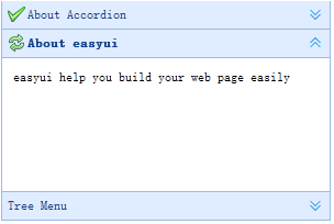
The accordion allows you to provide multiple panels and display one or more panels at the same time. Each panel has built-in support for expanding and collapsing. Clicking a panel header expands or collapses the panel body. Panel content can be loaded via ajax by specifying the 'href' attribute. The user can define the selected panel. If not specified, the first panel is selected by default.
Dependencies
- panel
Usage
Create an Accordion
Create an accordion from markup by adding the 'easyui-accordion' class to the <div> tag.
<div id="aa" class="easyui-accordion" style="width:300px;height:200px;">
    <div title="Title1" data-options="iconCls:'icon-save'" style="overflow:auto;padding:10px;">
        <h3 style="color:#0099FF;">Accordion for jQuery</h3>
        <p>Accordion is a part of easyui framework for jQuery.
        It lets you define your accordion component on web page more easily.</p>
    </div>
    <div title="Title2" data-options="iconCls:'icon-reload',selected:true" style="padding:10px;">
        content2
    </div>
    <div title="Title3">
        content3
    </div>
</div>
We can modify certain features after changing or rebuilding the accordion.
$('#aa').accordion({
    animate:false
});
Refresh Accordion Panel Content
Call the 'getSelected' method to get the current panel, then we can call the panel's 'refresh' method to load new content.
var pp = $('#aa').accordion('getSelected'); // 获取选中的面板(panel)
if (pp){
    pp.panel('refresh','new_content.php'); // 调用 'refresh' 方法加载新内容
}
Container Options
| Name | Type | Description | Default Value |
|---|---|---|---|
| width | number | The width of the accordion container. | auto |
| height | number | The height of the accordion container. | auto |
| fit | boolean | Set to true to make the accordion container size fit its parent container. | false |
| border | boolean | Defines whether to show the border. | true |
| animate | boolean | Defines whether to show animation effects when expanding or collapsing a panel. | true |
| multiple | boolean | Set to true to allow multiple panels to be expanded at the same time. This property is available since version 1.3.5. | false |
| selected | number | The index of the initially selected panel. This property is available since version 1.3.5. | 0 |
Panel Options
The accordion's panel options inherit from the panel. The following are additional properties:
| Name | Type | Description | Default Value |
|---|---|---|---|
| selected | boolean | Set to true to expand the panel. | false |
| collapsible | boolean | Defines whether to show the collapsible button. If set to false, the panel cannot be expanded/collapsed by clicking. | true |
Events
| Name | Parameters | Description |
|---|---|---|
| onSelect | title,index | Fired when a panel is selected. |
| onUnselect | title,index | Fired when a panel is unselected. This event is available since version 1.3.5. |
| onAdd | title,index | Fired when a new panel is added. |
| onBeforeRemove | title,index | Fired before a panel is removed. Return false to cancel the removal action. |
| onRemove | title,index | Fired when a panel is removed. |
Methods
| Name | Parameters | Description |
|---|---|---|
| options | none | Returns the options of the accordion. |
| panels | none | Gets all panels. |
| resize | none | Resizes the accordion. |
| getSelected | none | Gets the first selected panel. |
| getSelections | none | Gets all selected panels. This method is available since version 1.3.5. |
| getPanel | which | Gets the specified panel. The 'which' parameter can be the panel's title or index. |
| getPanelIndex | panel | Gets the index of the specified panel. This method is available since version 1.3. The example below shows how to get the selected panel index.
var p = $('#aa').accordion('getSelected');
if (p){
    var index = $('#aa').accordion('getPanelIndex', p);
    alert(index);
}
|
| select | which | Selects the specified panel. The 'which' parameter can be the panel's title or index. |
| unselect | which | Unselects the specified panel. The 'which' parameter can be the panel's title or index. This method is available since version 1.3.5. |
| add | options | Adds a new panel. By default, the newly added panel will be selected. To add a new panel that is not selected, pass the 'selected' property and set it to false. Code example:
$('#aa').accordion('add', {
    title: 'New Title',
    content: 'New Content',
    selected: false
});
|
| remove | which | Removes the specified panel. The 'which' parameter can be the panel's title or index. |
jQuery EasyUI Plugins Other Extensions