Vue3 Components
Each Vue component is an independent Vue instance with its own template, data, methods, and lifecycle hooks, allowing components to define and manage their own functionality and styles in a self-contained manner.
Components are one of the most powerful features of Vue.js.
Components can extend HTML elements, encapsulate reusable code, and help you split your user interface into independent and reusable parts.
Each Vue component is an independent Vue instance with its own template, data, methods, and lifecycle hooks, allowing components to define and manage their own functionality and styles in a self-contained manner.
Features and Advantages of Vue Components
- Reusability: Components can be used multiple times in different places, improving code reusability and maintainability.
- Encapsulation: Each component is an independent scope that encapsulates its own state and logic, avoiding global pollution.
- Composability: Complex interfaces can be built by combining multiple small components.
- Reactivity: The component's data is reactively bound to the view, and the view updates automatically when the data changes.
- Modularity: Modular development is supported, and modern front-end toolchains can be used for building and management.
The component system lets us build large applications with independent, reusable small components. Almost any type of application's interface can be abstracted into a component tree:
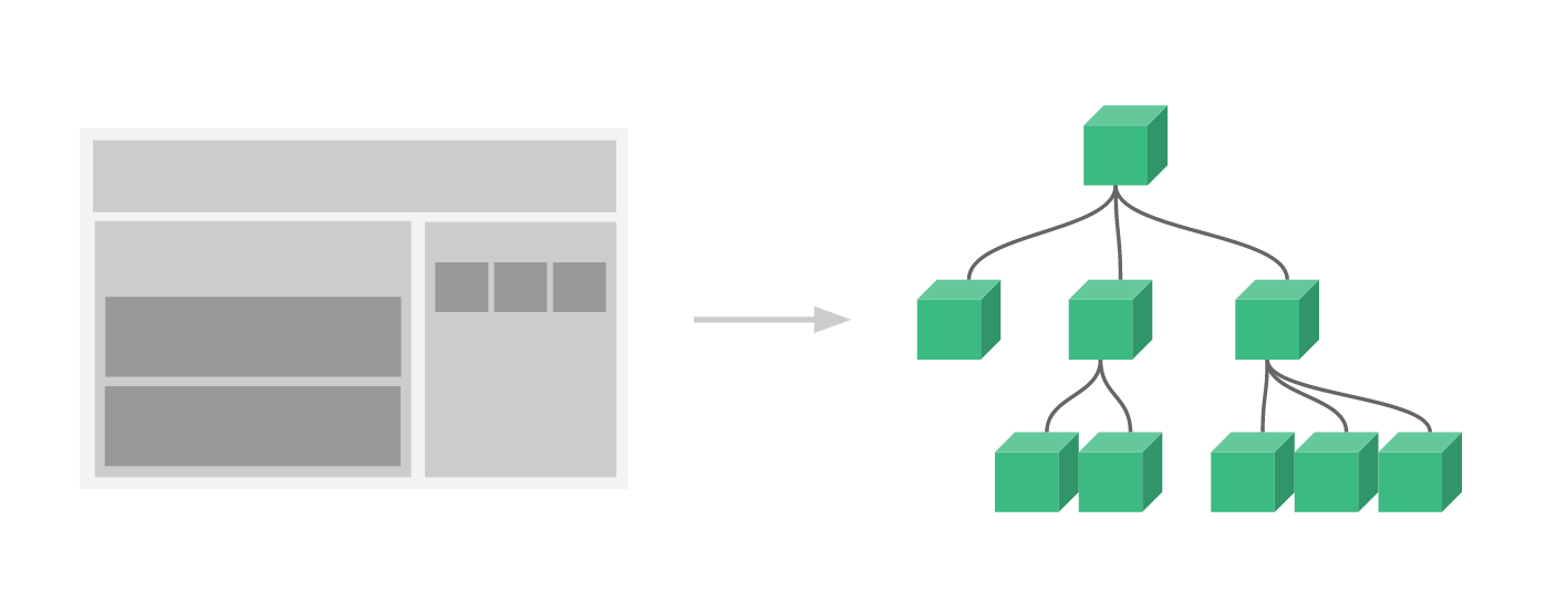
Every Vue application is created using the createApp function. The options passed to createApp are used to configure the root component. When we mount the application, that component is used as the starting point for rendering.
An application needs to be mounted to a DOM element.
In the following example, we mount the Vue application to<div id="app"></div>, and #app should be passed in:
const RootComponent = { /* 选项 */ }
const app = Vue.createApp(RootComponent)
const vm = app.mount('#app')
The syntax for registering a global component is as follows:
const app = Vue.createApp({...})

app.component('my-component-name', {
  /* ... */
})
my-component-nameis the component name,/* ... */part is the configuration options. After registration, we can call the component in the following way:
<my-component-name></my-component-name>
A simple example of a Vue component:
Global Component Example
Register a simple global component example and use it:
Try it »
Next, let's register a button-counter component. After each click, the counter will increase by 1:
Example
const app = Vue.createApp({})
// Define a new global component named button-counter
app.component('button-counter', {
data() {
return {
count: 0
}
},
template: `
<button @click="count++">
Clicked{{ count }}times!
</button>`
})
app.mount('#app')
</script>
Try it »
Note: In template,`is a backtick, not a single quote.'。
Component Reuse
You can reuse a component any number of times:
Example
<button-counter></button-counter>
<button-counter></button-counter>
<button-counter></button-counter>
</div>
Try it »
Global Components
In the examples above, our components are all registered globally using the component method.
Globally registered components can be used in the templates of app instances created afterwards, including the templates of all child components in the root instance's component tree.
Global Component Example
Register a simple global component example and use it:
Try it »
Local Components
Global registration is often not ideal. For example, if you use a build system like webpack, globally registering all components means that even if you no longer use a component, it will still be included in your final build result. This causes an unnecessary increase in the JavaScript downloaded by users.
In these cases, you can define a component with a plain JavaScript object:
const ComponentA = {
  /* ... */
}
const ComponentB = {
  /* ... */
}
const ComponentC = {
  /* ... */
}
Then define the components you want to use in the components option:
const app = Vue.createApp({
  components: {
    'component-a': ComponentA,
    'component-b': ComponentB
  }
})
For each property in the components object, the property name is the name of the custom element (component-a, component-b), and the property value is the component's options object (ComponentA, ComponentB).
We can also register local components in the instance option, so that the component can only be used in this instance:
Local Component Example
Register a simple local component exampleA and use it:
Try it »
Single-File Components (.vue Files)
Using single-file components allows you to better organize and manage Vue components. A component usually consists of three parts: template, script, and style.
Example
<template>
<div>
<p>{{ message }}</p>
<button @click="increment">Increment</button>
</div>
</template>
<script>
export default {
data() {
return {
message: 'Hello from MyComponent',
count: 0
};
},
methods: {
increment() {
this.count++;
}
}
};
</script>
<style scoped>
/* Component private styles */
p {
color: blue;
}
</style>
Prop
prop is a custom attribute used by child components to receive data passed from parent components.
Parent component data needs to be passed to child components via props, and child components need to explicitly declare "prop" using the props option:
Prop Example
Try it »
A component can have any number of props by default, and any value can be passed to any prop.
Dynamic Props
Similar to binding HTML attributes to an expression with v-bind, you can also use v-bind to dynamically bind prop values to parent component data. Whenever the parent component's data changes, the change will also be passed to the child component:
Prop Example
Try it »
Prop Validation
Components can specify validation requirements for props.
To customize the validation method for props, you can provide an object with validation requirements for the values in props, instead of an array of strings. For example:
Vue.component('my-component', {
  props: {
    // 基础的类型检查 (`null` 和 `undefined` 会通过任何类型验证)
    propA: Number,
    // 多个可能的类型
    propB: [String, Number],
    // 必填的字符串
    propC: {
      type: String,
      required: true
    },
    // 带有默认值的数字
    propD: {
      type: Number,
      default: 100
    },
    // 带有默认值的对象
    propE: {
      type: Object,
      // 对象或数组默认值必须从一个工厂函数获取
      default: function () {
        return { message: 'hello' }
      }
    },
    // 自定义验证函数
    propF: {
      validator: function (value) {
        // 这个值必须匹配下列字符串中的一个
        return ['success', 'warning', 'danger'].indexOf(value) !== -1
      }
    }
  }
})
When prop validation fails, Vue (in the development build) will produce a console warning.
type can be one of the following native constructors:
StringNumberBooleanArrayObjectDateFunctionSymbol
type can also be a custom constructor, checked using instanceof.
Other Extensions