Bootstrap Panels
In this chapter we will discuss Bootstrap panels. Panels are components used for inserting into DOM components.
To get a basic panel, you only need to add the.paneland.panel-defaultclass to the <div> element.
The example is shown below:
<div class="panel panel-default">
   <div class="panel-body">
      This is a Basic panel
   </div>
</div>
The effect of the above example is shown below:

Panel Title
We can add a panel title in the following two ways:
- Use the.panel-headingclass to easily add a title container to your panel.
- Use <h1> - <h6> elements and use the .panel-titleclass to add a pre-styled title to your panel.
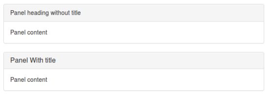
The following example demonstrates two different implementation methods:
<div class="panel panel-default">
   <div class="panel-heading">
      Panel heading without title
   </div>
   <div class="panel-body">
      Panel content
   </div>
</div>

<div class="panel panel-default">
   <div class="panel-heading">
      <h3 class="panel-title">
         Panel With title
      </h3>
   </div>
   <div class="panel-body">
      Panel content
   </div>
</div>
The effect of the above example is shown below:
Panel Footer
You can add a footer to the panel. You only need to add the.panel-footerclass to the <div> element. The example is as follows:
<div class="panel panel-default">
   <div class="panel-body">
      This is a Basic panel
   </div>
   <div class="panel-footer">Panel footer</div>
</div>
The effect of the above example is shown below:

Note: the panel footer does not inherit colors from the contextual classes, because it is not in the preceding content.
Panels with Contextual Colors
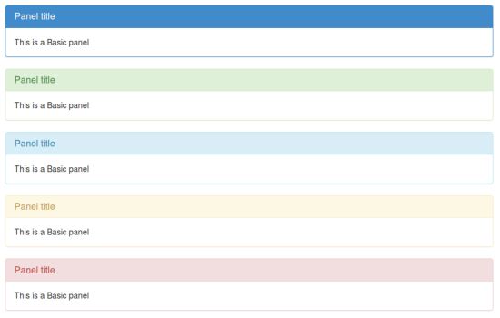
You can use the panel-primary, panel-success, panel-info, panel-warning, panel-danger classes to set contextual panels. The example is as follows:
<div class="panel panel-primary">
   <div class="panel-heading">
      <h3 class="panel-title">Panel title</h3>
   </div>
   <div class="panel-body">
      This is a Basic panel
   </div>
</div>
<div class="panel panel-success">
   <div class="panel-heading">
      <h3 class="panel-title">Panel title</h3>
   </div>
   <div class="panel-body">
      This is a Basic panel
   </div>
</div>
<div class="panel panel-info">
   <div class="panel-heading">
      <h3 class="panel-title">Panel title</h3>
   </div>
   <div class="panel-body">
      This is a Basic panel
   </div>
</div>
<div class="panel panel-warning">
   <div class="panel-heading">
      <h3 class="panel-title">Panel title</h3>
   </div>
   <div class="panel-body">
      This is a Basic panel
   </div>
</div>
<div class="panel panel-danger">
   <div class="panel-heading">
      <h3 class="panel-title">Panel title</h3>
   </div>
   <div class="panel-body">
      This is a Basic panel
   </div>
</div>
The effect of the above example is shown below:
Panels with Tables
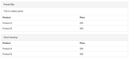
We can use the .table class in a panel to set a borderless table. The .panel-body class can be used to define additional text content along with the table. The example is as follows:
<div class="panel panel-default">
   <div class="panel-heading">
      <h3 class="panel-title">Panel title</h3>
   </div>
   <div class="panel-body">
      This is a Basic panel
   </div>
   <table class="table">
      <th>Product</th><th>Price </th>
      <tr><td>Product A</td><td>200</td></tr>
      <tr><td>Product B</td><td>400</td></tr>
   </table>
</div>
<div class="panel panel-default">
   <div class="panel-heading">Panel Heading</div>
   <table class="table">
      <th>Product</th><th>Price </th>
      <tr><td>Product A</td><td>200</td></tr>
      <tr><td>Product B</td><td>400</td></tr>
   </table>
</div>
The effect of the above example is shown below:
Panels with List Groups
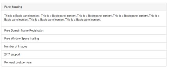
We can include a list group in any panel by adding the.paneland.panel-defaultclass to the <div> element to create a panel, and then adding the list group to the panel. The example is as follows:
<div class="panel panel-default">
   <div class="panel-heading">Panel heading</div>
      <div class="panel-body">
         <p>This is a Basic panel content. This is a Basic panel content.
         This is a Basic panel content.This is a Basic panel content.
         This is a Basic panel content.This is a Basic panel content.
         This is a Basic panel content.
         </p>
   </div>
   <ul class="list-group">
      <li class="list-group-item">Free Domain Name Registration</li>
      <li class="list-group-item">Free Window Space hosting</li>
      <li class="list-group-item">Number of Images</li>
      <li class="list-group-item">24*7 support</li>
      <li class="list-group-item">Renewal cost per year</li>
   </ul>
</div>
The effect of the above example is shown below: