Bootstrap Navbar
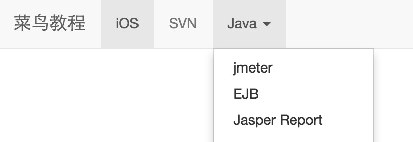
Navbar is a great feature and a prominent feature of Bootstrap websites. The navbar serves as a responsive base component for navigation headers in your application or website. The navbar is collapsed in the mobile view, and as the available viewport width increases, the navbar also expands horizontally. At the core of the Bootstrap navbar, the navbar includes the site name and basic navigation definition styles.
Default Navbar
The steps to create a default navbar are as follows:
- Add a class to the <nav> tag.navbar、.navbar-default。
- Add to the above elementrole="navigation", which helps increase accessibility.
- Add a title class to the <div> element.navbar-header, which contains a classnavbar-brandof the <a> element. This will make the text look one size larger.
- To add links to the navbar, simply add an unordered list with class.nav、.navbar-nav.
The following example demonstrates this:
Example
<nav class="navbar navbar-default" role="navigation">
<div class="container-fluid">
<div class="navbar-header">
<a class="navbar-brand" href="#">Example</a>
</div>
<div>
<ul class="nav navbar-nav">
<li class="active"><a href="#">iOS</a></li>
<li><a href="#">SVN</a></li>
<li class="dropdown">
<a href="#" class="dropdown-toggle" data-toggle="dropdown">
Java
<b class="caret"></b>
</a>
<ul class="dropdown-menu">
<li><a href="#">jmeter</a></li>
<li><a href="#">EJB</a></li>
<li><a href="#">Jasper Report</a></li>
<li class="divider"></li>
<li><a href="#">Separated link</a></li>
<li class="divider"></li>
<li><a href="#">Another separated link</a></li>
</ul>
</li>
</ul>
</div>
</div>
</nav>
Try it »
The result is as follows:
Responsive Navbar
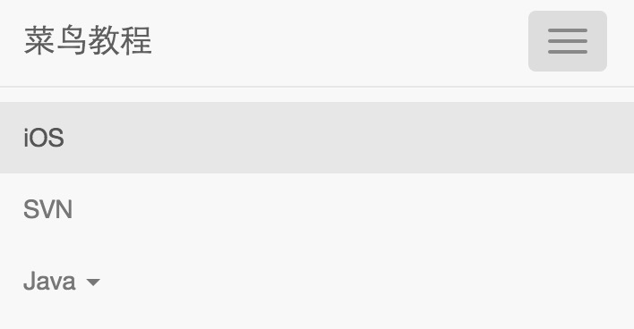
To add responsive features to the navbar, the content you want to collapse must be wrapped in a <div> with class.collapse、.navbar-collapse. The collapsed navbar is actually a button with class.navbar-toggleand two data- elements. The first isdata-toggle, which is used to tell JavaScript what to do with the button, and the second isdata-target, indicating which element to switch to. Three elements with class.icon-barof the <span> create the so-called hamburger button. These will switch to the.nav-collapse<div> element. To achieve these features, you must include theBootstrap Collapse plugin。
The following example demonstrates this:
Example
<nav class="navbar navbar-default" role="navigation">
<div class="container-fluid">
<div class="navbar-header">
<button type="button" class="navbar-toggle" data-toggle="collapse"
data-target="#example-navbar-collapse">
<span class="sr-only">Toggle navigation</span>
<span class="icon-bar"></span>
<span class="icon-bar"></span>
<span class="icon-bar"></span>
</button>
<a class="navbar-brand" href="#">Example</a>
</div>
<div class="collapse navbar-collapse" id="example-navbar-collapse">
<ul class="nav navbar-nav">
<li class="active"><a href="#">iOS</a></li>
<li><a href="#">SVN</a></li>
<li class="dropdown">
<a href="#" class="dropdown-toggle" data-toggle="dropdown">
Java <b class="caret"></b>
</a>
<ul class="dropdown-menu">
<li><a href="#">jmeter</a></li>
<li><a href="#">EJB</a></li>
<li><a href="#">Jasper Report</a></li>
<li class="divider"></li>
<li><a href="#">Separated link</a></li>
<li class="divider"></li>
<li><a href="#">Another separated link</a></li>
</ul>
</li>
</ul>
</div>
</div>
</nav>
Try it »
The result is as follows:
Forms in Navbar
Forms in the navbar do not use theBootstrap Formsdefault classes mentioned in the chapter; instead, they use the.navbar-formclass. This ensures appropriate vertical alignment of the form and collapsed behavior in narrower viewports. Use the alignment options (which will be discussed in detail in the Component Alignment section) to determine where the content in the navbar is placed.
The following example demonstrates this:
Example
<nav class="navbar navbar-default" role="navigation">
<div class="container-fluid">
<div class="navbar-header">
<a class="navbar-brand" href="#">Example</a>
</div>
<form class="navbar-form navbar-left" role="search">
<div class="form-group">
<input type="text" class="form-control" placeholder="Search">
</div>
<button type="submit" class="btn btn-default">Submit</button>
</form>
</div>
</nav>
Try it »
The result is as follows:
Buttons in Navbar
You can use the class.navbar-btnto add buttons to a <button> element that is not inside a <form>, and the button will be vertically centered on the navbar..navbar-btnIt can be used on <a> and <input> elements.
Do not use.navbar-navon <a> elements inside.navbar-btn, because it is not a standardbutton class。
The following example demonstrates this:
Example
<nav class="navbar navbar-default" role="navigation">
<div class="container-fluid">
<div class="navbar-header">
<a class="navbar-brand" href="#">Example</a>
</div>
<div>
<form class="navbar-form navbar-left" role="search">
<div class="form-group">
<input type="text" class="form-control" placeholder="Search">
</div>
<button type="submit" class="btn btn-default">Submit button</button>
</form>
<button type="button" class="btn btn-default navbar-btn">Navbar button</button>
</div>
</div>
</nav>
Try it »
The result is as follows:
Text in Navbar
If you need to include text strings in the navigation, use the class.navbar-text. This is usually used together with the <p> tag to ensure proper leading and color. The following example demonstrates this:
Example
<nav class="navbar navbar-default" role="navigation">
<div class="container-fluid">
<div class="navbar-header">
<a class="navbar-brand" href="#">Example</a>
</div>
<div>
<p class="navbar-text">Example User Login</p>
</div>
</div>
</nav>
Try it yourself »
The result is as follows:
Navbar Links with Icons
If you want to use icons in the regular navbar navigation components, use the classglyphicon glyphicon-*to set the icons. For more, seeBootstrap Icons, as shown in the following example:
Example
<nav class="navbar navbar-default" role="navigation">
<div class="container-fluid">
<div class="navbar-header">
<a class="navbar-brand" href="#">Example</a>
</div>
<ul class="nav navbar-nav navbar-right">
<li><a href="#"><span class="glyphicon glyphicon-user"></span>Register</a></li>
<li><a href="#"><span class="glyphicon glyphicon-log-in"></span>Login</a></li>
</ul>
</div>
</nav>
Try it yourself »
The result is as follows:
Component Alignment
You can use utility classes.navbar-leftor.navbar-rightto align the navbar'snav links, forms, buttons, or textto the left or right. Both of these classes add a CSS float in the specified direction. The following example demonstrates this:
Example
<nav class="navbar navbar-default" role="navigation">
<div class="container-fluid">
<div class="navbar-header">
<a class="navbar-brand" href="#">Example</a>
</div>
<div>
<ul class="nav navbar-nav navbar-left">
<li class="dropdown">
<a href="#" class="dropdown-toggle" data-toggle="dropdown">
Java
<b class="caret"></b>
</a>
<ul class="dropdown-menu">
<li><a href="#">jmeter</a></li>
<li><a href="#">EJB</a></li>
<li><a href="#">Jasper Report</a></li>
<li class="divider"></li>
<li><a href="#">Separated link</a></li>
<li class="divider"></li>
<li><a href="#">Another separated link</a></li>
</ul>
</li>
</ul>
<form class="navbar-form navbar-left" role="search">
<button type="submit" class="btn btn-default">Left-aligned submit button</button>
</form>
<p class="navbar-text navbar-left">Left-aligned text</p>
<ul class="nav navbar-nav navbar-right">
<li class="dropdown">
<a href="#" class="dropdown-toggle" data-toggle="dropdown">
Java <b class="caret"></b>
</a>
<ul class="dropdown-menu">
<li><a href="#">jmeter</a></li>
<li><a href="#">EJB</a></li>
<li><a href="#">Jasper Report</a></li>
<li class="divider"></li>
<li><a href="#">Separated link</a></li>
<li class="divider"></li>
<li><a href="#">Another separated link</a></li>
</ul>
</li>
</ul>
<form class="navbar-form navbar-right" role="search">
<button type="submit" class="btn btn-default">Right-aligned submit button</button>
</form>
<p class="navbar-text navbar-right">Right-aligned text</p>
</div>
</div>
</nav>
Try it yourself »
The result is as follows:
Fixed to Top
The Bootstrap navbar can be positioned dynamically. By default, it is a block-level element positioned based on where it is placed in the HTML. With some helper classes, you can place it at the top or bottom of the page, or you can make it a static navbar that scrolls with the page.
If you want to fix the navbar to the top of the page,.navbar classadd the class.navbar-fixed-top. The following example demonstrates this:
To prevent the navbar from overlapping the top of other content in the page body, add at least 50 pixels of padding to the <body> tag. The padding value can be set according to your needs.
Example
<nav class="navbar navbar-default navbar-fixed-top" role="navigation">
<div class="container-fluid">
<div class="navbar-header">
<a class="navbar-brand" href="#">Example</a>
</div>
<div>
<ul class="nav navbar-nav">
<li class="active"><a href="#">iOS</a></li>
<li><a href="#">SVN</a></li>
<li class="dropdown">
<a href="#" class="dropdown-toggle" data-toggle="dropdown">
Java <b class="caret"></b>
</a>
<ul class="dropdown-menu">
<li><a href="#">jmeter</a></li>
<li><a href="#">EJB</a></li>
<li><a href="#">Jasper Report</a></li>
<li class="divider"></li>
<li><a href="#">Separated link</a></li>
<li class="divider"></li>
<li><a href="#">Another separated link</a></li>
</ul>
</li>
</ul>
</div>
</div>
</nav>
Try it yourself »
The result is as follows:
Fixed to Bottom
If you want to fix the navbar to the bottom of the page,.navbar classadd the class.navbar-fixed-bottom. The following example demonstrates this:
Example
<nav class="navbar navbar-default navbar-fixed-bottom" role="navigation">
<div class="container-fluid">
<div class="navbar-header">
<a class="navbar-brand" href="#">Example</a>
</div>
<div>
<ul class="nav navbar-nav">
<li class="active"><a href="#">iOS</a></li>
<li><a href="#">SVN</a></li>
<li class="dropdown">
<a href="#" class="dropdown-toggle" data-toggle="dropdown">
Java <b class="caret"></b>
</a>
<ul class="dropdown-menu">
<li><a href="#">jmeter</a></li>
<li><a href="#">EJB</a></li>
<li><a href="#">Jasper Report</a></li>
<li class="divider"></li>
<li><a href="#">Separated link</a></li>
<li class="divider"></li>
<li><a href="#">Another separated link</a></li>
</ul>
</li>
</ul>
</div>
</div>
</nav>
Try it yourself »
The result is as follows:
Static Top
To create a navbar that scrolls with the page, add the.navbar-static-topclass. This class does not require adding padding to the <body>.
Example
<nav class="navbar navbar-default navbar-static-top" role="navigation">
<div class="container-fluid">
<div class="navbar-header">
<a class="navbar-brand" href="#">Example</a>
</div>
<div>
<ul class="nav navbar-nav">
<li class="active"><a href="#">iOS</a></li>
<li><a href="#">SVN</a></li>
<li class="dropdown">
<a href="#" class="dropdown-toggle" data-toggle="dropdown">
Java <b class="caret"></b>
</a>
<ul class="dropdown-menu">
<li><a href="#">jmeter</a></li>
<li><a href="#">EJB</a></li>
<li><a href="#">Jasper Report</a></li>
<li class="divider"></li>
<li><a href="#">Separated link</a></li>
<li class="divider"></li>
<li><a href="#">Another separated link</a></li>
</ul>
</li>
</ul>
</div>
</div>
</nav>
Try it yourself »
The result is as follows:
Inverted Navbar
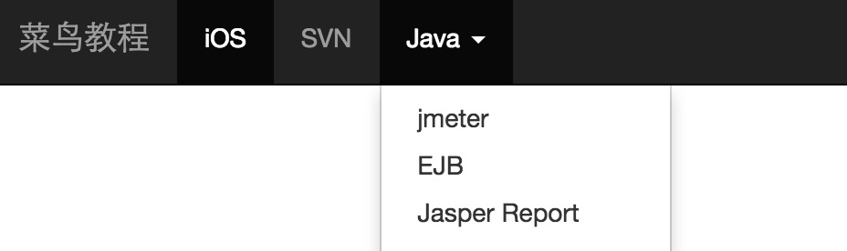
To create an inverted navbar with a black background and white text, simply.navbaradd the class to.navbar-inversethe class, as shown in the following example:
To prevent the navbar from overlapping the top of other content in the page body, add at least 50 pixels of padding to the <body> tag. The padding value can be set according to your needs.
Example
<nav class="navbar navbar-inverse" role="navigation">
<div class="container-fluid">
<div class="navbar-header">
<a class="navbar-brand" href="#">Example</a>
</div>
<div>
<ul class="nav navbar-nav">
<li class="active"><a href="#">iOS</a></li>
<li><a href="#">SVN</a></li>
<li class="dropdown">
<a href="#" class="dropdown-toggle" data-toggle="dropdown">
Java <b class="caret"></b>
</a>
<ul class="dropdown-menu">
<li><a href="#">jmeter</a></li>
<li><a href="#">EJB</a></li>
<li><a href="#">Jasper Report</a></li>
<li class="divider"></li>
<li><a href="#">Separated link</a></li>
<li class="divider"></li>
<li><a href="#">Another separated link</a></li>
</ul>
</li>
</ul>
</div>
</div>
</nav>
Try it yourself »
The result is as follows:
Other extensions