Bootstrap Alerts
This chapter will explain alerts and the classes Bootstrap provides for alerts. Alerts provide a way to style messages to users. They provide contextual feedback for typical user actions.
You can add an optional close button to an alert box. To create an inline dismissible alert box, useAlerts jQuery Plugin。
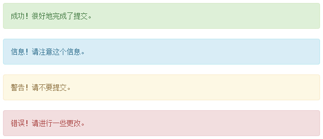
You can, by creating a <div> and adding to it a.alertclass and one of the four contextual classes (i.e. .alert-success、.alert-info、.alert-warning、.alert-danger) to add a basic alert box. The following example demonstrates this:
Examples
<div class="alert alert-success">Success! The submission was completed successfully.</div>
<div class="alert alert-info">Info! Please note this information.</div>
<div class="alert alert-warning">Warning! Please do not submit.</div>
<div class="alert alert-danger">Error! Please make some changes.</div>
Try it »
The result is shown below:
Dismissible Alerts (Dismissal Alerts)
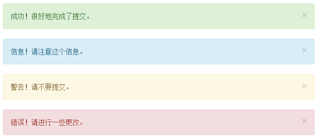
The steps to create a dismissible alert (Dismissal Alert) are as follows:
- By creating a <div> and adding to it a.alertclass and one of the four contextual classes (i.e. .alert-success、.alert-info、.alert-warning、.alert-danger) to add a basic alert box.
- Also add the optional ... to the <div> class above..alert-dismissable。
- Add a close button.
The following example demonstrates this:
Examples
<div class="alert alert-success alert-dismissable">
<button type="button" class="close" data-dismiss="alert"
aria-hidden="true">
×
</button>Success! The submission was completed successfully.</div>
<div class="alert alert-info alert-dismissable">
<button type="button" class="close" data-dismiss="alert"
aria-hidden="true">
×
</button>Info! Please note this information.</div>
<div class="alert alert-warning alert-dismissable">
<button type="button" class="close" data-dismiss="alert"
aria-hidden="true">
×
</button>Warning! Please do not submit.</div>
<div class="alert alert-danger alert-dismissable">
<button type="button" class="close" data-dismiss="alert"
aria-hidden="true">
×
</button>Error! Please make some changes.</div>
Please make sure to usedata-dismiss="alert"a <button> element with the data attribute.
Try it »
The result is shown below:
Links in Alerts
The steps for creating links in alerts are as follows:
- By creating a <div> and adding to it a.alertclass and one of the four contextual classes (i.e. .alert-success、.alert-info、.alert-warning、.alert-danger) to add a basic alert box.
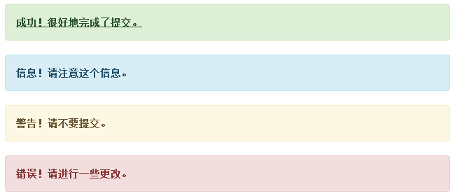
- Use.alert-linkthe class to quickly provide links with matching colors.
Examples
<div class="alert alert-success">
<a href="#" class="alert-link">Success! The submission was completed successfully.</a>
</div>
<div class="alert alert-info">
<a href="#" class="alert-link">Info! Please note this information.</a>
</div>
<div class="alert alert-warning">
<a href="#" class="alert-link">Warning! Please do not submit.</a>
</div>
<div class="alert alert-danger">
<a href="#" class="alert-link">Error! Please make some changes.</a>
</div>
Try it »
The result is shown below:
Other Extensions