Bootstrap Tables
Bootstrap provides a clear layout for creating tables. The following table lists some table elements supported by Bootstrap:
| Tag | Description |
|---|---|
| <table> | Adds basic styling to the table. |
| <thead> | The container element for the table header row (<tr>), used to identify table columns. |
| <tbody> | The container element for table rows (<tr>) in the table body. |
| <tr> | A container element for a group of table cells (<td> or <th>) that appear on a single row. |
| <td> | Default table cell. |
| <th> | A special table cell used to identify a column or row (depending on scope and position). Must be used within <thead>. |
| <caption> | A description or summary of the content stored in the table. |
Table Classes
The following table styles can be used in tables:
| Class | Description | Example |
|---|---|---|
| .table | Adds basic styling to any <table> (only horizontal dividers) | Try it |
| .table-striped | Adds zebra-striping to rows within <tbody> (IE8 not supported) | Try it |
| .table-bordered | Adds borders to all table cells. | Try it |
| .table-hover | Enables a hover state on any row within <tbody> | Try it |
| .table-condensed | Makes the table more compact. | Try it |
| Combine all table classes. | Try it | |
<tr>, <th>, and <td> Classes
The classes in the table below can be used on table rows or cells:
| Class | Description | Example |
|---|---|---|
| .active | Applies the hover color to a row or cell. | Try it |
| .success | Indicates a successful action. | Try it |
| .info | Indicates an informational change action. | Try it |
| .warning | Indicates a warning action. | Try it |
| .danger | Indicates a dangerous action. | Try it |
Basic Table
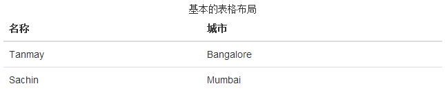
If you want a basic table with only padding and horizontal dividers, add the class.table, as shown in the example below:
Example
Try it »
The result is shown below:
Optional Table Classes
In addition to the basic table markup and the `.table` class, there are also some classes that can be used to style the markup. These classes are introduced below.
Striped Table
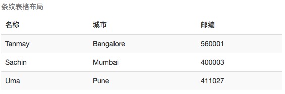
By adding.table-stripedclass, you will see stripes on rows within <tbody>, as shown in the example below:
Example
Try it »
The result is shown below:
Bordered Table
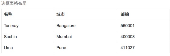
By adding.table-borderedclass, you will see borders around every element, and the entire table is rounded, as shown in the example below:
Example
Try it »
The result is shown below:
Hover Table
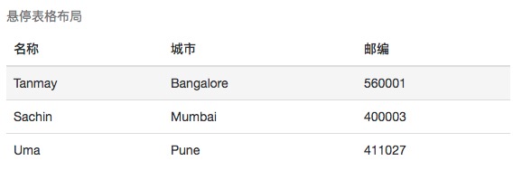
By adding.table-hoverclass, a light gray background will appear when the pointer hovers over a row, as shown in the example below:
Example
Try it Yourself »
The result is as follows:
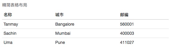
Condensed Table
By adding.table-condensed class, the row padding is cut in half to make the table look more compact, as shown in the example below. This is very useful when you want the information to look more compact.
Example
Try it Yourself »
The result is as follows:
Contextual Classes
The contextual classes listed in the following table allow you to change the background color of table rows or individual cells.
| Class | Description |
|---|---|
| .active | Applies the hover color to a particular row or cell. |
| .success | Indicates a successful or positive action. |
| .warning | Indicates a warning that requires attention. |
| .danger | Indicates a dangerous or potentially negative action. |
These classes can be applied to <tr>, <td>, or <th>.
Example
Try it Yourself »
The result is as follows:

Responsive Table
By wrapping any.tableinside a.table-responsiveclass, you can make the table scroll horizontally to fit small devices (less than 768px).
Example
Try it Yourself »
The result is as follows:
