Bootstrap Button group
Button groups allow multiple buttons to be stacked on the same row. When you want to align buttons together, this is very useful. You canBootstrap Button PluginAdds optional JavaScript radio and checkbox style behavior.
The following table summarizes some important classes provided by Bootstrap for using button groups:
| Class | Description | Code example |
|---|
| .btn-group | This class is used to form a basic button group. In.btn-groupplace a series of buttons with class.btnbuttons. |
<div class="btn-group">
  <button type="button" class="btn btn-default">Button1</button>
   <button type="button" class="btn btn-default">Button2</button>
</div>
|
| .btn-toolbar | This class helps to combine several <div class="btn-group"> groups into a <div class="btn-toolbar">, generally to obtain more complex components. |
<div class="btn-toolbar" role="toolbar">
  <div class="btn-group">...</div>
  <div class="btn-group">...</div>
</div>
|
| .btn-group-lg, .btn-group-sm, .btn-group-xs | These classes can be applied to the sizing of the entire button group, without needing to adjust the size of each button. |
<div class="btn-group btn-group-lg">...</div>
<div class="btn-group btn-group-sm">...</div>
<div class="btn-group btn-group-xs">...</div>
|
| .btn-group-vertical | This class makes a group of buttons display vertically stacked instead of horizontally stacked. |
<div class="btn-group-vertical">
  ...
</div>
|
Basic button group
The example below demonstrates the class discussed in the table above.btn-groupthe use of:
Example
<div class="btn-group">
<button type="button" class="btn btn-default">Button 1</button>
<button type="button" class="btn btn-default">Button 2</button>
<button type="button" class="btn btn-default">Button 3</button>
</div>
Try it »
The result is shown below:
Button toolbar
The example below demonstrates the class discussed in the table above.btn-toolbarthe use of:
Example
<div class="btn-toolbar" role="toolbar">
<div class="btn-group">
<button type="button" class="btn btn-default">Button 1</button>
<button type="button" class="btn btn-default">Button 2</button>
<button type="button" class="btn btn-default">Button 3</button>
</div>
<div class="btn-group">
<button type="button" class="btn btn-default">Button 4</button>
<button type="button" class="btn btn-default">Button 5</button>
<button type="button" class="btn btn-default">Button 6</button>
</div>
<div class="btn-group">
<button type="button" class="btn btn-default">Button 7</button>
<button type="button" class="btn btn-default">Button 8</button>
<button type="button" class="btn btn-default">Button 9</button>
</div>
</div>
Try it »
The result is shown below:
Button size
The example below demonstrates the class discussed in the table above.btn-group-*the use of:
Example
<div class="btn-group btn-group-lg">
<button type="button" class="btn btn-default">Button 1</button>
<button type="button" class="btn btn-default">Button 2</button>
<button type="button" class="btn btn-default">Button 3</button>
</div>
<div class="btn-group btn-group-sm">
<button type="button" class="btn btn-default">Button 4</button>
<button type="button" class="btn btn-default">Button 5</button>
<button type="button" class="btn btn-default">Button 6</button>
</div>
<div class="btn-group btn-group-xs">
<button type="button" class="btn btn-default">Button 7</button>
<button type="button" class="btn btn-default">Button 8</button>
<button type="button" class="btn btn-default">Button 9</button>
</div>
Try it »
The result is shown below:
Nesting
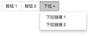
You can nest another button group inside a button group, that is, in a.btn-groupnest another inside.btn-group . This is used when you want to combine a dropdown menu with a series of buttons.
Example
<div class="btn-group">
<button type="button" class="btn btn-default">Button 1</button>
<button type="button" class="btn btn-default">Button 2</button>
<div class="btn-group">
<button type="button" class="btn btn-default dropdown-toggle" data-toggle="dropdown">Dropdown<span class="caret"></span>
</button>
<ul class="dropdown-menu">
<li><a href="#">Dropdown link 1</a></li>
<li><a href="#">Dropdown link 2</a></li>
</ul>
</div>
</div>
Try it »
The result is shown below:
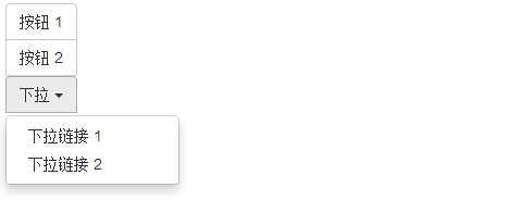
Vertical button group
The example below demonstrates the class discussed in the table above.btn-group-verticalthe use of:
Example
<div class="btn-group-vertical">
<button type="button" class="btn btn-default">Button 1</button>
<button type="button" class="btn btn-default">Button 2</button>
<div class="btn-group-vertical">
<button type="button" class="btn btn-default dropdown-toggle" data-toggle="dropdown">Dropdown<span class="caret"></span>
</button>
<ul class="dropdown-menu">
<li><a href="#">Dropdown link 1</a></li>
<li><a href="#">Dropdown link 2</a></li>
</ul>
</div>
</div>
Try it »
The result is shown below:
Other extensions