Bootstrap Labels
This chapter will cover Bootstrap labels. Labels can be used for counting, prompts, or other marker displays on the page. Use the class.labelto display labels, as shown in the example below:
Example
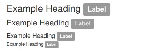
<h1>Example Heading <span class="label label-default">Label</span></h1>
<h2>Example Heading <span class="label label-default">Label</span></h2>
<h3>Example Heading <span class="label label-default">Label</span></h3>
<h4>Example Heading <span class="label label-default">Label</span></h4>
Try it Yourself »
The result is as follows:
You can use modifier classeslabel-default、label-primary、label-success、label-info、label-warning、label-dangerto change the appearance of labels, as shown in the example below:
Example
<span class="label label-default">Default Label</span>
<span class="label label-primary">Primary Label</span>
<span class="label label-success">Success Label</span>
<span class="label label-info">Info Label</span>
<span class="label label-warning">Warning Label</span>
<span class="label label-danger">Danger Label</span>
Try it Yourself »
The result is as follows:

More Label Examples
| Class | Description | Example |
|---|---|---|
| .label label-default | Default gray label | Try it Yourself |
| .label label-primary | Blue label of "primary" type | Try it Yourself |
| .label label-success | Green label of "success" type | Try it Yourself |
| .label label-info | Light blue label of "info" type | Try it Yourself |
| .label label-warning | Yellow label of "warning" type | Try it Yourself |
| .label label-danger | Red label of "danger" type | Try it Yourself |