Bootstrap Buttons
This chapter will explain how to use Bootstrap buttons through examples. Any element with class.btnwill inherit the default appearance of rounded gray buttons. However, Bootstrap provides some options to define button styles, as shown in the table below:
The following styles can be used on <a>, <button>, or <input> elements:
| Class |
Description |
Example |
| .btn |
Add basic styles to buttons |
Try it |
| .btn-default |
Default/Standard button |
Try it |
| .btn-primary |
Primary button style (not active) |
Try it |
| .btn-success |
Indicates a successful action |
Try it |
| .btn-info |
This style can be used for buttons that pop up information |
Try it |
| .btn-warning |
Indicates a button that requires careful operation |
Try it |
| .btn-danger |
Indicates a button operation representing a dangerous action |
Try it |
| .btn-link |
Make the button look like a link (while still retaining button behavior) |
Try it |
| .btn-lg |
Make a large button |
Try it |
| .btn-sm |
Make a small button |
Try it |
| .btn-xs |
Make an extra small button |
Try it |
| .btn-block |
Block-level button (stretched to 100% width of the parent element) |
Try it |
| .active |
Button is clicked |
Try it |
| .disabled |
Disabled button |
Try it |
The following examples demonstrate all the button classes above:
Example
<button type="button" class="btn btn-default">Default button</button>
<button type="button" class="btn btn-primary">Primary button</button>
<button type="button" class="btn btn-success">Success button</button>
<button type="button" class="btn btn-info">Info button</button>
<button type="button" class="btn btn-warning">Warning button</button>
<button type="button" class="btn btn-danger">Danger button</button>
<button type="button" class="btn btn-link">Link button</button>
Try it »
The result is as follows:
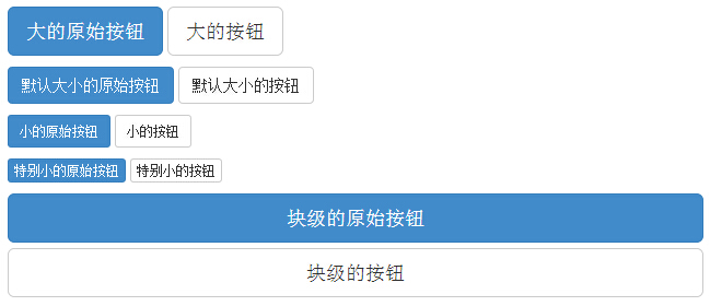
The following table lists the classes for obtaining buttons of various sizes:
| Class | Description |
|---|
| .btn-lg | This will make the button look larger. |
| .btn-sm | This will make the button look smaller. |
| .btn-xs | This will make the button look extra small. |
| .btn-block | This creates a block-level button that spans the full width of the parent element. |
The following example demonstrates all the button classes above:
Example
<p>
<button type="button" class="btn btn-primary btn-lg">Large primary button</button>
<button type="button" class="btn btn-default btn-lg">Large button</button>
</p>
<p>
<button type="button" class="btn btn-primary">Default-size primary button</button>
<button type="button" class="btn btn-default">Default-size button</button>
</p>
<p>
<button type="button" class="btn btn-primary btn-sm">Small primary button</button>
<button type="button" class="btn btn-default btn-sm">Small button</button>
</p>
<p>
<button type="button" class="btn btn-primary btn-xs">Extra small primary button</button>
<button type="button" class="btn btn-default btn-xs">Extra small button</button>
</p>
<p>
<button type="button" class="btn btn-primary btn-lg btn-block">Block-level primary button</button>
<button type="button" class="btn btn-default btn-lg btn-block">Block-level button</button>
</p>
Try it »
The result is as follows:
Bootstrap provides classes for button states such as active and disabled, which will be explained in detail below.
Active State
When a button is active, it will appear pressed (darker background, darker border, and shadow).
The following table lists the classes that make button elements and anchor elements appear active:
| Element | Class |
|---|
| Button element | Add.activeclass to show it is active. |
| Anchor element | Add .activeclass to the <a> button to show it is active. |
The following example demonstrates this:
Example
<p>
<button type="button" class="btn btn-default btn-lg ">Default button</button>
<button type="button" class="btn btn-default btn-lg active">Active button</button>
</p>
<p>
<button type="button" class="btn btn-primary btn-lg ">Primary button</button>
<button type="button" class="btn btn-primary btn-lg active">Active primary button</button>
</p>
Try it yourself »
The result is as follows:
Disabled State
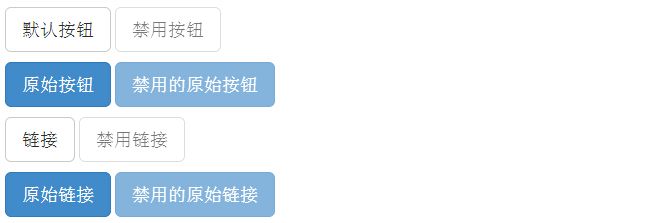
When you disable a button, its color fades by 50% and it loses its gradient.
The following table lists the classes that make button elements and anchor elements appear disabled:
| Element | Class |
|---|
| Button element | Adddisabled attributeto the <button> button. |
| Anchor element | Adddisabled classto the <a> button. |
The following example demonstrates this:
Example
<p>
<button type="button" class="btn btn-default btn-lg">Default button</button>
<button type="button" class="btn btn-default btn-lg" disabled="disabled">Disabled button</button>
</p>
<p>
<button type="button" class="btn btn-primary btn-lg ">Primary button</button>
<button type="button" class="btn btn-primary btn-lg" disabled="disabled">Disabled primary button</button>
</p>
<p>
<a href="#" class="btn btn-default btn-lg" role="button">Link</a>
<a href="#" class="btn btn-default btn-lg disabled" role="button">Disabled link</a>
</p>
<p>
<a href="#" class="btn btn-primary btn-lg" role="button">Primary link</a>
<a href="#" class="btn btn-primary btn-lg disabled" role="button">Disabled primary link</a>
</p>
Try it yourself »
The result is as follows:
You can use the button classes on <a>, <button>, or <input> elements. However, it is recommended that you use the button classes on <button> elements to avoid cross-browser inconsistencies.
The following example demonstrates this:
Example
<a class="btn btn-default" href="#" role="button">Link</a>
<button class="btn btn-default" type="submit">Button</button>
<input class="btn btn-default" type="button" value="Input">
<input class="btn btn-default" type="submit" value="Submit">
Try it yourself »
The result is as follows:
Button Groups
Use .btn-group directly within a div to create a button group:
Example
<div class="btn-group">
<button type="button" class="btn btn-primary">Apple</button>
<button type="button" class="btn btn-primary">Samsung</button>
<button type="button" class="btn btn-primary">Sony</button>
</div>
Try it yourself »
Use .btn-group-lg|sm|xs to control the size of the button group:
Example
<div class="btn-group btn-group-lg">
<button type="button" class="btn btn-primary">Apple</button>
<button type="button" class="btn btn-primary">Samsung</button>
<button type="button" class="btn btn-primary">Sony</button>
</div>
Try it yourself »
To create vertically stacked buttons, use the .btn-group-vertical class:
Example
<div class="btn-group-vertical">
<button type="button" class="btn btn-primary">Apple</button>
<button type="button" class="btn btn-primary">Samsung</button>
<button type="button" class="btn btn-primary">Sony</button>
</div>
Try it yourself »
Responsive Button Groups
You can create justified button groups with the .btn-group-justified class.
The following example uses an a tag to demonstrate:
Example
<div class="btn-group btn-group-justified">
<a href="#" class="btn btn-primary">Apple</a>
<a href="#" class="btn btn-primary">Samsung</a>
<a href="#" class="btn btn-primary">Sony</a>
</div>
Try it yourself »
Note:If it is<button>element, you need to use on the outer layer.btn-groupclass to wrap:
Example
<div class="btn-group btn-group-justified">
<div class="btn-group">
<button type="button" class="btn btn-primary">Apple</button>
</div>
<div class="btn-group">
<button type="button" class="btn btn-primary">Samsung</button>
</div>
<div class="btn-group">
<button type="button" class="btn btn-primary">Sony</button>
</div>
</div>
Try it yourself »
Button Groups with Dropdown Menus
Buttons within a button group can have dropdown menus, as in the following example:
Example
<div class="btn-group">
<button type="button" class="btn btn-primary">Apple</button>
<button type="button" class="btn btn-primary">Samsung</button>
<div class="btn-group">
<button type="button" class="btn btn-primary dropdown-toggle" data-toggle="dropdown">
Sony <span class="caret"></span></button>
<ul class="dropdown-menu" role="menu">
<li><a href="#">Tablet</a></li>
<li><a href="#">Smartphone</a></li>
</ul>
</div>
</div>
Try it yourself »
Split Buttons
Example
<div class="btn-group">
<button type="button" class="btn btn-primary">Sony</button>
<button type="button" class="btn btn-primary dropdown-toggle" data-toggle="dropdown">
<span class="caret"></span>
</button>
<ul class="dropdown-menu" role="menu">
<li><a href="#">Tablet</a></li>
<li><a href="#">Smartphone</a></li>
</ul>
</div>
Try it yourself »
Other extensions