Bootstrap Forms
In this chapter, we will learn how to use Bootstrap to create forms. Bootstrap can create forms of different styles through some simple HTML tags and extended classes.
Bootstrap provides the following types of form layouts:
- Vertical form (default)
- Inline form
- Horizontal form
Vertical or Basic Form
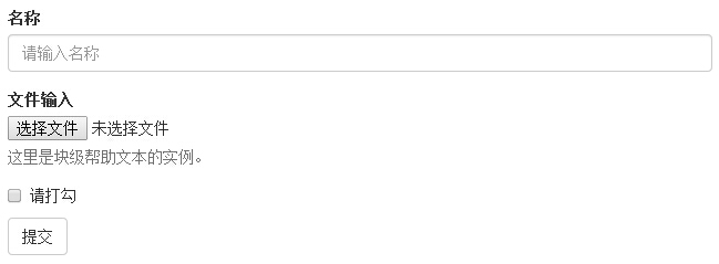
The basic form structure is built into Bootstrap, and individual form controls automatically receive some global styles. The steps to create a basic form are listed below:
- Add to the parent <form> elementrole="form"。
- Put labels and controls in a div with class.form-groupin a <div>. This is necessary for optimal spacing.
- Add class = to all text elements <input>, <textarea>, and <select>form-control" 。
Example
<form role="form">
<div class="form-group">
<label for="name">Name</label>
<input type="text" class="form-control" id="name" placeholder="Please enter your name">
</div>
<div class="form-group">
<label for="inputfile">File input</label>
<input type="file" id="inputfile">
<p class="help-block">Here is an example of block-level help text.</p>
</div>
<div class="checkbox">
<label>
<input type="checkbox">Please check</label>
</div>
<button type="submit" class="btn btn-default">Submit</button>
</form>
Try it »
The result is as follows:
Inline Form
If you need to create a form where all elements are inline, left-aligned, and labels are side by side, add the class to the <form> tag.form-inline。
Example
<form class="form-inline" role="form">
<div class="form-group">
<label class="sr-only" for="name">Name</label>
<input type="text" class="form-control" id="name" placeholder="Please enter your name">
</div>
<div class="form-group">
<label class="sr-only" for="inputfile">File input</label>
<input type="file" id="inputfile">
</div>
<div class="checkbox">
<label>
<input type="checkbox">Please check</label>
</div>
<button type="submit" class="btn btn-default">Submit</button>
</form>
Try it »
The result is as follows:
- By default, input, select, and textarea in Bootstrap have 100% width. When using inline forms, you need to set a width on the form controls.
- Using the class.sr-only, you can hide the labels of the inline form.
Horizontal Form
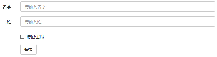
Horizontal forms differ from other forms not only in the amount of markup, but also in the way the form is presented. To create a horizontally laid-out form, follow the steps below:
- Add the class to the parent <form> element.form-horizontal。
- Put labels and controls in a div with class.form-groupin a <div>.
- Add the class to the label.control-label。
Example
<form class="form-horizontal" role="form">
<div class="form-group">
<label for="firstname" class="col-sm-2 control-label">First Name</label>
<div class="col-sm-10">
<input type="text" class="form-control" id="firstname" placeholder="Please enter your first name">
</div>
</div>
<div class="form-group">
<label for="lastname" class="col-sm-2 control-label">Surname</label>
<div class="col-sm-10">
<input type="text" class="form-control" id="lastname" placeholder="Please enter your last name">
</div>
</div>
<div class="form-group">
<div class="col-sm-offset-2 col-sm-10">
<div class="checkbox">
<label>
<input type="checkbox">Remember me</label>
</div>
</div>
</div>
<div class="form-group">
<div class="col-sm-offset-2 col-sm-10">
<button type="submit" class="btn btn-default">Login</button>
</div>
</div>
</form>
Try it »
The result is as follows:
Bootstrap supports the most common form controls, mainlyinput, textarea, checkbox, radio, and select。
Input
The most common form text field is the input. Users can enter most of the necessary form data in it. Bootstrap provides support for all native HTML5 input types, including:text、password、datetime、datetime-local、date、month、time、week、number、email、url、search、telandcolor. PropertypeA declaration is required so thatinputfull styles are obtained.
Example
<form role="form">
<div class="form-group">
<label for="name">Labels</label>
<input type="text" class="form-control" placeholder="Text input">
</div>
</form>
Try it yourself »
The result is as follows:
Textarea
When you need multi-line input, you can use the textarea. You can change therowsattribute when necessary (fewer rows = smaller box, more rows = larger box).
Example
<form role="form">
<div class="form-group">
<label for="name">Textarea</label>
<textarea class="form-control" rows="3"></textarea>
</div>
</form>
Try it yourself »
The result is as follows:
Checkbox and Radio
Checkboxes and radio buttons are used to let users choose from a set of preset options.
- When creating a form, if you want users to choose several options from a list, usecheckbox. If you restrict users to selecting only one option, useradio。
- For a series of checkboxes and radio buttons, use the.checkbox-inlineor.radio-inlineclass to keep them displayed on the same line.
The following example demonstrates both types (default and inline):
Example
<label for="name">Example of default checkboxes and radio buttons</label>
<div class="checkbox">
<label><input type="checkbox" value="">Option 1</label>
</div>
<div class="checkbox">
<label><input type="checkbox" value="">Option 2</label>
</div>
<div class="radio">
<label>
<input type="radio" name="optionsRadios" id="optionsRadios1" value="option1" checked>Option 1</label>
</div>
<div class="radio">
<label>
<input type="radio" name="optionsRadios" id="optionsRadios2" value="option2">Option 2 - Selecting it will deselect option 1</label>
</div>
<label for="name">Example of inline checkboxes and radio buttons</label>
<div>
<label class="checkbox-inline">
<input type="checkbox" id="inlineCheckbox1" value="option1">Option 1</label>
<label class="checkbox-inline">
<input type="checkbox" id="inlineCheckbox2" value="option2">Option 2</label>
<label class="checkbox-inline">
<input type="checkbox" id="inlineCheckbox3" value="option3">Option 3</label>
<label class="radio-inline">
<input type="radio" name="optionsRadiosinline" id="optionsRadios3" value="option1" checked>Option 1</label>
<label class="radio-inline">
<input type="radio" name="optionsRadiosinline" id="optionsRadios4" value="option2">Option 2</label>
</div>
Try it yourself »
The result is as follows:
Select
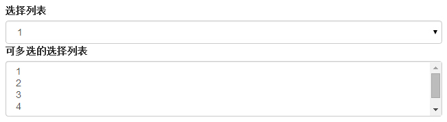
When you want users to choose from multiple options, but only one option can be selected by default, use a select box.
- Use <select> to display a list of options, usually lists that users are familiar with, such as states or numbers.
- Usemultiple="multiple"to allow users to select multiple options.
The following example demonstrates both types (select and multiple):
Example
<form role="form">
<div class="form-group">
<label for="name">Select list</label>
<select class="form-control">
<option>1</option>
<option>2</option>
<option>3</option>
<option>4</option>
<option>5</option>
</select>
<label for="name">Select list with multiple choices</label>
<select multiple class="form-control">
<option>1</option>
<option>2</option>
<option>3</option>
<option>4</option>
<option>5</option>
</select>
</div>
</form>
Try it yourself »
The result is as follows:
When you need to place plain text after a form label within a horizontal form, use the class on a <p>.form-control-static。
Example
<form class="form-horizontal" role="form">
<div class="form-group">
<label class="col-sm-2 control-label">Email</label>
<div class="col-sm-10">
<p class="form-control-static">email@example.com</p>
</div>
</div>
<div class="form-group">
<label for="inputPassword" class="col-sm-2 control-label">Password</label>
<div class="col-sm-10">
<input type="password" class="form-control" id="inputPassword" placeholder="Please enter password">
</div>
</div>
</form>
Try it yourself »
The result is as follows:
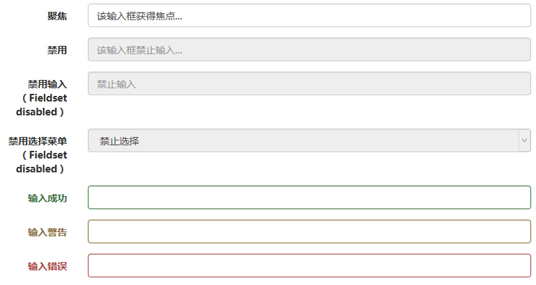
In addition to the:focusstate (i.e., when the user clicks the input or uses the Tab key to focus on the input), Bootstrap also defines styles for disabled inputs and provides form validation classes.
Input Focus
When the input receives:focus, the outline of the input is removed and abox-shadow。
Disabled input
If you want to disable an input, simply add thedisabledattribute, which not only disables the input but also changes its style and the mouse cursor style when the pointer hovers over the element.
Disabled fieldset
Add the disabled attribute to <fieldset> to disable all controls within the <fieldset>.
Validation States
Bootstrap includes validation styles for error, warning, and success messages. Simply add the appropriate class to the parent element (.has-warning, .has-error, or .has-success) to use the validation states.
The following example demonstrates all control states:
Example
<form class="form-horizontal" role="form">
<div class="form-group">
<label class="col-sm-2 control-label">Focus</label>
<div class="col-sm-10">
<input class="form-control" id="focusedInput" type="text" value="This input gains focus...">
</div>
</div>
<div class="form-group">
<label for="inputPassword" class="col-sm-2 control-label">Disabled</label>
<div class="col-sm-10">
<input class="form-control" id="disabledInput" type="text" placeholder="This input is not editable..." disabled>
</div>
</div>
<fieldset disabled>
<div class="form-group">
<label for="disabledTextInput" class="col-sm-2 control-label">Disabled input (Fieldset disabled)</label>
<div class="col-sm-10">
<input type="text" id="disabledTextInput" class="form-control" placeholder="Not editable">
</div>
</div>
<div class="form-group">
<label for="disabledSelect" class="col-sm-2 control-label">Disabled select menu (Fieldset disabled)</label>
<div class="col-sm-10">
<select id="disabledSelect" class="form-control">
<option>Not selectable</option>
</select>
</div>
</div>
</fieldset>
<div class="form-group has-success">
<label class="col-sm-2 control-label" for="inputSuccess">Input success</label>
<div class="col-sm-10">
<input type="text" class="form-control" id="inputSuccess">
</div>
</div>
<div class="form-group has-warning">
<label class="col-sm-2 control-label" for="inputWarning">Input warning</label>
<div class="col-sm-10">
<input type="text" class="form-control" id="inputWarning">
</div>
</div>
<div class="form-group has-error">
<label class="col-sm-2 control-label" for="inputError">Input error</label>
<div class="col-sm-10">
<input type="text" class="form-control" id="inputError">
</div>
</div>
</form>
Try it Yourself »
The results are as follows:
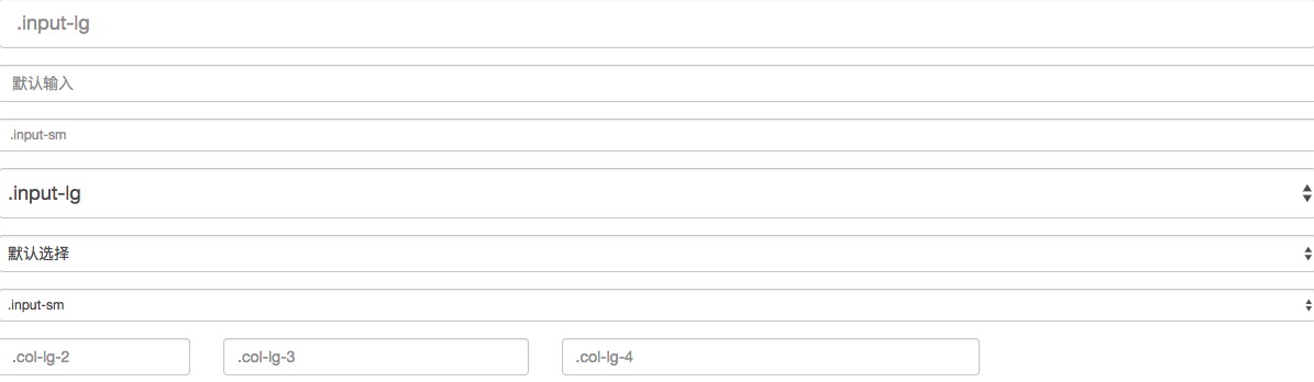
You can use the class.input-lgand.col-lg-*to set the height and width of the form. The following example demonstrates this:
Example
<form role="form">
<div class="form-group">
<input class="form-control input-lg" type="text" placeholder=".input-lg">
</div>
<div class="form-group">
<input class="form-control" type="text" placeholder="Default input">
</div>
<div class="form-group">
<input class="form-control input-sm" type="text" placeholder=".input-sm">
</div>
<div class="form-group"></div>
<div class="form-group">
<select class="form-control input-lg">
<option value="">.input-lg</option>
</select>
</div>
<div class="form-group">
<select class="form-control">
<option value="">Default selection</option>
</select>
</div>
<div class="form-group">
<select class="form-control input-sm">
<option value="">.input-sm</option>
</select>
</div>
<div class="row">
<div class="col-lg-2">
<input type="text" class="form-control" placeholder=".col-lg-2">
</div>
<div class="col-lg-3">
<input type="text" class="form-control" placeholder=".col-lg-3">
</div>
<div class="col-lg-4">
<input type="text" class="form-control" placeholder=".col-lg-4">
</div>
</div>
</form>
Try it Yourself »
The results are as follows:
Bootstrap form controls can have a block-level help text on the input element. To add a content block that occupies the full width, use it after <input>.help-block. The following example demonstrates this:
Example
<form role="form">
<span>Help text example</span>
<input class="form-control" type="text" placeholder="">
<span class="help-block">A longer block of help text that exceeds one line and needs to extend to the next line. The help text in this example has a total of two lines.</span>
</form>
Try it Yourself »
The results are as follows:
Other extensions