Bootstrap Modal Plugin
A modal is a child window that overlays the parent window. Typically, the purpose is to display content from a separate source, allowing some interaction without leaving the parent window. Child windows can provide information, interaction, etc.
If you want to reference this plugin's functionality separately, then you need to referencemodal.js. Or, asBootstrap Plugins Overviewmentioned in the chapter, you can referencebootstrap.jsor the compressed version ofbootstrap.min.js。
Usage
You can toggle the hidden content of the Modal plugin:
- Via data attributes: Set attributes on a controller element (such as a button or link)data-toggle="modal", and setdata-target="#identifier"orhref="../index.html"to specify the particular modal to toggle (with id="identifier").
- Via JavaScript: Using this technique, you can invoke a modal with id="identifier" with a simple one line of JavaScript:
$('#identifier').modal(options)
Example
A static modal window example, as shown in the example below:
Example
Try it »
The result is as follows:
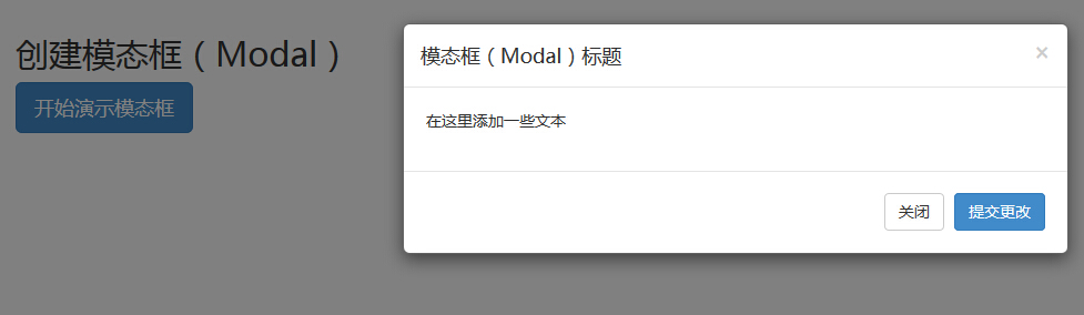
Code explanation:
- To use a modal window, you need some kind of trigger. You can use a button or a link. Here we use a button.
- If you look carefully at the code above, you will find in the <button> tag,data-target="#myModal"is the target of the modal you want to load on the page. You can create multiple modals on the page, and then create different triggers for each modal. Now, obviously, you cannot load multiple modals at the same time, but you can create multiple on the page to load at different times.
- There are two things to note in the modal:
- First is.modal, used to identify the content of the <div> as a modal.
- Second is.fadeclass. When the modal is toggled, it causes the content to fade in and out.
- aria-labelledby="myModalLabel", this attribute references the title of the modal.
- Attributearia-hidden="true"is used to keep the modal window invisible until the trigger is activated (for example, clicking on the relevant button).
- <div class="modal-header">, modal-header is a class that defines styles for the header of the modal window.
- class="close", close is a CSS class used to style the close button of the modal window.
- data-dismiss="modal", is a custom HTML5 data attribute. Here it is used to close the modal window.
- class="modal-body", is a CSS class in Bootstrap CSS, used to style the body of the modal window.
- class="modal-footer", is a CSS class in Bootstrap CSS, used to style the footer of the modal window.
- data-toggle="modal", HTML5 custom data attribute data-toggle is used to open the modal window.
Options
There are some options that can be used to customize the look and feel of the modal window. They are passed via data attributes or JavaScript. The following table lists these options:
| Option Name | Type/Default Value | Data Attribute Name | Description |
|---|---|---|---|
| backdrop | boolean or string 'static' Default value: true | data-backdrop | Specifies a static backdrop; when the user clicks outside the modal, the modal will not close. |
| keyboard | boolean Default value: true | data-keyboard | Closes the modal when the Escape key is pressed. If set to false, the key has no effect. |
| show | boolean Default value: true | data-show | Shows the modal when initialized. |
| remote | path Default value: false | data-remote | Using jQuery.loadmethod, injects content into the modal body. If an href with a valid URL is added, the content will be loaded from it. As shown in the example below:<a data-toggle="modal" href="remote.html" data-target="#modal" rel="noopener noreferrer">请点击我</a> |
Methods
Below are some useful methods that can be used with modal().
| Method | Description | Example |
|---|---|---|
| Options: .modal(options) | Activates the content as a modal. Accepts an optional options object. |
$('#identifier').modal({
keyboard: false
})
|
| Toggle: .modal('toggle') | Manually toggles the modal. |
$('#identifier').modal('toggle')
|
| Show: .modal('show') | Manually opens the modal. |
$('#identifier').modal('show')
|
| Hide: .modal('hide') | Manually hides the modal. |
$('#identifier').modal('hide')
|
Example
The following example demonstrates the usage of the methods:
Example
Try it yourself »
The result is as follows:
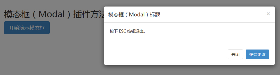
Just press the ESC key, and the modal window will exit.
Events
The following table lists the events used in the modal. These events can be used as hooks in functions.
| Event | Description | Example |
|---|---|---|
| show.bs.modal | Triggered after the show method is called. |
$('#identifier').on('show.bs.modal', function () {
  // 执行一些动作...
})
|
| shown.bs.modal | Triggered when the modal is visible to the user (will wait for CSS transitions to complete). |
$('#identifier').on('shown.bs.modal', function () {
  // 执行一些动作...
})
|
| hide.bs.modal | Triggered when the hide instance method is called. |
$('#identifier').on('hide.bs.modal', function () {
  // 执行一些动作...
})
|
| hidden.bs.modal | Triggered when the modal is completely hidden from the user. |
$('#identifier').on('hidden.bs.modal', function () {
  // 执行一些动作...
})
|
Example
The following example demonstrates the usage of the events:
Example
Try it yourself »
The result is as follows:
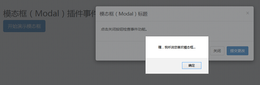
As shown in the example above, if you click theClosebutton, that is, thehideevent, an alert message will be displayed.
Other extensions