Bootstrap Popover Plugin
The Popover plugin is similar to the Tooltip; it provides an expanded view. To activate a popover, the user only needs to hover the mouse over the element. The content of the popover can be populated entirely using the Bootstrap Data API. This method depends on the tooltip plugin.
If you want to include the functionality of this plugin separately, you need to referencepopover.js, which depends onthe Tooltip plugin. Or, asthe Bootstrap Plugins Overviewchapter mentions, you can referencebootstrap.jsor the minified version ofbootstrap.min.js。
Usage
The Popover plugin generates content and markup on demand. By default, the popover is placed after its trigger element. You can add a popover in the following two ways:
- Via data attributes: To add a popover, just adddata-toggle="popover"to an anchor/button tag. The anchor's title is the text of the popover. By default, the plugin places the popover at the top.
<a href="../index.html" data-toggle="popover" title="Example popover">
    请悬停在我的上面
</a>
- Via JavaScript:Enable popovers via JavaScript:
$('#identifier').popover(options)
The Popover plugin is not a pure CSS plugin, unlike the dropdowns and other plugins discussed earlier. To use this plugin, you must activate it with jQuery (read JavaScript). Use the following script to enable all popovers in the page:
$(function () { $("[data-toggle='popover']").popover(); });
Example
The following example demonstrates the use of the Popover plugin via the data attribute.
Example
Try it »
The result is shown below:

Options
There are some options added via the Bootstrap Data API or invoked via JavaScript. The following table lists these options:
| Option Name | Type/Default Value | Data Attribute Name | Description |
|---|---|---|---|
| animation | boolean Default value: true | data-animation | Apply a CSS fade transition to the popover. |
| html | boolean Default value: false | data-html | Insert HTML into the popover. If false, jQuery's text method will be used to insert content into the DOM. If you are concerned about XSS attacks, use text. |
| placement | string|function Default value: top | data-placement | Specifies how to position the popover (i.e., top|bottom|left|right|auto). When set toauto, the popover will be dynamically adjusted. For example, if placement is "auto left", the popover will be displayed as far left as possible, and only show on the right if circumstances do not allow. |
| selector | string Default value: false | data-selector | If a selector is provided, popover objects will be delegated to the specified targets. |
| title | string | function Default value: '' | data-title | If thetitleattribute is not specified, then the title option is the default title value. |
| trigger | string Default value: 'hover focus' | data-trigger | Defines how the popover is triggered: click| hover | focus | manualYou can pass multiple triggers, separated by spaces. |
| delay | number | object Default value: 0 | data-delay | Number of milliseconds to delay showing and hiding the popover - not applicable to the manual trigger type. If a number is provided, the delay will be applied to both show and hide. If an object is provided, the structure is as follows:
delay:
{ show: 500, hide: 100 } |
| container | string | false Default value: false | data-container | Append a popover to the specified element. Example: container: 'body' |
Methods
Below are some useful methods in the Popover plugin:
| Method | Description | Example |
|---|---|---|
| Options: .popover(options) | Attach a popover handle to a collection of elements. |
$().popover(options) |
| Toggle: .popover('toggle') | Toggle show/hide the popover of an element. |
$('#element').popover('toggle')
|
| Show: .popover('show') | Show the popover of an element. |
$('#element').popover('show')
|
| Hide: .popover('hide') | Hide the popover of an element. |
$('#element').popover('hide')
|
| Destroy: .popover('destroy') | Hide and destroy the popover of an element. |
$('#element').popover('destroy')
|
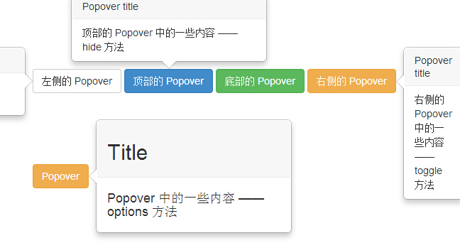
Example
The following example demonstrates the methods of the Popover plugin:
Example
Try it »
The result is as follows:
Events
The following table lists the events used in the Popover plugin. These events can be used as hooks in functions.
| Event | Description | Example |
|---|---|---|
| show.bs.popover | This event is triggered immediately when the show instance method is called. |
$('#mypopover').on('show.bs.popover', function () {
  // 执行一些动作...
})
|
| shown.bs.popover | This event is triggered when the popover is visible to the user (it will wait for the CSS transition to complete). |
$('#mypopover').on('shown.bs.popover', function () {
  // 执行一些动作...
})
|
| hide.bs.popover | This event is triggered immediately when the hide instance method is called. |
$('#mypopover').on('hide.bs.popover', function () {
  // 执行一些动作...
})
|
| hidden.bs.popover | This event is triggered when the popover is hidden from the user (it will wait for the CSS transition to complete). |
$('#mypopover').on('hidden.bs.popover', function () {
  // 执行一些动作...
})
|
Example
The following example demonstrates the events of the Popover plugin:
Example
Try it »
The result is as follows:
