BootstrapMedia Objects
In this chapter, we will discuss media objects in Bootstrap. These abstract object styles are used to build various component types (such as blog comments). We can use a mix of text and images in components, and the images can be left-aligned or right-aligned. Media objects allow you to mix media objects with text using less code.
You can add the following two forms in HTML tags to set up media objects:
- .media: This class allows the media (images, videos) in a media object to float to the left or right of the content block.
- .media-list: If you need a list where each item is part of an unordered list, you can use this class. It can be used for comment lists and article lists.
Below, let's look at an example using the .media class for media objects:
<div class="media">
   <a class="pull-left" href="../index.html">
      <img class="media-object" src="../bootstrap/images/64.jpg.html"
      alt="Media Object">
   </a>
   <div class="media-body">
      <h4 class="media-heading">Media heading</h4>
      This is some sample text. This is some sample text.
      This is some sample text. This is some sample text.
      This is some sample text. This is some sample text.
      This is some sample text. This is some sample text.
   </div>
</div>
<div class="media">
   <a class="pull-left" href="../index.html">
      <img class="media-object" src="../bootstrap/images/64.jpg.html"
      alt="Media Object">
   </a>
   <div class="media-body">
      <h4 class="media-heading">Media heading</h4>
      This is some sample text. This is some sample text.
      This is some sample text. This is some sample text.
      This is some sample text. This is some sample text.
      This is some sample text. This is some sample text.
      <div class="media">
         <a class="pull-left" href="../index.html">
            <img class="media-object" src="../bootstrap/images/64.jpg.html"
            alt="Media Object">
         </a>
         <div class="media-body">
            <h4 class="media-heading">Media heading</h4>
            This is some sample text. This is some sample text.
            This is some sample text. This is some sample text.
            This is some sample text. This is some sample text.
            This is some sample text. This is some sample text.
         </div>
      </div>
   </div>
</div>
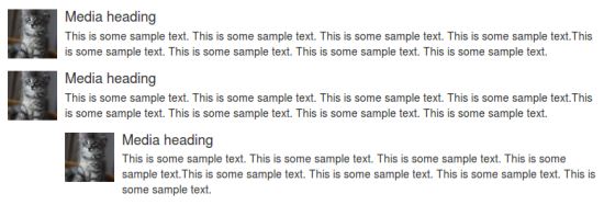
The effect of the above example is shown below:
Below, let's look at an example using the .media-list class for media objects:
<ul class="media-list">
   <li class="media">
      <a class="pull-left" href="../index.html">
         <img class="media-object" src="../bootstrap/images/64.jpg.html"
         alt="Generic placeholder image">
      </a>
      <div class="media-body">
         <h4 class="media-heading">Media heading</h4>
         <p>This is some sample text. This is some sample text.
            This is some sample text. This is some sample text.
            This is some sample text. This is some sample text.
            This is some sample text. This is some sample text.</p>
         <!-- Nested media object -->
         <div class="media">
            <a class="pull-left" href="../index.html">
               <img class="media-object" src="../bootstrap/images/64.jpg.html"
               alt="Generic placeholder image">
            </a>
            <div class="media-body">
               <h4 class="media-heading">Nested media heading</h4>
               This is some sample text. This is some sample text.
               This is some sample text. This is some sample text.
               This is some sample text. This is some sample text.
               This is some sample text. This is some sample text.
               <!-- Nested media object -->
               <div class="media">
                  <a class="pull-left" href="../index.html">
                     <img class="media-object" src="../bootstrap/images/64.jpg.html"
                     alt="Generic placeholder image">
                  </a>
                  <div class="media-body">
                     <h4 class="media-heading">Nested media heading</h4>
                     This is some sample text. This is some sample text.
                     This is some sample text. This is some sample text.
                     This is some sample text. This is some sample text.
                     This is some sample text. This is some sample text.
                  </div>
               </div>
            </div>
         </div>
         <!-- Nested media object -->
         <div class="media">
            <a class="pull-left" href="../index.html">
               <img class="media-object" src="../bootstrap/images/64.jpg.html"
               alt="Generic placeholder image">
            </a>
            <div class="media-body">
               <h4 class="media-heading">Nested media heading</h4>
               This is some sample text. This is some sample text.
               This is some sample text. This is some sample text.
               This is some sample text. This is some sample text.
               This is some sample text. This is some sample text.
            </div>
         </div>
      </div>
   </li>
   <li class="media">
      <a class="pull-right" href="../index.html">
         <img class="media-object" src="../bootstrap/images/64.jpg.html"
         alt="Generic placeholder image">
      </a>
      <div class="media-body">
         <h4 class="media-heading">Media heading</h4>
         This is some sample text. This is some sample text.
         This is some sample text. This is some sample text.
         This is some sample text. This is some sample text.
         This is some sample text. This is some sample text.
      </div>
   </li>
</ul>
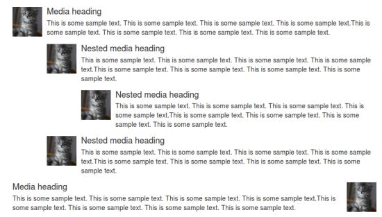
The effect of the above example is shown below: