Bootstrap Images
Objectives
In this tutorial, we will discuss three Bootstrap 3 classes to style images. We will also discuss what Bootstrap 3 provides for responsive images.
General Styles
Before we discuss the special classes that Bootstrap 3 provides for styling images, we will look at the general styles that Bootstrap 3 provides for defining images.
img {
  border: 0;
}
This is the first CSS rule for images found in Bootstrap 3's CSS, used to remove borders when images are rendered.
Then, within the print media query, these rules are specified.
 img {
    page-break-inside: avoid;
  }
  img {
    max-width: 100% !important;
  }
page-break-inside: avoid;Avoid page breaks inside images.
max-width: 100% !important;The styles defined for images are obvious. Here it is used to ensure that even if the image width exceeds the container, it can be constrained to display within the container. It is combined with!importantused together to override any other styles that break this style. Sometimes, developers want styles to better support the friendly presentation of images on mobile devices, so they will specifically use these two rules.
Here is another rule for images
img {
  vertical-align: middle;
}
Because of this rule, an image will be vertically centered within a div or other element. As shown in the example below.
Example
<html>
<head>
<title>Bootstrap 3 Rendering Image Example</title>
<meta name="viewport" content="width=device-width, initial-scale=1.0">
<!-- Bootstrap -->
<link href="dist/css/bootstrap.min.css.html" rel="stylesheet" media="screen">
<style>
body {
padding: 50px
}
.mdl {
background-color: silver;
padding: 7px
}
</style>
<!-- HTML5 Shim and Respond.js IE8 support of HTML5 elements and media queries -->
<!-- WARNING: Respond.js doesn't work if you view the page via file:// -->
<!--[if lt IE 9]>
<script src="https://oss.maxcdn.com/libs/html5shiv/3.7.0/html5shiv.js"></script>
<script src="https://oss.maxcdn.com/libs/respond.js/1.3.0/respond.min.js"></script>
<![endif]-->
</head>
<body>
<p class="mdl"><img src="icon-default-screenshot.png.html">Lorem ipsum dolor sit amet, consectetuer adipiscing elit, sed diam nonummy nibh euismod tincidunt ut laoreet dolore magna aliquam erat volutpat.</p>
<!-- jQuery (necessary for Bootstrap's JavaScript plugins) -->
<script src="https://code.jquery.com/jquery.js"></script>
<!-- Include all compiled plugins (below), or include individual files as needed -->
<script src="dist/js/bootstrap.min.js.html"></script>
</body>
</html>
Click here to view the demo online
Please note that if you need to vertically center images depending on the context, you will need additional styles.
Special Styles
Bootstrap 3 provides three classes for rendering images with specific styles.
img-rounded
You can use this class to render images with rounded corners. To achieve this, Bootstrap providesimg-roundedclass. The styles for this class are defined as follows
.img-rounded {
  border-radius: 6px;
}
Therefore, it sets theborder-radiusproperty to a value of 6 pixels to define the rounded corners of the corresponding image. The example below demonstrates two identical images, the first withoutimg-roundedclass, and the second withimg-roundedclass. Please note that the second image is rounded. You canClick here to view the example online。

Example
<html>
<head>
<title>Bootstrap 3 Example of Rendering Images with Rounded Corners</title>
<meta name="viewport" content="width=device-width, initial-scale=1.0">
<!-- Bootstrap -->
<link href="dist/css/bootstrap.min.css.html" rel="stylesheet" media="screen">
<style>
body {
padding: 50px
}
</style>
<!-- HTML5 Shim and Respond.js IE8 support of HTML5 elements and media queries -->
<!-- WARNING: Respond.js doesn't work if you view the page via file:// -->
<!--[if lt IE 9]>
<script src="https://oss.maxcdn.com/libs/html5shiv/3.7.0/html5shiv.js"></script>
<script src="https://oss.maxcdn.com/libs/respond.js/1.3.0/respond.min.js"></script>
<![endif]-->
</head>
<body>
<img src="rounded-corner-images.png.html" alt="image with rounded corners">
<img src="rounded-corner-images.png.html" alt="image with rounded corners" class="img-rounded">
<!-- jQuery (necessary for Bootstrap's JavaScript plugins) -->
<script src="https://code.jquery.com/jquery.js"></script>
<!-- Include all compiled plugins (below), or include individual files as needed -->
<script src="dist/js/bootstrap.min.js.html"></script>
</body>
</html>
img-thumbnail
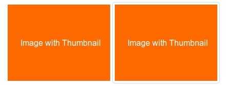
This is another Bootstrap 3 CSS class that adds a thumbnail to an image. The code for this class is shown below
.img-thumbnail {
  display: inline-block;
  height: auto;
  max-width: 100%;
  padding: 4px;
  line-height: 1.428571429;
  background-color: #FFFFFF;
  border: 1px solid #DDDDDD;
  border-radius: 4px;
  -webkit-transition: all 0.2s ease-in-out;
          transition: all 0.2s ease-in-out;
}
Below is an example using this class. You canClick here to view the online demo。
Example
<html>
<head>
<title>Bootstrap 3 Thumbnails</title>
<meta name="viewport" content="width=device-width, initial-scale=1.0">
<!-- Bootstrap -->
<link href="dist/css/bootstrap.min.css.html" rel="stylesheet" media="screen">
<style>
body {
padding: 50px
}
</style>
<!-- HTML5 Shim and Respond.js IE8 support of HTML5 elements and media queries -->
<!-- WARNING: Respond. If you view the page via file://, the js will not work. -->
<!--[if lt IE 9]>
<script src="https://oss.maxcdn.com/libs/html5shiv/3.7.0/html5shiv.js"></script>
<script src="https://oss.maxcdn.com/libs/respond.js/1.3.0/respond.min.js"></script>
<![endif]-->
</head>
<body>
<img src="image-with-thumbnail.png.html" alt="image without thumbnail corners">
<img src="image-with-thumbnail.png.html" alt="image with thumbnail corners" class="img-thumbnail">
<!-- jQuery (necessary for Bootstrap's JavaScript plugins) -->
<script src="https://code.jquery.com/jquery.js"></script>
<!-- Include all compiled plugins (below), or include individual files as needed -->
<script src="dist/js/bootstrap.min.js.html"></script>
</body>
</html>
img-circle
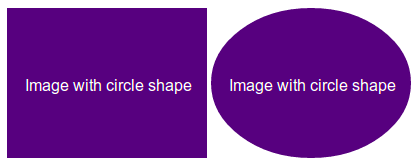
By using the border-radius property, Bootstrap 3 creates an image that is displayed in a circular shape.img-circleThe CSS code for the class is as follows:
.img-circle {
  border-radius: 50%;
}
Click here to view the example online.. Below are the screenshot and the code.
Example
<html>
<head>
<title>Bootstrap 3 Circle Image</title>
<meta name="viewport" content="width=device-width, initial-scale=1.0">
<!-- Bootstrap -->
<link href="dist/css/bootstrap.min.css.html" rel="stylesheet" media="screen">
<style>
body {
padding: 50px
}
</style>
<!-- HTML5 Shim and Respond.js IE8 support for HTML5 elements and media queries. -->
<!-- WARNING: Respond. If you view the page via file://, the js will not work. -->
<!--[if lt IE 9]>
<script src="https://oss.maxcdn.com/libs/html5shiv/3.7.0/html5shiv.js"></script>
<script src="https://oss.maxcdn.com/libs/respond.js/1.3.0/respond.min.js"></script>
<![endif]-->
</head>
<body>
<img src="image-with-circle.png.html" alt="image without circle shape">
<img src="image-with-circle.png.html" alt="image with circle shape" class="img-circle">
<!-- jQuery (necessary for Bootstrap's JavaScript plugins) -->
<script src="https://code.jquery.com/jquery.js"></script>
<!-- Include all compiled plugins (below), or include individual files as needed -->
<script src="dist/js/bootstrap.min.js.html"></script>
</body>
</html>
Responsive Images
Bootstrap 3 does not provide responsive images out of the box.. You must addimg-responsiveclass to the image to make it responsive. The CSS code for this class is as follows.
.img-responsive {
  display: block;
  height: auto;
  max-width: 100%;
}
It defines that the image must be displayed as a block-level element, the height will be the same as the image height, and the maximum width is 100%, to constrain the image to render according to the device it is on.
If you want images to be responsive by default, you can add these CSS rules toimg{ }。
An example of using the class is below. You canClick here to view the demo online.。
Example
<html>
<head>
<title>Bootstrap 3 Responsive Images</title>
<meta name="viewport" content="width=device-width, initial-scale=1.0">
<!-- Bootstrap -->
<link href="dist/css/bootstrap.min.css.html" rel="stylesheet" media="screen">
<style>
body {
padding: 50px
}
img {
margin-bottom:30px
}
</style>
<!-- HTML5 Shim and Respond.js IE8 support for HTML5 elements and media queries. -->
<!-- WARNING: Respond. If you view the page via file://, the js will not work. -->
<!--[if lt IE 9]>
<script src="https://oss.maxcdn.com/libs/html5shiv/3.7.0/html5shiv.js"></script>
<script src="https://oss.maxcdn.com/libs/respond.js/1.3.0/respond.min.js"></script>
<![endif]-->
</head>
<body>
<img src="image-with-circle.png.html" alt="without responsive image feature">
<img src="image-with-circle.png.html" alt="with responsive image feature" class="img-responsive">
<!-- jQuery (necessary for Bootstrap's JavaScript plugins) -->
<script src="https://code.jquery.com/jquery.js"></script>
<!-- Include all compiled plugins (below), or include individual files as needed -->
<script src="dist/js/bootstrap.min.js.html"></script>
</body>
</html>
This method of adding responsive capabilities to images has limitations.
Respectively on large-screen devices and mobile devices (which have smaller screens, may causeperformance issues) loading the same large high-resolution image.art directionproblem.
Developers have come up with solutions to overcome these limitations. We will see aMarc GrabanskiandChristopher SchmittuseHiSRCexample. This is a jQuery plugin that automatically creates low, medium, and high-resolution versions of an image, and the version presented depends on the resolution and bandwidth of the device displaying the image.
In our laterresponsive image tutorial, we will discuss all these methods in detail.
Click here to view the demo online.. The code is as follows:
Example
<html>
<head>
<title>Bootstrap 3 Responsive Image Example Using HiSRC</title>
<meta name="viewport" content="width=device-width, initial-scale=1.0">
<!-- Bootstrap -->
<link href="dist/css/bootstrap.min.css.html" rel="stylesheet" media="screen">
<style>
body {
padding: 50px
}
img {
margin-bottom:30px
}
</style>
<!-- HTML5 Shim and Respond.js IE8 support for HTML5 elements and media queries. -->
<!-- WARNING: Respond. If you view the page via file://, the js will not work. -->
<!--[if lt IE 9]>
<script src="https://oss.maxcdn.com/libs/html5shiv/3.7.0/html5shiv.js"></script>
<script src="https://oss.maxcdn.com/libs/respond.js/1.3.0/respond.min.js"></script>
<![endif]-->
</head>
<body>
<img src="5216852563_eca0af1b0d_m.jpg.html" data-1x="5216852563_eca0af1b0d.jpg" data-2x="5216852563_90c3f9c402_o.jpg" class="hisrc" />
<!-- jQuery (necessary for Bootstrap's JavaScript plugins) -->
<script src="https://code.jquery.com/jquery.js"></script>
<!-- Include all compiled plugins (below), or include individual files as needed -->
<script src="dist/js/bootstrap.min.js.html"></script>
<script>
$(document).ready(function(){
$(".hisrc").hisrc();
});
</script>
<p>Photo courtesy: /http://www.flickr.com/photos/cubagallery/</p>
</body>
</html>