Bootstrap Buttons
Objectives
Buttons are widely used in websites or applications. In this tutorial, we will discuss how to use Bootstrap 3 buttons and how to customize default buttons through examples and example explanations.
Using Default Buttons
The following example will demonstrate how to quickly create buttons with Bootstrap 3.
Example
<html>
<head>
<title>Bootstrap 3 Default Buttons</title>
<meta name="viewport" content="width=device-width, initial-scale=1.0">
<!-- Bootstrap -->
<link href="dist/css/bootstrap.min.css.html" rel="stylesheet" media="screen">
<style>
body {
padding: 50px
}
</style>
<!-- HTML5 Shim and Respond.js IE8 support for HTML5 elements and media queries. -->
<!-- WARNING: Respond.js won't work if you view the page via file:// -->
<!--[if lt IE 9]>
<script src="https://oss.maxcdn.com/libs/html5shiv/3.7.0/html5shiv.js"></script>
<script src="https://oss.maxcdn.com/libs/respond.js/1.3.0/respond.min.js"></script>
<![endif]-->
</head>
<body>
<!-- Standard button -->
<button type="button" class="btn btn-default">Default</button>
<!-- Provides extra visual weight and identifies the primary action in a set of buttons -->
<button type="button" class="btn btn-primary">Primary</button>
<!-- Indicates a successful or positive action -->
<button type="button" class="btn btn-success">Success</button>
<!-- Contextual button for informational alert messages -->
<button type="button" class="btn btn-info">Info</button>
<!-- Indicates caution should be taken with this action -->
<button type="button" class="btn btn-warning">Warning</button>
<!-- Indicates a dangerous or potentially negative action -->
<button type="button" class="btn btn-danger">Danger</button>
<!-- De-emphasize a button by making it look like a link while maintaining button behavior -->
<button type="button" class="btn btn-link">Link</button>
<!-- jQuery (necessary for Bootstrap's JavaScript plugins) -->
<script src="https://code.jquery.com/jquery.js"></script>
<!-- Include all compiled plugins (below), or include individual files as needed -->
<script src="dist/js/bootstrap.min.js.html"></script>
</body>
</html>
The above code outputs the following. You canClick here to view the example online。

CSS
We will now explore the CSS rules used to create these buttons. The main class used to create buttons isbtn, as shown below.
.btn {
  display: inline-block;
  padding: 6px 12px;
  margin-bottom: 0;
  font-size: 14px;
  font-weight: normal;
  line-height: 1.428571429;
  text-align: center;
  white-space: nowrap;
  vertical-align: middle;
  cursor: pointer;
  background-image: none;
  border: 1px solid transparent;
  border-radius: 4px;
  -webkit-user-select: none;
     -moz-user-select: none;
      -ms-user-select: none;
       -o-user-select: none;
          user-select: none;
}
Because of the above CSS code, buttons (with the btn class) are rendered as inline-block, allowing buttons to be rendered inline with adjacent elements that share a common baseline, but you can add width and height properties to it. Its padding is 6 pixels for the top and bottom, and 12 pixels for the left and right. The bottom margin is set to 0.
The font size is set to 14 pixels, and the font weight is set to normal. The line height of a button with the btn class is 1.428571429, which is slightly higher than the default height of 1. The text is center-aligned.
The white-space property is set to nowrap, so newlines, spaces, and tabs will be collapsed. Related vertically centered elements will be positioned in the middle of the height. When you hover the mouse over the related element, the cursor will appear as a pointer shape. No background image will be displayed here.
A transparent, 1-pixel thick solid border will be rendered here. Becauseborder-radius: 4px;, the corners of the relevant buttons will be rounded. By increasing or decreasing the value by 4px, you can make the roundness of the corners larger or smaller. Sinceuser-select: none, the text of the related buttons and child elements will be unselectable. To achieve cross-browser consistency, the same property is applied with multiple vendor prefixes.
Each button shown in the above example, exceptbtnIn addition, there are other CSS classes, such as btn-default, btn-primary, etc. These classes are used to set the button'scolor、background-colorandborderAttributes. They are CSS rules for regular buttons and for buttons with link states (i.e., hover, active, focus, etc.).
btn-primaryThe code for the class is as follows
.btn-primary {
  color: #FFFFFF;
  background-color: #428BCA;
  border-color: #357EBD;
}
Different Sized Buttons
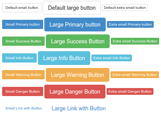
There are three sizes that can be set. To set each size, you need to add an extra class.
btn-lg for setting large button.
<button type="button" class="btn btn-primary btn-lg">Large button</button>
The CSS code for the btn-lg class is as follows
.btn-lg {
  padding: 10px 16px;
  font-size: 18px;
  line-height: 1.33;
  border-radius: 6px;
}
Usagebtn-smandbtn-xsSet up buttons with different sizes.
<button type="button" class="btn btn-primary btn-sm">Large button</button>
<button type="button" class="btn btn-primary btn-xs">Large button</button>
The CSS code for btn-sm and btn-xs classes is as follows.
.btn-sm,
.btn-xs {
  padding: 5px 10px;
  font-size: 12px;
  line-height: 1.5;
  border-radius: 3px;
}

.btn-xs {
  padding: 1px 5px;
}
The following code demonstrates different types of buttons with different sizes. You canClick here to view the demo online.. Below is a screenshot of the effect and the code.
Example
<html>
<head>
<title>Bootstrap 3 Buttons of Different Sizes</title>
<meta name="viewport" content="width=device-width, initial-scale=1.0">
<!-- Bootstrap -->
<link href="dist/css/bootstrap.min.css.html" rel="stylesheet" media="screen">
<style>
body {
padding: 50px
}
</style>
<!-- HTML5 Shim and Respond.js IE8 support HTML5 elements and media queries -->
<!-- WARNING: Respond.js will not work if the page is viewed via file:// -->
<!--[if lt IE 9]>
<script src="https://oss.maxcdn.com/libs/html5shiv/3.7.0/html5shiv.js"></script>
<script src="https://oss.maxcdn.com/libs/respond.js/1.3.0/respond.min.js"></script>
<![endif]-->
</head>
<body>
<!-- Standard buttons -->
<p>
<button type="button" class="btn btn-default btn-sm">Default small button</button>
<button type="button" class="btn btn-default btn-lg">Default large button</button>
<button type="button" class="btn btn-default btn-xs">Default extra small button</button>
</p>
<p>
<!-- Provides additional visual effects to identify the primary action in a group of buttons -->
<button type="button" class="btn btn-primary btn-sm">Small primary button</button>
<button type="button" class="btn btn-primary btn-lg">Large primary button</button>
<button type="button" class="btn btn-primary btn-xs">Extra small primary button</button>
</p>
<p>
<!-- Indicates a successful or positive action -->
<button type="button" class="btn btn-success btn-sm">Small success button</button>
<button type="button" class="btn btn-success btn-lg">Large success button</button>
<button type="button" class="btn btn-success btn-xs">Extra small success button</button>
</p>
<p>
<!-- Context button for info and warning messages -->
<button type="button" class="btn btn-info btn-sm">Small info button</button>
<button type="button" class="btn btn-info btn-lg">Large info button</button>
<button type="button" class="btn btn-info btn-xs">Extra small info button</button>
</p>
<p>
<!-- Indicates an action that should be taken with caution -->
<button type="button" class="btn btn-warning btn-sm">Small warning button</button>
<button type="button" class="btn btn-warning btn-lg">Large Warning Button</button>
<button type="button" class="btn btn-warning btn-xs">Extra Small Warning Button</button>
</p>
<p>
<!-- Indicates a dangerous or potentially negative action -->
<button type="button" class="btn btn-danger btn-sm">Small Danger Button</button>
<button type="button" class="btn btn-danger btn-lg">Large Danger Button</button>
<button type="button" class="btn btn-danger btn-xs">Extra Small Danger Button</button>
</p>
<p>
<!-- Not emphasized as a button, looks like a link, but maintains button behavior -->
<button type="button" class="btn btn-link btn-sm">Small Link Button</button>
<button type="button" class="btn btn-link btn-lg">Large Link Button</button>
</p>
<!-- jQuery (necessary for Bootstrap's JavaScript plugins) -->
<script src="https://code.jquery.com/jquery.js"></script>
<!-- Include all compiled plugins (below), or include individual files as needed -->
<script src="dist/js/bootstrap.min.js.html"></script>
</body>
</html>
Block Level Buttons
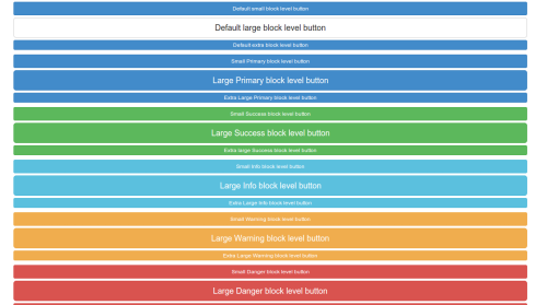
To use the full width of the button's container, Bootstrap 3 provides a block-level button option. You need to addbtn-blockclass to the class discussed above to create block-level buttons.
<button type="button" class="btn btn-primary btn-lg btn-block">Large button</button>
<button type="button" class="btn btn-success btn-lg btn-block">Large button</button>
The CSS definition for creating block-level buttons is as follows
.btn-block {
  display: block;
  width: 100%;
  padding-right: 0;
  padding-left: 0;
}

.btn-block + .btn-block {
  margin-top: 5px;
}
The following shows screenshots and code for block-level buttons. You canclick here to view the example online。
Example
<html>
<head>
<title>Bootstrap 3 Block-level Buttons</title>
<meta name="viewport" content="width=device-width, initial-scale=1.0">
<!-- Bootstrap -->
<link href="dist/css/bootstrap.min.css.html" rel="stylesheet" media="screen">
<style>
body {
padding: 50px
}
</style>
<!-- HTML5 Shim and Respond.js IE8 support for HTML5 elements and media queries. -->
<!-- WARNING: Respond. If viewing the page via file://, the js will not work. -->
<!--[if lt IE 9]>
<script src="https://oss.maxcdn.com/libs/html5shiv/3.7.0/html5shiv.js"></script>
<script src="https://oss.maxcdn.com/libs/respond.js/1.3.0/respond.min.js"></script>
<![endif]-->
</head>
<body>
<div class="container">
<div class="row">
<div class="col-lg-12">
<!-- Standard buttons -->
<p>
<button type="button" class="btn btn-primary btn-sm btn-block">Default Small Block-level Button</button>
<button type="button" class="btn btn-default btn-lg btn-block">Default Large Block-level Button</button>
<button type="button" class="btn btn-primary btn-xs btn-block">Default Extra Small Block-level Button</button>
</p>
<p>
<!-- Provides additional visual effect, identifies the primary action in a group of buttons -->
<button type="button" class="btn btn-primary btn-sm btn-block">Small Primary Block-level Button</button>
<button type="button" class="btn btn-primary btn-lg btn-block">Large Primary Block-level Button</button>
<button type="button" class="btn btn-primary btn-xs btn-block">Extra Small Primary Block-level Button</button>
</p>
<p>
<!-- Indicates a successful or positive action -->
<button type="button" class="btn btn-success btn-sm btn-block">Small Success Block-level Button</button>
<button type="button" class="btn btn-success btn-lg btn-block">Large Success Block-level Button</button>
<button type="button" class="btn btn-success btn-xs btn-block">Extra small success block button</button>
</p>
<p>
<!-- Contextual button for informational alert messages -->
<button type="button" class="btn btn-info btn-sm btn-block">Small info block button</button>
<button type="button" class="btn btn-info btn-lg btn-block">Large info block button</button>
<button type="button" class="btn btn-info btn-xs btn-block">Extra small info block button</button>
</p>
<p>
<!-- Indicates caution should be taken with this action -->
<button type="button" class="btn btn-warning btn-sm btn-block">Small warning block button</button>
<button type="button" class="btn btn-warning btn-lg btn-block">Large warning block button</button>
<button type="button" class="btn btn-warning btn-xs btn-block">Extra small warning block button</button>
</p>
<p>
<!-- Indicates a dangerous or potentially negative action -->
<button type="button" class="btn btn-danger btn-sm btn-block">Small danger block button</button>
<button type="button" class="btn btn-danger btn-lg btn-block">Large danger block button</button>
<button type="button" class="btn btn-danger btn-xs btn-block">Extra small danger block button</button>
</p>
<p>
<!-- Deemphasize a button by making it look like a link while maintaining button behavior -->
<button type="button" class="btn btn-link btn-sm btn-block">Small link block button</button>
<button type="button" class="btn btn-link btn-lg btn-block">Large link block button</button>
</p>
</div>
</div>
</div>
<!-- jQuery (necessary for Bootstrap's JavaScript plugins) -->
<script src="https://code.jquery.com/jquery.js"></script>
<!-- Include all compiled plugins (below), or include individual files as needed -->
<script src="dist/js/bootstrap.min.js.html"></script>
</body>
</html>
Active Buttons
You can useactiveCSS class to give buttons or links a different appearance to show that it is active. Here is alive demoscreenshot and code.

Example
<html>
<head>
<title>Bootstrap 3 Active Buttons</title>
<meta name="viewport" content="width=device-width, initial-scale=1.0">
<!-- Bootstrap -->
<link href="dist/css/bootstrap.min.css.html" rel="stylesheet" media="screen">
<style>
body {
padding: 50px
}
</style>
<!-- HTML5 Shim and Respond.js IE8 support for HTML5 elements and media queries -->
<!-- WARNING: Respond.js doesn't work if you view the page via file:// -->
<!--[if lt IE 9]>
<script src="https://oss.maxcdn.com/libs/html5shiv/3.7.0/html5shiv.js"></script>
<script src="https://oss.maxcdn.com/libs/respond.js/1.3.0/respond.min.js"></script>
<![endif]-->
</head>
<body>
<!-- Standard button -->
<button type="button" class="btn btn-default active">Default</button>
<!-- Provides extra visual weight and identifies the primary action in a set of buttons -->
<button type="button" class="btn btn-primary active">Primary</button>
<!-- Indicates a successful or positive action -->
<button type="button" class="btn btn-success active">Success</button>
<!-- Contextual button for informational alert messages -->
<button type="button" class="btn btn-info active">Info</button>
<!-- Indicates caution should be taken with this action -->
<button type="button" class="btn btn-warning active">Warning</button>
<!-- Indicates a dangerous or potentially negative action -->
<button type="button" class="btn btn-danger active">Danger</button>
<!-- Not emphasized as a button; looks like a link, but maintains button behavior -->
<button type="button" class="btn btn-link active">Link</button>
<!-- jQuery (required for Bootstrap's JavaScript plugins) --->
<script src="https://code.jquery.com/jquery.js"></script>
<!-- Include all compiled plugins (below), or include individual files as needed -->
<script src="dist/js/bootstrap.min.js.html"></script>
</body>
</html>
Using Chrome Developer Tools, we will find that when a button is added withactiveclass, the CSS rules take effect.
Default active button
.btn-default:hover, .btn-default:focus, .btn-default:active, .btn-default.active, .open .dropdown-toggle.btn-default {
color: #333;
background-color: #EBEBEB;
border-color: #ADADAD;
}
Primary active button
.btn-primary:hover, .btn-primary:focus, .btn-primary:active, .btn-primary.active, .open .dropdown-toggle.btn-primary {
color: #fff;
background-color: #3276B1;
border-color: #285E8E;
}
Success active button
.btn-success:hover, .btn-success:focus, .btn-success:active, .btn-success.active, .open .dropdown-toggle.btn-success {
color: #fff;
background-color: #4877A6;
border-color: #4877A6;
}
Info active button
.btn-info:hover, .btn-info:focus, .btn-info:active, .btn-info.active, .open .dropdown-toggle.btn-info {
color: #fff;
background-color: #39B3D7;
border-color: #269ABC;
}
Warning active button
.btn-warning:hover, .btn-warning:focus, .btn-warning:active, .btn-warning.active, .open .dropdown-toggle.btn-warning {
color: #fff;
background-color: #ED9C28;
border-color: #D58512;
}
Danger active button
.btn-danger:hover, .btn-danger:focus, .btn-danger:active, .btn-danger.active, .open .dropdown-toggle.btn-danger {
color: #fff;
background-color: #D2322D;
border-color: #AC2925;
}
Link active button
.btn-link, .btn-link:hover, .btn-link:focus, .btn-link:active {
border-color: transparent;
}
So, you can see that these are achieved by changing the color, backgound-color, and border-color properties.
Disabled Buttons
You can usedisabledCSS class to add different appearances to buttons or links to show that they are disabled. Here is alive demo, screenshot, and code.
To make the button a bit blurred, use the following CSS rule (found via Chrome Developer Tools)
.btn[disabled], fieldset[disabled] .btn {
pointer-events: none;
cursor: not-allowed;
opacity: .65;
filter: alpha(opacity=65);
-webkit-box-shadow: none;
box-shadow: none;
}

Example
<html>
<head>
<title>Bootstrap 3 Disabled Buttons</title>
<meta name="viewport" content="width=device-width, initial-scale=1.0">
<!-- Bootstrap -->
<link href="dist/css/bootstrap.min.css.html" rel="stylesheet" media="screen">
<style>
body {
padding: 50px
}
</style>
<!-- HTML5 Shim and Respond.js for IE8 support of HTML5 elements and media queries. -->
<!-- WARNING: Respond.js will not work if the page is viewed via file://. -->
<!--[if lt IE 9]>
<script src="https://oss.maxcdn.com/libs/html5shiv/3.7.0/html5shiv.js"></script>
<script src="https://oss.maxcdn.com/libs/respond.js/1.3.0/respond.min.js"></script>
<![endif]-->
</head>
<body>
<!-- Standard button -->
<button type="button" class="btn btn-default" disabled="disabled">Default</button>
<!-- Provides additional visual effects, identifies the primary action in a group of buttons -->
<button type="button" class="btn btn-primary" disabled="disabled">Primary</button>
<!-- Indicates a successful or positive action -->
<button type="button" class="btn btn-success" disabled="disabled">Success</button>
<!-- Contextual button for informational alert messages -->
<button type="button" class="btn btn-info" disabled="disabled">Info</button>
<!-- Indicates an action that should be taken with caution -->
<button type="button" class="btn btn-warning" disabled="disabled">Warning</button>
<!-- Indicates a dangerous or potentially negative action -->
<button type="button" class="btn btn-danger" disabled="disabled">Danger</button>
<!-- jQuery (required for Bootstrap's JavaScript plugins) --->
<script src="https://code.jquery.com/jquery.js"></script>
<!-- Include all compiled plugins (below), or include individual files as needed -->
<script src="dist/js/bootstrap.min.js.html"></script>
</body>
</html>
Disabled Anchor Elements
When anchor elements with btn and other related classes are rendered as disabled, it is a bit different from usual. First, the anchor element's link still exists; only the appearance and feel have changed. Additionally, you cannot use them in the navbar.
Click here to view the demo online.The code is as follows:
Example
<html>
<head>
<title>Bootstrap 3 Disabled Anchor Button</title>
<meta name="viewport" content="width=device-width, initial-scale=1.0">
<!-- Bootstrap -->
<link href="dist/css/bootstrap.min.css.html" rel="stylesheet" media="screen">
<style>
body {
padding: 50px
}
</style>
<!-- HTML5 Shim and Respond.js IE8 support HTML5 elements and media queries. -->
<!-- WARNING: Respond.js will not work if the page is viewed via file://. -->
<!--[if lt IE 9]>
<script src="https://oss.maxcdn.com/libs/html5shiv/3.7.0/html5shiv.js"></script>
<script src="https://oss.maxcdn.com/libs/respond.js/1.3.0/respond.min.js"></script>
<![endif]-->
</head>
<body>
<!-- Standard button -->
<a href="http://www.example.com" class="btn btn-default disabled" role="button">Default</a>
<!-- Provides extra visual weight and identifies the primary action in a set of buttons -->
<a href="http://www.example.com" class="btn btn-primary disabled" role="button">Primary</a>
<!-- Indicates a successful or positive action -->
<a href="http://www.example.com" class="btn btn-success disabled" role="button">Success</a>
<!-- Contextual button for informational alert messages -->
<a href="http://www.example.com" class="btn btn-info disabled" role="button">Info</a>
<!-- Indicates caution should be taken with this action -->
<a href="http://www.example.com" class="btn btn-warning disabled" role="button">Warning</a>
<!-- Indicates a dangerous or potentially negative action -->
<a href="http://www.example.com" class="btn btn-danger disabled" role="button">Danger</a>
<!-- jQuery (necessary for Bootstrap's JavaScript plugins) -->
<script src="https://code.jquery.com/jquery.js"></script>
<!-- Include all compiled plugins (below), or include individual files as needed -->
<script src="dist/js/bootstrap.min.js.html"></script>
</body>
</html>
Please note,role="button"it is used for ease of use.
Button Tags
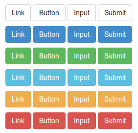
You can use the button classes on button, a, and input elements to use them as buttons. However, it is recommended that you generally use the button element, otherwise it may cause cross-browser inconsistencies.
The following example demonstrates how to use button tags
Example
<html>
<head>
<title>Bootstrap 3 Button Tags Example</title>
<meta name="viewport" content="width=device-width, initial-scale=1.0">
<!-- Bootstrap -->
<link href="dist/css/bootstrap.min.css.html" rel="stylesheet" media="screen">
<style>
body {
padding: 50px
}
</style>
<!-- HTML5 Shim and Respond.js IE8 support HTML5 elements and media queries. -->
<!-- WARNING: Respond.js will not work if the page is viewed via file://. -->
<!--[if lt IE 9]>
<script src="https://oss.maxcdn.com/libs/html5shiv/3.7.0/html5shiv.js"></script>
<script src="https://oss.maxcdn.com/libs/respond.js/1.3.0/respond.min.js"></script>
<![endif]-->
</head>
<body>
<p>
<a class="btn btn-default" href="../index.html" role="button">Link</a>
<button class="btn btn-default" type="submit">Button</button>
<input class="btn btn-default" type="button" value="Input">
<input class="btn btn-default" type="submit" value="Submit">
</p>
<p>
<a class="btn btn-primary" href="../index.html" role="button">Link</a>
<button class="btn btn-primary" type="submit">Button</button>
<input class="btn btn-primary" type="button" value="Input">
<input class="btn btn-primary" type="submit" value="Submit">
</p>
<p>
<a class="btn btn-success" href="../index.html" role="button">Link</a>
<button class="btn btn-success" type="submit">Button</button>
<input class="btn btn-success" type="button" value="Input">
<input class="btn btn-success" type="submit" value="Submit">
</p>
<p>
<a class="btn btn-info" href="../index.html" role="button">Link</a>
<button class="btn btn-info" type="submit">Button</button>
<input class="btn btn-info" type="button" value="Input">
<input class="btn btn-info" type="submit" value="Submit">
</p>
<p>
<a class="btn btn-warning" href="../index.html" role="button">Link</a>
<button class="btn btn-warning" type="submit">Button</button>
<input class="btn btn-warning" type="button" value="Input">
<input class="btn btn-warning" type="submit" value="Submit">
</p>
<p>
<a class="btn btn-danger" href="../index.html" role="button">Link</a>
<button class="btn btn-danger" type="submit">Button</button>
<input class="btn btn-danger" type="button" value="Input">
<input class="btn btn-danger" type="submit" value="Submit">
</p>
<!-- jQuery (necessary for Bootstrap's JavaScript plugins) -->
<script src="https://code.jquery.com/jquery.js"></script>
<!-- Include all compiled plugins (below), or include individual files as needed -->
<script src="dist/js/bootstrap.min.js.html"></script>
</body>
</html>
Click here to view the online demo.
Custom Buttons
Now we will start customizing with the default button to give it a completely different look and feel.
We will start with the following button code.
<button type="button" class="btn btn-default">Default</button>
Now we will create a CSS classbtn-w3r, and use it to replace btn-default. So, we will write the following code to replace the code above.
<button type="button" class="btn btn-w3r">Default</button>
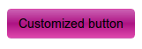
First, we will change the background color by adding the following CSS.
.btn-w3r {
    background: #CB60B3; /* Old browsers */
    background: -moz-linear-gradient(top,  #CB60B3 0%, #AD1283 50%, #DE47AC 100%); /* FF3.6+ */
    background: -webkit-gradient(linear, left top, left bottom, color-stop(0%,#CB60B3), color-stop(50%,#AD1283), color-stop(100%,#DE47AC)); /   *   Chrome,Safari4+ */
    background: -webkit-linear-gradient(top,  #CB60B3 0%,#AD1283 50%,#DE47AC 100%); /* Chrome10+,Safari5.1+ */
    background: -o-linear-gradient(top,  #CB60B3 0%,#AD1283 50%,#DE47AC 100%); /* Opera 11.10+ */
    background: -ms-linear-gradient(top,  #CB60B3 0%,#AD1283 50%,#DE47AC 100%); /* IE10+ */
    background: linear-gradient(to bottom,  #CB60B3 0%,#AD1283 50%,#DE47AC 100%); /* W3C */
    filter: progid:DXImageTransform.Microsoft.gradient( startColorstr='#CB60B3', endColorstr='#DE47AC',GradientType=0 ); /* IE6-9 */
    }
Now the button looks as follows.
To change the font color, we will, after the existingbtn-w3rclass's CSS code, append the following CSS.
color:#fff;
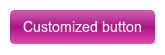
Now, to make the button shape look like a circle, we will, before the existingbtn-w3rclass's CSS code, add the following CSS.
width: 200px;
    height: 200px;
    -moz-border-radius: 50%;
    -webkit-border-radius: 50%;
    border-radius: 50%;
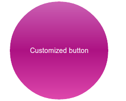
To add a hover effect, we will add the following CSS code.
.btn-w3r:hover {
    background: #333;
    color:#E75616;
    }
Below is the button hover effect after adding the above CSS code.
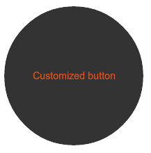
You canclick here to view the online demo of the custom button we created.。
Other Extensions