Bootstrap Grid System
Introduction
In this tutorial, you will learn how to use Bootstrap to create a grid system.
As you may know, in graphic design, a grid system is a two-dimensional structure composed of intersecting horizontal and vertical axes used to build content. It is widely used in the layout design and content structure of graphic design. In web design, it is a very effective method for quickly and efficiently creating consistent layouts by using HTML and CSS. Therefore, the grid system has become an important component/module of the framework or workflow of web design.
Simply put, in web design, we use HTML and CSS to create rows and columns to implement a grid, and the columns contain the actual content.
Since version 2.3.2, Bootstrap has provided two types of grids. The default grid system is 940px wide with 12 columns. You can add a responsive stylesheet to make it adjust its width to 724px and 1170px according to the viewport.
There is also a fluid grid system, which is percentage-based rather than pixel-based. It can also be extended to be responsive like the default fixed grid. In this tutorial, we will discuss the default grid through some examples. The fluid grid system will be covered in a separate tutorial.
Please download the latest version of Bootstrap files from "http://twitter.github.io/bootstrap/assets/bootstrap.zip". You can find the relevant file structure in ourGetting Started Tutorialto learn about the relevant file structure.
Getting Started with the Default Grid
Let's start with a basic HTML and see how to apply the default grid to it.
<!DOCTYPE html>
<html>
<head>
    <title>使用Bootstrap固定布局的实例</title>
    <meta name="viewport" content="width=device-width, initial-scale=1.0">
    <!-- Bootstrap -->
    <link href="bootstrap/css/bootstrap.min.css.html" rel="stylesheet" media="screen">
    <script src="http://code.jquery.com/jquery.js"></script>
        <script src="bootstrap/js/bootstrap.min.js.html"></script>
</head>
<body>

</body>
</html>
Bootstrap uses the CSS class "row" to create horizontal rows, and the CSS class "spanx" (where x ranges from 1 to 12) to create vertical columns. Using these two, you can create a three-column grid (each column contains some text content), with HTML as shown below.
<!DOCTYPE html>
<html>
<head>
<title>使用Bootstrap固定布局的实例</title>
<meta name="viewport" content="width=device-width, initial-scale=1.0">
<!-- Bootstrap -->
<link href="bootstrap/css/bootstrap.min.css.html" rel="stylesheet" media="screen">
<script src="http://code.jquery.com/jquery.js"></script>
<script src="bootstrap/js/bootstrap.min.js.html"></script>
</head>
<body>
<div class="container">
<div class="row">
    <div class="span4"><p>Lorem ipsum dolor sit amet, consectetuer adipiscing elit. Nam cursus. Morbi ut mi. Nullam enim leo, egestas id, condimentum at, laoreet mattis, massa. Sed eleifend nonummy diam. Praesent mauris ante, elementum et, bibendum at, posuere sit amet, nibh. Duis tincidunt lectus quis dui viverra vestibulum. Suspendisse vulputate aliquam dui. Nulla elementum dui ut augue. Aliquam vehicula mi at mauris. Maecenas placerat, nisl at consequat rhoncus, sem nunc gravida justo, quis eleifend arcu velit quis lacus. Morbi magna magna, tincidunt a, mattis non, imperdiet vitae, tellus. Sed odio est, auctor ac, sollicitudin in, consequat vitae, orci. Fusce id felis. Vivamus sollicitudin metus eget eros.</p></div>
    <div class="span4"><p>Lorem ipsum dolor sit amet, consectetuer adipiscing elit. Nam cursus. Morbi ut mi. Nullam enim leo, egestas id, condimentum at, laoreet mattis, massa. Sed eleifend nonummy diam. Praesent mauris ante, elementum et, bibendum at, posuere sit amet, nibh. Duis tincidunt lectus quis dui viverra vestibulum. Suspendisse vulputate aliquam dui. Nulla elementum dui ut augue. Aliquam vehicula mi at mauris. Maecenas placerat, nisl at consequat rhoncus, sem nunc gravida justo, quis eleifend arcu velit quis lacus. Morbi magna magna, tincidunt a, mattis non, imperdiet vitae, tellus. Sed odio est, auctor ac, sollicitudin in, consequat vitae, orci. Fusce id felis. Vivamus sollicitudin metus eget eros.</p></div>
    <div class="span4"><p>Lorem ipsum dolor sit amet, consectetuer adipiscing elit. Nam cursus. Morbi ut mi. Nullam enim leo, egestas id, condimentum at, laoreet mattis, massa. Sed eleifend nonummy diam. Praesent mauris ante, elementum et, bibendum at, posuere sit amet, nibh. Duis tincidunt lectus quis dui viverra vestibulum. Suspendisse vulputate aliquam dui. Nulla elementum dui ut augue. Aliquam vehicula mi at mauris. Maecenas placerat, nisl at consequat rhoncus, sem nunc gravida justo, quis eleifend arcu velit quis lacus. Morbi magna magna, tincidunt a, mattis non, imperdiet vitae, tellus. Sed odio est, auctor ac, sollicitudin in, consequat vitae, orci. Fusce id felis. Vivamus sollicitudin metus eget eros.</p></div>
</div>
</div>
</body>
</html>
Below is a graphical representation of the grid system.
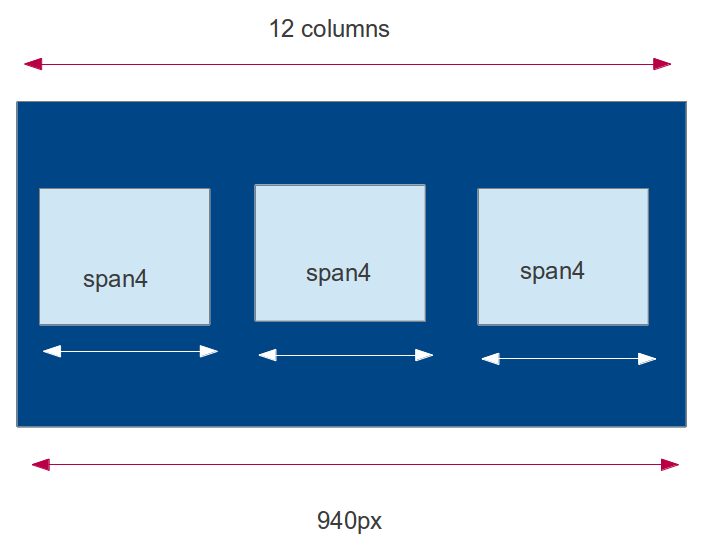
In this way, we have created a three-column grid by using the "span4" class for each column. The "container" class is used to hold the entire structure.You can view the online example here. From this point, we can deduce the general syntax of the CSS class used to create a given number of columns.
General syntax for creating a grid:
<div class="row"> <div class="spanx"> inline elements like span, block level elements like p, div. </div> repeat <div class="spanx"> y times.
Where y is the number of columns you want to create, and the sum of x equals 12 (this is the maximum number of columns you can create). x must be a positive integer, and its value must be from 1 to 12.
For example, if you have three equal-width columns, each column is class="span4", but if you want the first column to be larger than the other two, you can use class="span6" for the first column and class="span3" for the other two.
How to Create Rows in a Fixed Grid
Next, before we continue with other examples, let's take a look at the CSS rules used to create rows and columns in the fixed grid.
The row class is as follows
.row {
    margin-left: -20px;
    *zoom: 1;
}
Set the left margin to -20px and set "*zoom: 1;". The "*" here indicates that the zoom property of all elements is set to 1, used to fix IE6/7 bugs. Setting the zoom property to 1 sets an internal property named hasLayout, which is used to fix many scaling/rendering issues in IE6/7.
.row:before,
.row:after {
    display: table;
    line-height: 0;
    content: "";
}
Bootstrap uses the preceding CSS code to create rows. It uses the ":before" and ":after" CSS properties. These two are pseudo-elements. ":before" is used to insert some content before the target element, and ":after" is used to insert some content after the target element. "display:table;" makes the element render in table form. By setting "line-height: 0;" it ensures that each row does not have its own line height, and by using 'content: ""' it ensures that no content is inserted before or after the element.
Then the following rule is used to ensure that there are no floated elements on the left or right side of a given element.
.row:after {
    clear: both;
}
How to Create Columns in a Fixed Grid
[class*="span"] {
    float: left;
    min-height: 1px;
    margin-left: 20px;
}
These are the CSS rules to use. '[class*="span"]' selects all elements whose class attribute value starts with 'span'. Now use "float: left;" to position each column adjacent to each other. Use "min-height: 1px" to give all columns a minimum height of 1px, and use "margin-left: 20px;" to set the left margin to 20px.
Separate CSS rules are used to set the column widths. Specifically, as shown in the table below.
| CSS code | Explanation |
|---|---|
.span12 {
    width: 940px;
}
|
If the row has a single column, the column width is 940px. |
.span11 {
    width: 860px;
}
|
If the row has a column spanning 11 columns, the column width is 860px. |
.span10 {
    width: 780px;
}
|
If the row has a column spanning 10 columns, the column width is 780px. |
.span9 {
    width: 700px;
}
|
If the row has a column spanning 9 columns, the column width is 700px. |
.span8 {
    width: 620px;
}
|
If the row has a column spanning 8 columns, the column width is 620px. |
.span7 {
    width: 540px;
}
|
If the row has a column spanning 7 columns, the column width is 540px. |
.span6 {
    width: 460px;
}
|
If the row has a column spanning 6 columns, the column width is 460px. |
.span5 {
    width: 380px;
}
|
If the row has a column spanning 5 columns, the column width is 380px. |
.span4 {
    width: 300px;
}
|
If the row has a column spanning 4 columns, the column width is 300px. |
.span3 {
    width: 220px;
}
|
If the row has a column spanning 3 columns, the column width is 220px. |
.span2 {
    width: 140px;
}
|
If the row has a column spanning 2 columns, the column width is 140px. |
.span1 {
    width: 60px;
}
|
A single column width is 60px. |
Bootstrap Default Grid Example
This example demonstrates how to create 1 column, 2 columns, 6 columns, 12 columns, and 4 columns (in that order).
Also note that all the created columns are wrapped by the "container" class, and "container" is used to create a fixed layout with Bootstrap.
Example
<html lang="en">
<head>
<meta charset="utf-8">
<title>Bootstrap Grid System Example - w3cschool Bootstrap Tutorial</title>
<meta name="description" content="Creating a 16 columns Grid with Bootstrap. Learn with examples to create a Grid System in Bootstrap.">
<link href="bootstrap/css/bootstrap.min.css.html" rel="stylesheet" media="screen">
<script src="http://code.jquery.com/jquery.js"></script>
<script src="bootstrap/js/bootstrap.min.js.html"></script>
<style>
.span12 h1{color:#FE6E4C; font-weight: bold; padding: 5px;}
h3 {margin: 10px 0 10px 0;}
</style>
</head>
<body>
<div class="container">
<div class="row">
<div class="span12">
<h1>w3cschool.cc is a web design and development tutorial.</h1>
</div>
</div>
<div class="row">
<div class="span12">
<p>w3cschool offers web development tutorials. We believe in Open Source. Love standards. And prioritize simplicity and readability while serving content. With 3000+ unique content pages and thousands of examples, we are comprehensive. We have online practice editors to play around with the example codes.</p>
</div>
</div>
<div class="row">
<div class="span12">
<h3>Some of the topics and more... :</h3>
</div>
<div class="span2">
<p><img src="images/html5_logo.png.html" width="140" height="86" alt="html5 logo" /></p>
</div>
<div class="span2">
<p><img src="images/javascript-logo.png.html" width="140" height="86" alt="javascript logo" /></p>
</div>
<div class="span2">
<p><img src="images/json.gif.html" width="140" height="86" alt="JSON logo" /></p>
</div>
<div class="span2">
<p><img src="images/php.png.html" width="140" height="86" alt="PHP logo" /></p>
</div>
<div class="span2">
<p><img src="images/mysql-logo.png.html" width="140" height="86" alt="MySQL logo" /></p>
</div>
<div class="span2">
<p><img src="images/browser-statistics.png.html" width="140" height="86" alt="Browser Statistics logo" /></p>
</div>
</div>
<div class="row">
<div class="span12">
<h3>Social networking sites to share:</h3>
</div>
</div>
<div class="row">
<div class="span1">
<p><img src="images/gplus.png.html" width="50" height="49" alt="GPlus logo" /></p>
</div>
<div class="span1">
<p><img src="images/twitter.png.html" width="50" height="38" alt="Twitter logo" /></p>
</div>
<div class="span1">
<p><img src="images/orkut.png.html" width="50" height="55" alt="Orkut logo" /></p>
</div>
<div class="span1">
<p><img src="images/ipad.png.html" width="50" height="53" alt="iPad logo" /></p>
</div>
<div class="span1">
<p><img src="images/digo.png.html" width="50" height="54" alt="Digo logo" /></p>
</div>
<div class="span1">
<p><img src="images/zapface.png.html" width="51" height="53" alt="Zapface logo" /></p>
</div>
<div class="span1">
<p><img src="images/facebook.png.html" width="48" height="53" alt="facebook logo" /></p>
</div>
<div class="span1">
<p><img src="images/netvibes.png.html" width="51" height="53" alt="Netvibes logo" /></p>
</div>
<div class="span1">
<p><img src="images/linkedin.png.html" width="49" height="54" alt="LinkedIn logo" /></p>
</div>
<div class="span1">
<p><img src="images/newsvine.png.html" width="48" height="53" alt="Newsvine logo" /></p>
</div>
<div class="span1">
<p><img src="images/blogger.png.html" width="51" height="53" alt="Blogger logo" /></p>
</div>
<div class="span1">
<p><img src="images/reditt.png.html" width="48" height="57" alt="Reddit logo" /></p>
</div>
</div>
<div class="row">
<div class="span3">
<h3>Fontend Development:</h3>
<p>HTML4.0, XHTML1.0, CSS2.1, HTML5, CSS3, JavaScript</p>
</div>
<div class="span3">
<h3>Backend Developemt:</h3>
<p>PHP, Ruby, Python, Java, ASP.NET, SCALA</p>
</div>
<div class="span3">
<h3>Database Management:</h3>
<p>SQL, MySQL POstgreSQL, NoSQL, MongoDB</p>
</div>
<div class="span3">
<h3>APIs, Tools and Tips:</h3>
<p>Google Plus API, Twitter Bootstrap, JSON, Firebug, WebPNG</p>
</div>
</div>
</div>
</body>
</html>
Below is what you will create
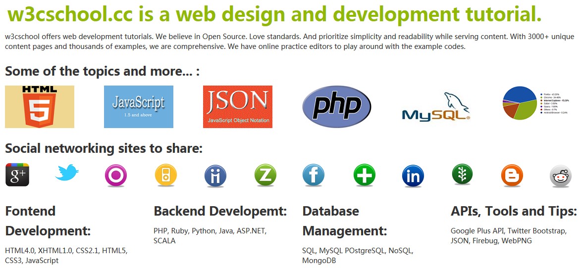
View Online
View the above example in different browser windows.
Please click here to download all HTML, CSS, JS, and image files for the above example.
Adding Responsiveness to the Default Grid
If you want to add responsiveness to Bootstrap's default grid, simply add the following after the original CSS in the HTML file:
<meta name="viewport" content="width=device-width, initial-scale=1.0"><link href="bootstrap/css/bootstrap-responsive.min.css.html" rel="stylesheet">
To view the responsive default grid,Click here to view the online demo.。Click here to download the related code.。
The default grid system becomes responsive under two conditions. When the viewport (the available space for grid rendering) is greater than 1200px [obtained via @media (min-width: 1200px)], and when the viewport is greater than 768px but less than 979px [set via @media (min-width: 768px) and (max-width: 979px)].
Offset Columns: Default Grid
By using offsets, you can move a column to the right of its original position. This is achieved by adding a left margin to the column. With Bootstrap, you can use the "offsetx" class (where x is a positive integer) and the class "spany" (where y is a positive integer). Depending on the value of 'x' in 'offestx', the relevant column moves to the right by the width of 'x' columns.
The offset widths are defined in the Bootstrap CSS. The maximum left margin for offset12 is 980px, and the minimum left margin for offset1 is 100px.
Since the default grid system is pixel-based, when applying offsets you must know the pixels you will use for the offset and the pixels to use for the columns. The sum of these two must not exceed the number of pixels in your horizontal viewport.
In the following example, we will create a two-column grid. We will move the left column 4 columns to the right. The HTML code is as follows:
Example
<div class="row">
<div class="span4 offset4">
<p>Lorem ipsum dolor sit amet, consectetuer adipiscing elit. Nam cursus. Morbi ut mi. Nullam enim leo, egestas id, condimentum at, laoreet mattis, massa. Sed eleifend nonummy diam. Praesent mauris ante, elementum et, bibendum at, posuere sit amet, nibh. Duis tincidunt lectus quis dui viverra vestibulum. Suspendisse vulputate aliquam dui. Nulla elementum dui ut augue. Aliquam vehicula mi at mauris. Maecenas placerat, nisl at consequat rhoncus, sem nunc gravida justo, quis eleifend arcu velit quis lacus. Morbi magna magna, tincidunt a, mattis non, imperdiet vitae, tellus. Sed odio est, auctor ac, sollicitudin in, consequat vitae, orci. Fusce id felis. Vivamus sollicitudin metus eget eros.</p>
</div>
<div class="span3">
<p>Lorem ipsum dolor sit amet, consectetuer adipiscing elit. Nam cursus. Morbi ut mi. Nullam enim leo, egestas id, condimentum at, laoreet mattis, massa. Sed eleifend nonummy diam. Praesent mauris ante, elementum et, bibendum at, posuere sit amet, nibh. Duis tincidunt lectus quis dui viverra vestibulum. Suspendisse vulputate aliquam dui. Nulla elementum dui ut augue. Aliquam vehicula mi at mauris. Maecenas placerat, nisl at consequat rhoncus, sem nunc gravida justo, quis eleifend arcu velit quis lacus. Morbi magna magna, tincidunt a, mattis non, imperdiet vitae, tellus. Sed odio est, auctor ac, sollicitudin in, consequat vitae, orci. Fusce id felis. Vivamus sollicitudin metus eget eros.</p>
</div>
</div>
</div>
Click here to view the online demoClick here to download the related code。
You can add responsiveness to the default grid by appending responsive CSS after the native CSS, or by using offset columns.
Nested Columns: Default Grid
Using the Bootstrap default grid, columns can be nested. You simply need to create a row inside a column and create the number of columns you want to nest within that row. At the same time, you must remember that the total number of columns used for nesting other columns must not exceed the number of columns specified for the parent column.
The following example demonstrates how to nest columns in Bootstrap's default grid.
Example
<div class="row">
<div class="span7">
<div class="row">
<div class="span4">
<p>Maecenas aliquet velit vel turpis. Mauris neque metus, malesuada nec, ultricies sit amet, porttitor mattis, enim. In massa libero, interdum nec, interdum vel, blandit sed, nulla. In ullamcorper, est eget tempor cursus, neque mi consectetuer mi, a ultricies massa est sed nisl. Class aptent taciti sociosqu ad litora torquent per conubia nostra, per inceptos hymenaeos. Proin nulla arcu, nonummy luctus, dictum eget, fermentum et, lorem. Nunc porta convallis pede.</p>
</div>
<div class="span3">
<p>Maecenas aliquet velit vel turpis. Mauris neque metus, malesuada nec, ultricies sit amet, porttitor mattis, enim. In massa libero, interdum nec, interdum vel, blandit sed, nulla. In ullamcorper, est eget tempor cursus, neque mi consectetuer mi, a ultricies massa est sed nisl. Class aptent taciti sociosqu ad litora torquent per conubia nostra, per inceptos hymenaeos. Proin nulla arcu, nonummy luctus, dictum eget, fermentum et, lorem. Nunc porta convallis pede.</p>
</div>
</div>
</div>
<div class="span5">
<p>Maecenas aliquet velit vel turpis. Mauris neque metus, malesuada nec, ultricies sit amet, porttitor mattis, enim. In massa libero, interdum nec, interdum vel, blandit sed, nulla. In ullamcorper, est eget tempor cursus, neque mi consectetuer mi, a ultricies massa est sed nisl. Class aptent taciti sociosqu ad litora torquent per conubia nostra, per inceptos hymenaeos. Proin nulla arcu, nonummy luctus, dictum eget, fermentum et, lorem. Nunc porta convallis pede.</p>
</div>
</div>
</div>
Click here to view the online demoClick here to download the related code。
In the above example, the row under the container has two columns, defined as 'class="span7"' and 'class="span5"'. This makes the total number of columns 12. Now, we add a row inside the left column, then create two columns, defined as 'class="span4"' and 'class="span3"'. Therefore, it follows the total number of columns specified by its parent column (7=4+3).
You can also add responsiveness here.
Conclusion
In this tutorial, we have discussed Bootstrap's default grid system. This tutorial is based on Bootstrap V2.3.2. The following is a summary of the key points in this tutorial:
- Bootstrap's default grid system is 940px wide and has 12 columns.
- In the grid, rows are created with 'class="row"', and columns are created with 'class="spanx"', where x is a positive integer. The sum of all column values x must not exceed 12.
- You can add responsiveness to the default grid by adding Bootstrap's responsive CSS.
- Use offsets to create extra space for columns. By using 'class="offsetx"', where x is a positive integer. If you use offsets, the total number of columns, including the number used for offsets, must not exceed 11.
- Columns can be nested. If nested columns are used, they are also counted when calculating the total number of columns in the grid (a row within the container).
- Offsets can also be used in nested columns.