Python Tkinter Entry
 Python GUI Programming
Python Tkinter Entry is used to let users input a single line of text string.
If you need to input multiple lines of text, you can use theTextcomponent.
If you need to display one or more lines of text and not allow users to modify it, you can use theLabelcomponent.
Syntax
The syntax is as follows:
w = Entry( master, option, ... )
master: The parent container of the button.
options: Optional items, i.e., the configurable properties of this button. These options can be set in the form of key = value, separated by commas.
| Serial number | Option & Description |
|---|---|
| 1 | bg Background color of the input box |
| 2 | bd Border size, default is 2 pixels |
3 | cursor Cursor shape setting, such as arrow, circle, cross, plus, etc. |
| 4 | font Text font |
| 5 | exportselection By default, if you select text in the input box, it will be copied to the clipboard. If you want to ignore this feature, you can set exportselection=0. |
| 6 | fg Text color. The value can be a color name or a color code, such as: 'red', '#ff0000' |
| 7 | highlightcolor Highlight border color of the text box, displayed when the text box gains focus |
| 8 | justify When displaying multiple lines of text, sets the alignment between different lines. Options include LEFT, RIGHT, CENTER |
| 9 | relief Border style, sets the 3D effect of the widget. Options: FLAT, SUNKEN, RAISED, GROOVE, RIDGE. Default is FLAT. |
| 10 | selectbackground Background color of selected text |
| 11 | selectborderwidth Background border width of selected text |
| 12 | selectforeground Color of selected text |
| 13 | show Specifies the text box content to be displayed as characters. The value can be any character. For passwords, you can set the value to show="*" |
| 14 | state Default is state=NORMAL. The state of the text box, can be read-only or writable. Values: normal/disabled |
| 15 | textvariable The value of the text box, a StringVar() object |
| 16 | width Width of the text box |
| 17 | xscrollcommand Sets the horizontal scrollbar, generally used when the width of the content entered by the user is greater than the width displayed in the text box. |
Methods
The following table lists the commonly used methods of the text box widget:
| Serial number | Method & Description |
|---|---|
| 1 | delete ( first, last=None ) Deletes the value at the specified position in the text box text.delete(10) # 删除索引值为10的值 text.delete(10, 20) # 删除索引值从10到20之前的值 text.delete(0, END) # 删除所有值 |
| 2 | get() Gets the value of the text box |
| 3 | icursor ( index ) Moves the cursor to the specified index position; only takes effect when the text box has gained focus |
| 4 | index ( index ) Returns the specified index value |
| 5 | insert ( index, s ) Inserts a value into the text box. index: insertion position, s: inserted value |
| 6 | select_adjust ( index ) Selects the value from the specified index to the cursor position |
| 7 | select_clear() Clears the selection in the specified widget |
| 8 | select_from ( index ) Sets the cursor position using the index value |
| 9 | select_present() Returns true if there is a selection, otherwise returns false. |
| 10 | select_range ( start, end ) Selects the value at the specified index positions. start (inclusive) is the beginning position, end (exclusive) is the ending position. start must be smaller than end. |
| 11 | select_to ( index ) Selects the values between the specified index and the cursor |
| 12 | xview ( index ) This method is useful when the text box is linked to a horizontal scrollbar. |
| 13 | xview_scroll ( number, what ) Used to scroll the text box horizontally. The what parameter can be UNITS, which scrolls by character width, or PAGES, which scrolls by text box widget blocks. The number parameter: positive numbers scroll from left to right, negative numbers scroll from right to left. |
Examples
In the example, clicking the button will display a message:
Examples
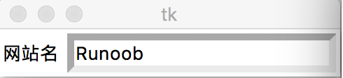
The test output is as follows:
 Other extensions