Bootstrap5 Forms

In this chapter, we will learn how to create forms using Bootstrap. Bootstrap can create forms of different styles through some simple HTML tags and extended classes.

Form Elements<input>, <textarea>, and<select>elements.form-controlWhen using the class, the width is set to 100%.

Bootstrap5 Form Layout

  • Stacked form (full-screen width): vertical direction
  • Inline form: horizontal direction

Bootstrap provides two types of form layouts:


Stacked Form

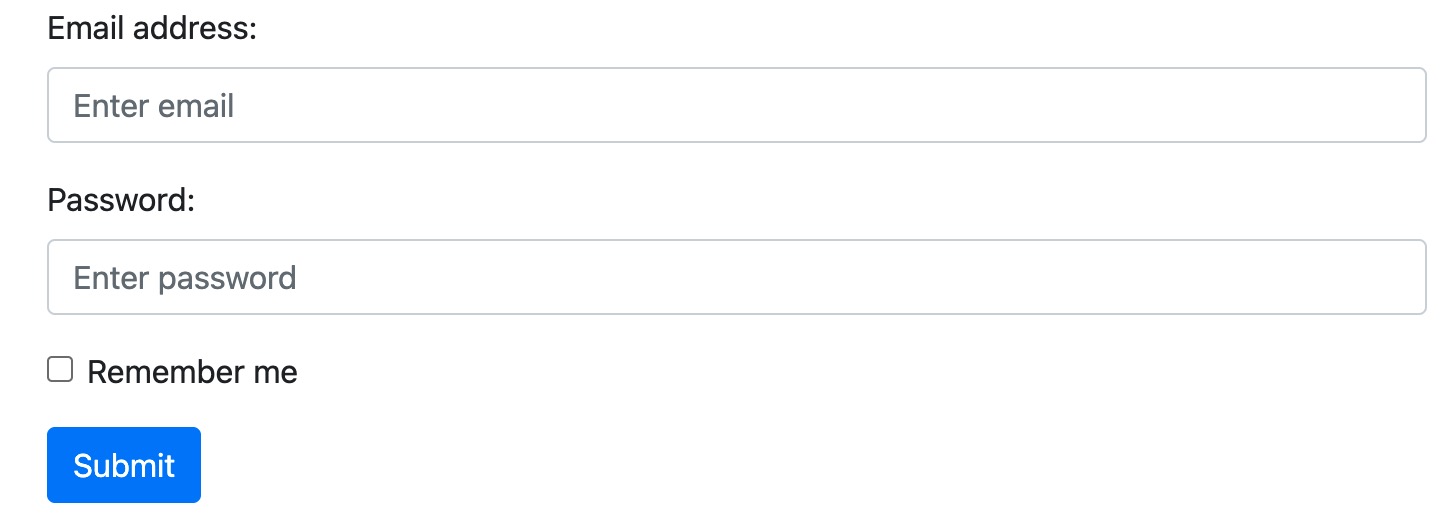
The following example uses two input boxes, a checkbox, and a submit button to create a stacked form:

Example

<form> <div class="mb-3 mt-3"> <label for="email" class="form-label">Email:</label> <input type="email" class="form-control" id="email" placeholder="Enter email" name="email"> </div> <div class="mb-3"> <label for="pwd" class="form-label">Password:</label> <input type="password" class="form-control" id="pwd" placeholder="Enter password" name="pswd"> </div> <div class="form-check mb-3"> <label class="form-check-label"> <input class="form-check-input" type="checkbox" name="remember"> Remember me </label> </div> <button type="submit" class="btn btn-primary">Submit</button> </form>

Try it »

Display effect:

In the example, we use.form-labelclass to ensure that label elements have a certain padding.

Checkboxes use different markup. They use.form-checkwrapped around the container element. Checkboxes and radio buttons use.form-check-input, and their labels can use.form-check-labelclass.


Inline Form

If you want form elements to be displayed side by side, use.rowand.col:

The following example displays two input boxes side by side to create an inline form:

Example

<form> <div class="row"> <div class="col"> <input type="text" class="form-control" placeholder="Enter email" name="email"> </div> <div class="col"> <input type="password" class="form-control" placeholder="Enter password" name="pswd"> </div> </div> </form>

Try it »

Display effect:

Textarea

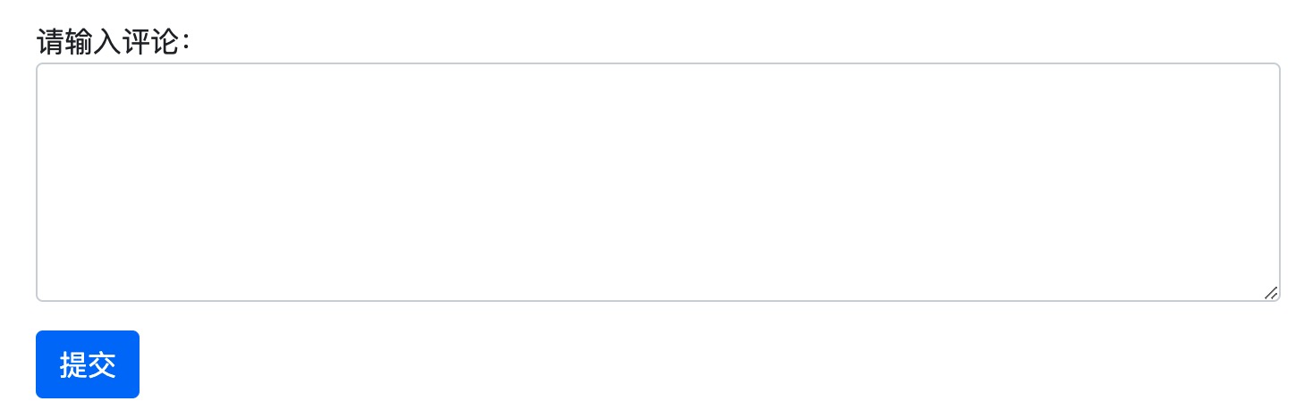
Use the textarea tag to create a textarea in the form, use.form-controlclass to render the textarea tags:

Example

<label for="comment">Please enter your comment:</label> <textarea class="form-control" rows="5" id="comment" name="text"></textarea>

Try it »

Display effect:


Input Size

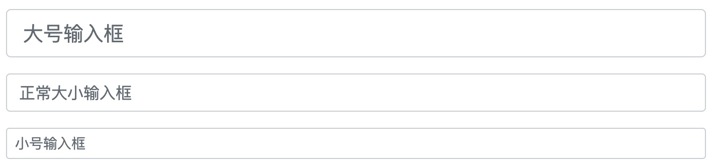
We can by using the.form-controlin the input box.form-control-lgor.form-control-smclass to set the size of the input box:

Example

<input type="text" class="form-control form-control-lg" placeholder="Large input"> <input type="text" class="form-control" placeholder="Normal size input"> <input type="text" class="form-control form-control-sm" placeholder="Small input">

Try it »

Display effect:


Disabled/Readonly Forms

Usedisabled/readonlyattribute to set the input disabled/readonly:

Example

<input type="text" class="form-control" placeholder="Normal input"> <input type="text" class="form-control" placeholder="Disabled input" disabled> <input type="text" class="form-control" placeholder="Readonly input" readonly>

Try it »

Plain Text Input

Use.form-control-plaintextclass can remove the border of the input box:

Example

<input type="text" class="form-control-plaintext" placeholder="Plaintext input"> <input type="text" class="form-control" placeholder="Normal input">

Try it »

Color Picker

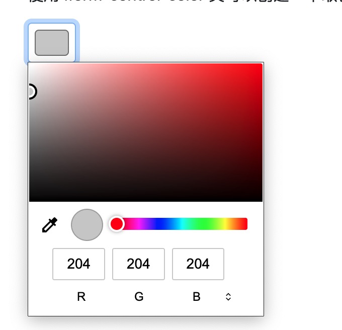
Use.form-control-colorclass can create a color picker:

Example

<input type="color" class="form-control form-control-color" value="#CCCCCC">

Try it »

Display effect:

Other Extensions