Bootstrap5 Dropdowns
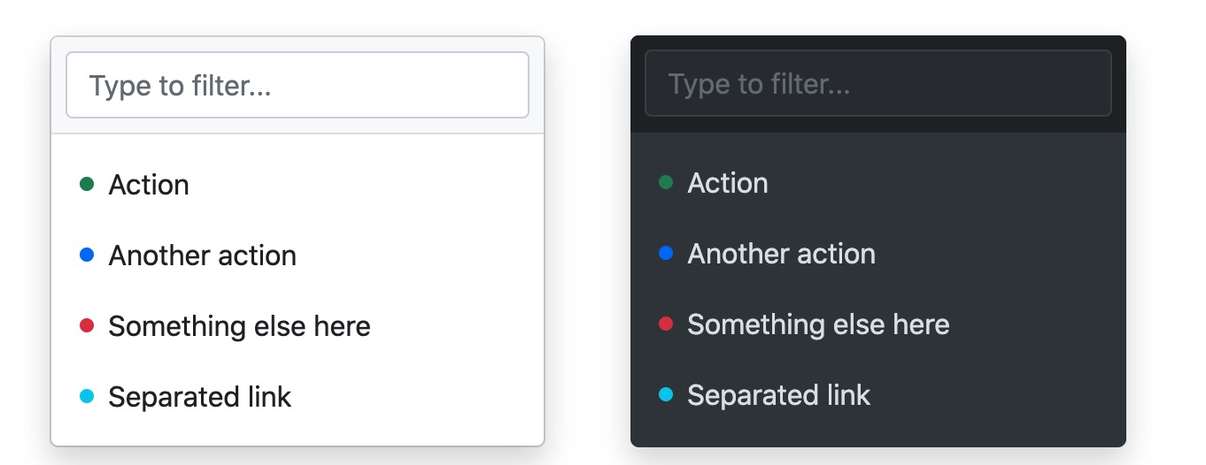
A dropdown menu is a toggleable contextual menu that displays links in a list format.
Example
<div class="dropdown">
<button type="button" class="btn btn-primary dropdown-toggle" data-bs-toggle="dropdown">Dropdown button</button>
<div class="dropdown-menu">
<a class="dropdown-item" href="#">Link 1</a>
<a class="dropdown-item" href="#">Link 2</a>
<a class="dropdown-item" href="#">Link 3</a>
</div>
</div>
Try it yourself »
Example Explanation
.dropdownThe class is used to specify a dropdown menu.
We can use a button or link to open the dropdown menu, and the button or link needs to add.dropdown-toggleanddata-toggle="dropdown"attribute.
<div>Add to the element.dropdown-menuclass to set the actual dropdown menu, then add to the options in the dropdown menu.dropdown-itemclass.
Divider in Dropdown Menu
.dropdown-dividerThe class is used to create a horizontal divider in the dropdown menu:
Header in Dropdown Menu
.dropdown-headerThe class is used to add a header in the dropdown menu:
Active and Disabled Items in Dropdown Menu
The .active class will highlight the dropdown menu item (adds a blue background).
To disable a dropdown menu item, you can use the.disabledclass.
Example
<a class="dropdown-item" href="#">Regular item</a>
<a class="dropdown-item active" href="#">Active item</a>
<a class="dropdown-item disabled" href="#">Disabled item</a>
Try it yourself »
Dropdown Positioning
If we want the dropdown menu to be right-aligned, we can on the element's.dropdownafter the class, add the.dropendor.dropstartclass.
.dropendis right-aligned,.dropstartis left-aligned.
Example
<div class="dropdown dropend">
...
</div>
<div class="dropdown dropstart">
...
</div>
Try it yourself »
Dropdown Popup Direction Settings
The default dropdown direction is downward, but we can also set different directions.
Specify a Dropdown that Pops to the Right
If you want the dropdown menu to pop to the right, you can add the.dropdown-menu-endclass:
Example
<div class="dropdown dropdown-menu-end">
<button type="button" class="btn btn-primary dropdown-toggle" data-bs-toggle="dropdown">Dropdown menu pops to the right</button>
<ul class="dropdown-menu">
<li><a class="dropdown-item" href="#">Link 1</a></li>
<li><a class="dropdown-item" href="#">Link 2</a></li>
<li><a class="dropdown-item" href="#">Link 3</a></li>
</ul>
</div>
Try it yourself »
Specify a Dropup that Pops Up
If you want the dropup menu to pop up, you can add the"dropup"class:
Example
<div class="dropup">
<button type="button" class="btn btn-primary dropdown-toggle" data-bs-toggle="dropdown">Dropdown menu</button>
<ul class="dropdown-menu">
<li><a class="dropdown-item" href="#">Link 1</a></li>
<li><a class="dropdown-item" href="#">Link 2</a></li>
<li><a class="dropdown-item" href="#">Link 3</a></li>
</ul>
</div>
Try it yourself »
Specify a Dropdown that Pops to the Left
If you want the dropdown menu to pop to the left, you can add thedropstartclass:
Example
<div class="dropstart">Add some content to test the left popup effect.<button type="button" class="btn btn-primary dropdown-toggle" data-bs-toggle="dropdown">Dropdown menu</button>
<ul class="dropdown-menu">
<li><a class="dropdown-item" href="#">Link 1</a></li>
<li><a class="dropdown-item" href="#">Link 2</a></li>
<li><a class="dropdown-item" href="#">Link 3</a></li>
</ul>
</div>
Try it yourself »
Dropdown Text Settings
.dropdown-item-textClasses can set text items in the dropdown menu:
Example
<ul class="dropdown-menu">
<li><a class="dropdown-item" href="#">Link 1</a></li>
<li><a class="dropdown-item" href="#">Link 2</a></li>
<li><a class="dropdown-item" href="#">Link 3</a></li>
<li><a class="dropdown-item-text" href="#">Text link</a></li>
<li><span class="dropdown-item-text">Just text</span></li>
</ul>
Try it Yourself »
Dropdown in Button Group
We can add a dropdown menu to a button:
Example
<div class="btn-group">
<button type="button" class="btn btn-primary">Apple</button>
<button type="button" class="btn btn-primary">Samsung</button>
<div class="btn-group">
<button type="button" class="btn btn-primary dropdown-toggle" data-bs-toggle="dropdown">Sony</button>
<ul class="dropdown-menu">
<li><a class="dropdown-item" href="#">Tablet</a></li>
<li><a class="dropdown-item" href="#">Smartphone</a></li>
</ul>
</div>
</div>
Try it Yourself »
Vertical Button Group with Dropdown Menu:
Example
<div class="btn-group-vertical">
<button type="button" class="btn btn-primary">Apple</button>
<button type="button" class="btn btn-primary">Samsung</button>
<div class="btn-group">
<button type="button" class="btn btn-primary dropdown-toggle" data-bs-toggle="dropdown">Sony</button>
<ul class="dropdown-menu">
<li><a class="dropdown-item" href="#">Tablet</a></li>
<li><a class="dropdown-item" href="#">Smartphone</a></li>
</ul>
</div>
</div>
Try it Yourself »
Navbar Example
Other Extensions