Bootstrap4 Forms
In this chapter, we will learn how to create forms using Bootstrap. Bootstrap can create forms of different styles with some simple HTML tags and extended classes.
Form elements<input>, <textarea>, and<select>elements
When using.form-controlin the case of the class, the width is set to 100%.
Bootstrap4 Form Layouts
- Stacked form (full-screen width): vertical direction
- Inline form: horizontal direction
Bootstrap provides two types of form layouts:
Stacked Form
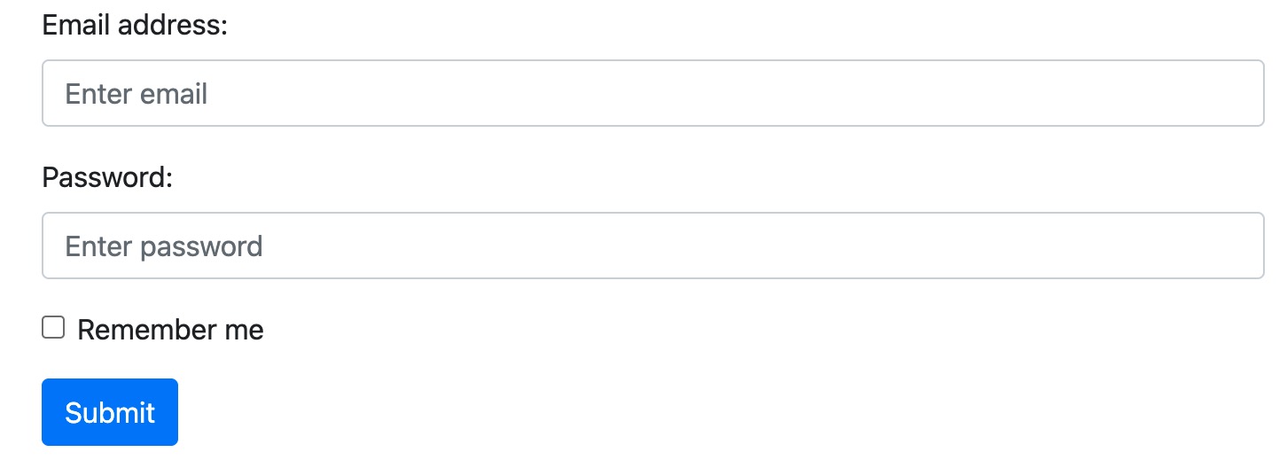
The following example uses two input fields, one checkbox, and one submit button to create a stacked form:
Example
<form action="">
<div class="form-group">
<label for="email">Email address:</label>
<input type="email" class="form-control" placeholder="Enter email" id="email">
</div>
<div class="form-group">
<label for="pwd">Password:</label>
<input type="password" class="form-control" placeholder="Enter password" id="pwd">
</div>
<div class="form-group form-check">
<label class="form-check-label">
<input class="form-check-input" type="checkbox"> Remember me
</label>
</div>
<button type="submit" class="btn btn-primary">Submit</button>
</form>
Try it Yourself »
Display effect:
Inline Form
All elements in an inline form are left-aligned.
Note: When the screen width is less than 576px, it is vertically stacked; if the screen width is greater than or equal to 576px, the form elements will be displayed on the same horizontal line.
Inline forms need to add<form>to the element.form-inlineclass.
The following example uses two input fields, one checkbox, and one submit button to create an inline form:
Example
<form class="form-inline">
<label for="email">Email address:</label>
<input type="email" class="form-control" id="email">
<label for="pwd">Password:</label>
<input type="password" class="form-control" id="pwd">
<div class="form-check">
<label class="form-check-label">
<input class="form-check-input" type="checkbox"> Remember me
</label>
</div>
<button type="submit" class="btn btn-primary">Submit</button>
</form>
Try it Yourself »
Display effect:

The arrangement of elements in the above example looks very compact; you can use.mr-sm-2class to set the right margin, use.mb-2class to set the bottom margin:
Example
<form class="form-inline" action="">
<label for="email" class="mr-sm-2">Email address:</label>
<input type="email" class="form-control mb-2 mr-sm-2" placeholder="Enter email" id="email">
<label for="pwd" class="mr-sm-2">Password:</label>
<input type="password" class="form-control mb-2 mr-sm-2" placeholder="Enter password" id="pwd">
<div class="form-check mb-2 mr-sm-2">
<label class="form-check-label">
<input class="form-check-input" type="checkbox"> Remember me
</label>
</div>
<button type="submit" class="btn btn-primary mb-2">Submit</button>
</form>
Try it Yourself »
Display effect:

Form Row/Grid
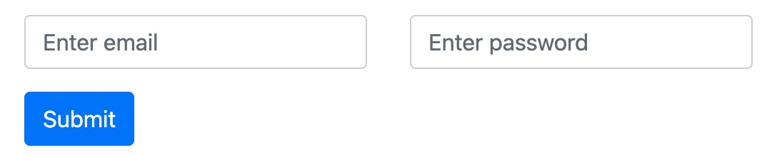
We can also use the.colclass to control the width and alignment of form elements; there is no need to use spacing classes..colForms controlled by the class need to be placed in a.rowcontainer.
The following example displays two columns side by side:
Example
<form>
<div class="row">
<div class="col">
<input type="text" class="form-control" id="email" placeholder="Enter email" name="email">
</div>
<div class="col">
<input type="password" class="form-control" placeholder="Enter password" name="pswd">
</div>
</div>
</form>
Try it Yourself »
Display effect:
If the grid needs to use smaller spacing, you can use .form-row instead of .row:
Example
<form>
<div class="form-row">
<div class="col">
<input type="text" class="form-control" id="email" placeholder="Enter email" name="email">
</div>
<div class="col">
<input type="password" class="form-control" placeholder="Enter password" name="pswd">
</div>
</div>
</form>
Try it Yourself »
Form Validation
We can use different validation classes to set the validation functionality of forms.
.was-validatedor.needs-validationAdd it to the <form> element, and input fields will have a green (valid) or red (invalid) border effect, used to indicate whether the form needs input.
.valid-feedbackor.invalid-feedbackThe class is used to tell users what information is missing, or what needs to be completed before submitting the form.
Example
Use the .was-validated class to display the content that needs to be filled in before the form is submitted:
<form action="" class="was-validated">
<div class="form-group">
<label for="uname">Username:</label>
<input type="text" class="form-control" id="uname" placeholder="Enter username" name="uname" required>
<div class="valid-feedback">Validation successful!</div>
<div class="invalid-feedback">Please enter a username!</div>
</div>
<div class="form-group">
<label for="pwd">Password:</label>
<input type="password" class="form-control" id="pwd" placeholder="Enter password" name="pswd" required>
<div class="valid-feedback">Validation successful!</div>
<div class="invalid-feedback">Please enter a password!</div>
</div>
<div class="form-group form-check">
<label class="form-check-label">
<input class="form-check-input" type="checkbox" name="remember" required>Agree to the terms<div class="valid-feedback">Validation successful!</div>
<div class="invalid-feedback">You must agree to the terms before submitting.</div>
</label>
</div>
<button type="submit" class="btn btn-primary">Submit</button>
</form>
Try it Yourself »
Example
Use .needs-validation; it will validate the missing content after the form is submitted. You need to add some JavaScript code to make the code work properly:
<form action="" class="needs-validation" novalidate>
<div class="form-group">
<label for="uname">Username:</label>
<input type="text" class="form-control" id="uname" placeholder="Enter username" name="uname" required>
<div class="valid-feedback">Validation successful!</div>
<div class="invalid-feedback">Please enter a username!</div>
</div>
<div class="form-group">
<label for="pwd">Password:</label>
<input type="password" class="form-control" id="pwd" placeholder="Enter password" name="pswd" required>
<div class="valid-feedback">Validation successful!</div>
<div class="invalid-feedback">Please enter a password!</div>
</div>
<div class="form-group form-check">
<label class="form-check-label">
<input class="form-check-input" type="checkbox" name="remember" required>Agree to the terms<div class="valid-feedback">Validation successful!</div>
<div class="invalid-feedback">You must agree to the terms before submitting.</div>
</label>
</div>
<button type="submit" class="btn btn-primary">Submit</button>
</form>
<script>// Prevent form submission if validation fails
(function() {
'use strict';
window.addEventListener('load', function() {
// Get form validation styles
var forms = document.getElementsByClassName('needs-validation');
// Loop through and prevent submission
var validation = Array.prototype.filter.call(forms, function(form) {
form.addEventListener('submit', function(event) {
if (form.checkValidity() === false) {
event.preventDefault();
event.stopPropagation();
}
form.classList.add('was-validated');
}, false);
});
}, false);
})();</script>
Try it Yourself » Other Extensions