Bootstrap4 Cards
The Bootstrap 4 Card component is a flexible and powerful content container that can be used to display various types of content, such as text, images, lists, etc.
The Card component is a very common UI element in Bootstrap 4, usually used to display information, blog posts, products, or social media posts, etc.
Basic Structure
The Card component is composed of multiple nested elements, mainly including the following parts:
.card: The outermost container of the card..card-body: A container that holds card content, typically used to place text, titles, or other elements..card-title: The title of the card..card-text: The text content of the card..card-img-topor.card-img-bottom: Used to display an image, placed at the top or bottom of the card.
Style Class Descriptions:
| Class name | Description | Example usage |
|---|---|---|
.card | The card container class, used to create the card frame. | <div class="card">...</div> |
.card-body | A container for card content, used to wrap the main content part of the card. | <div class="card-body">...</div> |
.card-title | The class for the card title, used to define the card title. | <h5 class="card-title">Card Title</h5> |
.card-text | The class for card body text, used to add text to the card. | <p class="card-text">Some quick example text...</p> |
.card-img-top | The image class for the top of the card, usually used to display an image at the top of the card. | <img src="image.jpg.html" class="card-img-top"> |
.card-img-bottom | The image class for the bottom of the card, usually used to display an image at the bottom of the card. | <img src="image.jpg.html" class="card-img-bottom"> |
.card-header | The header of the card, used to place titles, labels, etc. | <div class="card-header">Card Header</div> |
.card-footer | The footer of the card, usually used to place author, date, or copyright information, etc. | <div class="card-footer">Card Footer</div> |
.card-link | Used to create links inside the card, usually used together with other card content. | <a href="../index.html" class="card-link">Card link</a> |
.card-deck | Used to arrange cards horizontally, automatically distributing equal spacing between cards. | <div class="card-deck">...</div> |
.card-columns | Used to create a multi-column card layout, suitable for magazine-style card layouts. | <div class="card-columns">...</div> |
.no-gutters | Removes column gutters from the grid system, used to remove default spacing between cards. | <div class="row no-gutters">...</div> |
.card-group | Groups cards together, and they automatically adjust to the same height. | <div class="card-group">...</div> |
.card-img-overlay | Overlays a content layer on the card image, usually used to display text or other elements. | <div class="card-img-overlay">Overlay content</div> |
.card-subtitle | Card subtitle, used to display extra information below the title. | <h6 class="card-subtitle mb-2 text-muted">Card subtitle</h6> |
Simple Card
We can use Bootstrap4's.cardand.card-bodyclass to create a simple card, the example is as follows:

Bootstrap4 cards are similar to panels, image thumbnails, and wells in Bootstrap 3.
Header and Footer
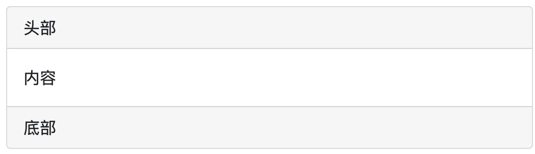
.card-headerclass is used to create the card header style,.card-footerclass is used to create the card footer style:
Example
Try it yourself »
Colored Cards
Bootstrap 4 provides multiple card background color classes:.bg-primary, .bg-success, .bg-info, .bg-warning, .bg-danger, .bg-secondary, .bg-darkand.bg-light。
Example
Try it yourself »
Title, Text, and Links
On the header element, we can use the.card-titleclass to set the card title..card-textclass is used to set the content of the card body..card-linkclass is used to set the color for links.
Example
Try it yourself »
Image Cards
We can <img>add.card-img-top(image above text) or.card-img-bottom(image below text) to create an image card:
Example
Try it yourself »
If you want to set the image as the background, you can use the.card-img-overlayclass:
Example
Try it yourself »
Horizontal Cards
By combining grids and utility classes, you can arrange cards horizontally in a way that responds adaptively to mobile devices.
In the following example, we use.no-guttersremove the grid spacing, and use the.col-md-*class at themdscreen breakpoint to set the cards in a horizontal layout.
Example
<div class="row no-gutters">
<div class="col-md-4">
<img src="..." class="card-img" alt="...">
</div>
<div class="col-md-8">
<div class="card-body">
<h5 class="card-title">Card title</h5>
<p class="card-text">This is a wider card with supporting text below as a natural lead-in to additional content. This content is a little bit longer.</p>
<p class="card-text"><small class="text-muted">Last updated 3 mins ago</small></p>
</div>
</div>
</div>
</div>
Try it Yourself »