Tailwind CSS Layout Classes
Tailwind CSS provides a rich set of layout-related classes that allow developers to control every aspect of a page with great flexibility.
Next, we will explain in detail some key layout-related classes.
1. Aspect Ratio
The Aspect Ratio classes help you set the aspect ratio of an element, preventing it from stretching or compressing in responsive design.
Main classes:
| Class name | CSS properties and values | Description |
|---|---|---|
aspect-auto | aspect-ratio: auto; | This class keeps the element's natural aspect ratio without any forced adjustments. It is suitable when you want the element to automatically size according to its content, rather than being forced to fill or shrink to a specific aspect ratio. |
aspect-square | aspect-ratio: 1 / 1; | This class forces the element's aspect ratio to 1:1, meaning the width and height are equal, commonly used to create square or circular elements. |
aspect-video | aspect-ratio: 16 / 9; | This class forces the element's aspect ratio to 16:9, a common video aspect ratio, suitable for elements that need to display videos or simulate a video player. |
Example
<div class="aspect-ratio">
<img src="video.jpg" alt="Video" class="object-cover">
</div>
Try it Yourself »
2. Container
The Container class makes container elements responsive to different screen sizes, commonly used to set the maximum width of content.
Main classes:
container: Makes the element a responsive container.mx-auto: Centers the container horizontally.
| Class name | CSS properties and values | Description |
|---|---|---|
container |
width: 100%; |
The container width is 100% by default, occupying the entire width of the parent element. |
sm:container |
max-width: 640px; |
When the screen width is >= 640px, the container's max-width is 640px. |
md:container |
max-width: 768px; |
When the screen width is >= 768px, the container's max-width is 768px. |
lg:container |
max-width: 1024px; |
When the screen width is >= 1024px, the container's max-width is 1024px. |
xl:container |
max-width: 1280px; |
When the screen width is >= 1280px, the container's max-width is 1280px. |
2xl:container |
max-width: 1536px; |
When the screen width is >= 1536px, the container's max-width is 1536px. |
When using these classes, you can create containers with responsive maximum widths, which is very useful when creating layouts, especially when you want to limit the width of content to improve readability.
Example
<!-- Content -->
</div>
<div class="lg:container mx-auto">
<!-- Content with a max width of 1024px on large screens -->
</div>
In these examples, the first<div>will always occupy 100% of the width, while the second<div>on large screens (lg) and above, its maximum width will be limited to 1024px.mx-autoThe class is used to center the container horizontally.
3. Columns
The Columns classes are used to implement multi-column layouts.
You can control the number of columns and the spacing between columns.
Main classes:
columns-{n}: Sets the number of columns.space-x-{size}: Sets the spacing between columns.
| Class name | CSS properties and values | Description |
|---|---|---|
columns-1 | columns: 1; | Sets the number of columns on the element to 1. |
columns-2 | columns: 2; | Sets the number of columns on the element to 2. |
columns-3 | columns: 3; | Sets the number of columns on the element to 3. |
columns-4 | columns: 4; | Sets the number of columns on the element to 4. |
columns-5 | columns: 5; | Sets the number of columns on the element to 5. |
columns-6 | columns: 6; | Sets the number of columns on the element to 6. |
columns-7 | columns: 7; | Sets the number of columns on the element to 7. |
columns-8 | columns: 8; | Sets the number of columns on the element to 8. |
columns-9 | columns: 9; | Sets the number of columns on the element to 9. |
columns-10 | columns: 10; | Sets the number of columns on the element to 10. |
columns-11 | columns: 11; | Sets the number of columns on the element to 11. |
columns-12 | columns: 12; | Sets the number of columns on the element to 12. |
columns-auto | columns: auto; | Sets the number of columns on the element to auto, automatically adjusting the column width based on the content. |
columns-3xs | columns: 16rem; /* 256px */ | Sets the column width of the element to 16rem (256px). |
columns-2xs | columns: 18rem; /* 288px */ | Sets the column width of the element to 18rem (288px). |
columns-xs | columns: 20rem; /* 320px */ | Sets the column width of the element to 20rem (320px). |
columns-sm | columns: 24rem; /* 384px */ | Sets the column width of the element to 24rem (384px). |
columns-md | columns: 28rem; /* 448px */ | Sets the column width of the element to 28rem (448px). |
columns-lg | columns: 32rem; /* 512px */ | Sets the column width of the element to 32rem (512px). |
columns-xl | columns: 36rem; /* 576px */ | Sets the column width of the element to 36rem (576px). |
columns-2xl | columns: 42rem; /* 672px */ | Sets the column width of the element to 42rem (672px). |
columns-3xl | columns: 48rem; /* 768px */ | Sets the column width of the element to 48rem (768px). |
columns-4xl | columns: 56rem; /* 896px */ | Sets the column width of the element to 56rem (896px). |
columns-5xl | `columns: 64rem; /* |
Example
<div class="columns-3 space-x-4">
<p>Column 1</p>
<p>Column 2</p>
<p>Column 3</p>
</div>
Try it Yourself »
4. Pagination
The following classes help developers better control the pagination and column layout of documents, to improve the readability and aesthetics of print output.
Main classes:
break-after-{value}: Controls the behavior after a page/column break.break-before-{value}: Controls the behavior before a page/column break.break-inside-{value}: Controls the behavior of breaks inside an element.
| Class name | CSS properties and values | Description |
|---|---|---|
break-after-auto | break-after: auto; | Allows content to break naturally after this element. |
break-after-avoid | break-after: avoid; | Avoid breaking after this element as much as possible. |
break-after-all | break-after: all; | Force a break after this element, even if it is not a natural place for a break. |
break-after-avoid-page | break-after: avoid-page; | Avoid breaking to a new page after this element as much as possible, but allow breaking to a new column. |
break-after-page | break-after: page; | Force a new page after this element, but do not allow a new column. |
break-after-left | break-after: left; | Force a break after this element, preferring a left page. |
break-after-right | break-after: right; | Force a break after this element, preferring a right page. |
break-after-column | break-after: column; | Force a new column after this element, but do not allow a new page. |
The above classes are used to control the pagination or column-break behavior of content in print or multi-column layouts:
- break-after-autoAllows the browser to decide whether to break after the element.
- break-after-avoidTells the browser to avoid breaking after the element as much as possible.
| Class name | CSS properties and values | Description |
|---|---|---|
break-before-auto | break-before: auto; | Allows content to break naturally before this element. |
break-before-avoid | break-before: avoid; | Avoid breaking before this element as much as possible. |
break-before-all | break-before: all; | Force a break before this element, even if it is not a natural place for a break. |
break-before-avoid-page | break-before: avoid-page; | Avoid breaking to a new page before this element as much as possible, but allow breaking to a new column. |
break-before-page | break-before: page; | Force a new page before this element, but do not allow a new column. |
break-before-left | break-before: left; | Force a break before this element, preferring a left page. |
break-before-right | break-before: right; | Force a break before this element, preferring a right page. |
break-before-column | break-before: column; | Force a new column before this element, but do not allow a new page. |
The above classes are used to control the pagination or column-break behavior of content in print or multi-column layouts.
- break-before-autoAllows the browser to decide whether to break before the element.
- break-before-avoidTells the browser to avoid breaking before the element as much as possible.
| Class name | CSS properties and values | Description |
|---|---|---|
break-inside-auto | break-inside: auto; | Allows content to break naturally inside this element. |
break-inside-avoid | break-inside: avoid; | Avoid breaking inside this element as much as possible. |
break-inside-avoid-page | break-inside: avoid-page; | Avoid breaking to a new page inside this element as much as possible, but allow breaking to a new column. |
break-inside-avoid-column | break-inside: avoid-column; | Avoid breaking to a new column inside this element as much as possible, but allow breaking to a new page. |
The above classes are used to control whether content is allowed to break inside an element in print or multi-column layouts.
- break-inside-autoAllows the browser to decide whether to break inside the element.
- break-inside-avoidTells the browser to avoid breaking inside the element as much as possible.
Example
<p>Well, let me tell you something, ...</p>
<p class="break-after-column">Of course, let's continue with our content...</p>
<p>Maybe we can...</p>
<p>If you think this is...</p>
</div>
In this example,<div>the element is set to a two-column layout (columns-2), which contains four<p>paragraphs. The second<p>paragraph has abreak-after-columnclass, which forces a column break after that paragraph but does not allow a page break. This means that if there is enough content, the content after the second paragraph will start a new column, rather than continuing on the next line of the same column. The other paragraphs have no special column-breaking directives, so they will flow naturally according to their content.
5. Text Break
The following are the utility classes in Tailwind CSS used to control how element fragments are rendered across multiple lines, columns, or pages, along with their corresponding CSS properties:
| Class name | CSS property and value | Description |
|---|---|---|
box-decoration-clone | box-decoration-break: clone; | Specifies that when a box is split into multiple boxes (for example, at column or page boundaries), each box should clone the original box's decorations (borders, backgrounds, etc.). |
box-decoration-slice | box-decoration-break: slice; | Specifies that when a box is split into multiple boxes, each box should "slice" the original box's decorations so that the decorations are displayed continuously across each box. |
The above classes are used to control how an element's decorations (such as borders and backgrounds) behave in multi-column layouts or when paginated.
- box-decoration-cloneCauses each box fragment to display the complete decoration.
- box-decoration-slice"Slices" the decoration at the point where the box is split, keeping the decoration visually continuous.
These utility classes help developers better control the visual appearance of elements in complex layouts.
Example
Hello<br />
World
</span>
<span class="box-decoration-clone bg-gradient-to-r from-indigo-600 to-pink-500 text-white px-2 ...">
Hello<br />
World
</span>
Try it »
6. Box Sizing
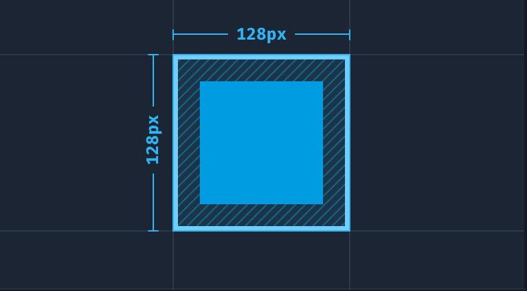
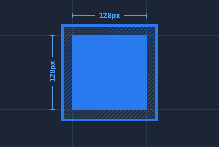
Tailwind CSS provides two utility classes to control an element's box model (box-sizing):
box-border: Calculates the element's total size including padding and borders.box-content: Calculates the element's size excluding padding and borders.
1、box-border
CSS property:
box-sizing: border-box;
Use the box-border utility class to set the element's box-sizing property to border-box. This means that when you specify a height or width for the element, the browser includes the element's borders and padding within that size.
If an element's size is 100px × 100px, with a 2px border and 4px padding, the total rendered size of the element will be 112px × 112px.
Example
<!-- ... -->
</div>
2、box-content
CSS property:
box-sizing: content-box;
Use the box-content utility class to set the element's box-sizing property to content-box. This means the browser adds borders and padding on top of the element's specified width or height.
If an element's size is 100px × 100px, with a 2px border and 4px padding, the element's actual rendered size will be 112px × 112px, with an inner content area of 100px × 100px.
display property
The display property is used to control the display type of an element, determining how the element is shown on the page.
| Tailwind class name | CSS property and value | Description |
|---|---|---|
block | display: block; | Displays the element as a block-level element, which occupies its own line. |
inline-block | display: inline-block; | Displays the element as an inline-block element, which can appear inline while having its own width and height. |
inline | display: inline; | Displays the element as an inline element, which appears side by side with other inline elements. |
flex | display: flex; | Displays the element as a flex container, allowing the use of Flexbox layout. |
inline-flex | display: inline-flex; | Displays the element as an inline flex container, allowing the use of Flexbox layout. |
table | display: table; | Displays the element as a table element. |
inline-table | display: inline-table; | Displays the element as an inline table element. |
table-caption | display: table-caption; | Displays the element as a table caption. |
table-cell | display: table-cell; | Displays the element as a table cell. |
table-column | display: table-column; | Displays the element as a table column. |
table-column-group | display: table-column-group; | Displays the element as a table column group. |
table-footer-group | display: table-footer-group; | Displays the element as a table footer group. |
table-header-group | display: table-header-group; | Displays the element as a table header group. |
table-row-group | display: table-row-group; | Displays the element as a table row group. |
table-row | display: table-row; | Displays the element as a table row. |
flow-root | display: flow-root; | Displays the element as a flow-root element, which establishes a BFC (block formatting context). |
grid | display: grid; | Displays the element as a grid container, allowing the use of CSS Grid layout. |
inline-grid | display: inline-grid; | Displays the element as an inline grid container, allowing the use of CSS Grid layout. |
contents | display: contents; | Removes the element's box model so that its child elements are displayed directly in its place. |
list-item | display: list-item; | Displays the element as a list item. |
hidden | display: none; | Hides the element so that it is not displayed on the page. |
Example
<div class="mx-auto max-w-xs bg-white shadow-xl p-4 text-slate-500 text-sm leading-6 sm:text-base sm:leading-7 dark:bg-slate-800 dark:text-slate-400">
When controlling text flow, use the CSS property
<span class="inline bg-sky-100 font-bold text-sm text-slate-900 font-mono rounded dark:bg-slate-600 dark:text-slate-200">display: inline</span>
will make the text within the element wrap normally.
<br>
<br>
And using the property<span class="inline-block bg-sky-100 font-bold text-sm text-slate-900 font-mono rounded dark:bg-slate-600 dark:text-slate-200">display: inline-block</span>
will wrap the element, preventing its internal text from expanding beyond its parent element.
<br>
<br>
Finally, using the property<span class="block bg-sky-100 font-bold text-sm text-slate-900 font-mono rounded dark:bg-slate-600 dark:text-slate-200">display: block</span>
will make the element occupy its own line and fill its parent element.
</div>
</div>
Try it »
Use the table, table-row, table-cell, table-caption, table-column, table-column-group, table-header-group, table-row-group, and table-footer-group utility classes to create elements that behave like their corresponding table elements.
Example
<div class="table-header-group ...">
<div class="table-row">
<div class="table-cell text-left ...">Song</div>
<div class="table-cell text-left ...">Artist</div>
<div class="table-cell text-left ...">Year</div>
</div>
</div>
<div class="table-row-group">
<div class="table-row">
<div class="table-cell ...">The Sliding Mr. Bones (Next Stop, Pottersville)</div>
<div class="table-cell ...">Malcolm Lockyer</div>
<div class="table-cell ...">1961</div>
</div>
<div class="table-row">
<div class="table-cell ...">Witchy Woman</div>
<div class="table-cell ...">The Eagles</div>
<div class="table-cell ...">1972</div>
</div>
<div class="table-row">
<div class="table-cell ...">Shining Star</div>
<div class="table-cell ...">Earth, Wind, and Fire</div>
<div class="table-cell ...">1975</div>
</div>
</div>
</div>
Try it »
Float
float-*Controls the floating position of an element, often used for wrapping text around it.
Main classes:
| Tailwind class name | CSS property and value | Description |
|---|---|---|
float-start | float: inline-start; | Floats the element to the start of its containing block. In LTR (left-to-right) languages, this is usually the left; in RTL (right-to-left) languages, this is usually the right. |
float-end | float: inline-end; | Floats the element to the end of its containing block. In LTR (left-to-right) languages, this is usually the right; in RTL (right-to-left) languages, this is usually the left. |
float-right | float: right; | Floats the element to the right of its containing block. |
float-left | float: left; | Floats the element to the left of its containing block. |
float-none | float: none; | Prevents the element from floating, keeping it in the normal document flow. |
Example
<div class="float-right ml-6">
<div class="relative aspect-w-4 aspect-h-5 sm:aspect-w-16 sm:aspect-h-9 w-20 sm:w-44">
<img class="object-cover rounded-lg" src="https://static.jyshare.com/images/demo/demo2.jpg">
<div class="absolute inset-0 ring-1 ring-inset ring-black/10 rounded-lg"></div>
</div>
</div>
Try it »
Clear Float
The utility classes in Tailwind CSS for controlling how an element clears floats, along with their corresponding CSS properties:
| Class name | CSS property and value | Description |
|---|---|---|
clear-start | clear: inline-start; | Clears floating elements on the start side of the element. In LTR (left-to-right) languages, this is usually the left; in RTL (right-to-left) languages, this is usually the right. |
clear-end | clear: inline-end; | Clears floating elements on the end side of the element. In LTR (left-to-right) languages, this is usually the right; in RTL (right-to-left) languages, this is usually the left. |
clear-left | clear: left; | Clears floating elements on the left side of the element. |
clear-right | clear: right; | Clears floating elements on the right side of the element. |
clear-both | clear: both; | Clears floating elements on both sides of the element. |
clear-none | clear: none; | Does not clear any floating elements, allowing floating elements to follow the element. |
Example
<img class="float-left ..." src="path/to/image.jpg">
<img class="float-right ..." src="path/to/image.jpg">
<p class="clear-left ...">Test text content...</p>
</article>
Try it »
isolate
The following are the utility classes used to control stacking contexts| Tailwind class name | CSS property and value | Description |
|---|---|---|
isolate | isolation: isolate; | The element will create a new stacking context, meaning that its descendant elements will not overlap with outside elements, even if they have a higherz-indexvalue. |
isolation-auto | isolation: auto; | The element's stacking context will be determined by the user agent, usually the same as when noisolationisolation property is set, and descendant elements may overlap with outside elements. |
These utility classes allow developers to control the stacking context behavior of an element, thereby affecting how the element and its descendants participate in stacking order.
The isolate class helps create an isolated environment in which the element's stacking order is not affected by outside elements, while isolation-auto allows the browser to handle the stacking context according to default rules.
Use the isolate and isolation-auto utility classes to control whether an element should explicitly create a new stacking context.
Example
<!-- ... -->
</div>
object-fit
The following are the utility classes used to control how replaced element content is scaled, along with their corresponding CSS properties:
| Class name | CSS property and value | Description |
|---|---|---|
object-contain | object-fit: contain; | Preserves the element's aspect ratio and resizes it to fit entirely within the container, possibly leaving empty space inside the container. |
object-cover | object-fit: cover; | Preserves the element's aspect ratio and resizes it to completely cover the container, possibly cropping out some parts of the element. |
object-fill | object-fit: fill; | Ignores the element's aspect ratio and stretches or compresses it to completely fill the container. |
object-none | object-fit: none; | Keeps the element's original size without scaling. |
object-scale-down | object-fit: scale-down; | Preserves the element's aspect ratio, similar tocontainsimilar, but chooses the smaller size to fit the container, leaving no empty space. |
Use object-cover to size the element's content to cover its container:
Other extensions