With the rise of the mobile Internet, the term "mobile thinking" has been mentioned more and more often. People often ask me what mobile thinking is. In fact, this term is relative to WEB thinking.
Here is a summary:

Differences in physical devices lead to differences in usage methods and usage habits. (Thinking refers to designers of mobile products, while for users it is usage habits.)
Let's use a squat toilet and a sitting toilet as analogies for WEB thinking and mobile thinking respectively:

Using WEB thinking to develop mobile:

Using mobile thinking to transform WEB:

Actually, no matter what kind of thinking it is, as long as the product is convenient for users to use and conforms to their usage habits, it is fine. WEB thinking can be considered the father of mobile thinking, but it cannot be transplanted entirely to mobile; it still needs to be adapted based on the characteristics of mobile.
Now let's explore some differences between Web and mobile:
I. Physical differences
Physical differences include differences in size and differences in functionality.
1. Differences in size
A PC can present more content on one screen than a smartphone, even though smartphones are getting bigger and bigger. The difference in screen size leads to differences in layout design between WEB and mobile.

At the same time, the interaction methods of WEB and mobile devices are different.
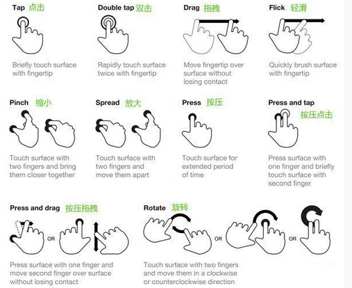
The types of gestures are more numerous than the types of mouse operations. By leveraging the characteristics of gestures, many interesting and novel interactions can be created.
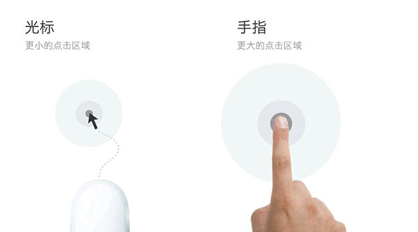
But the tap area of a finger is larger than that of a cursor.
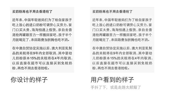
Moreover, due to the "harshness" of mobile scenarios, content and fonts on the mobile side should be made as large and recognizable as possible. Because your users may be on a crowded bus or subway, or may be walking while using their phones.
2. Differences in functionality
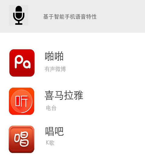
Compared with traditional PCs, smartphones are lightweight and portable, and come with various sensors. Many applications have been developed based on the unique characteristics of smartphones:

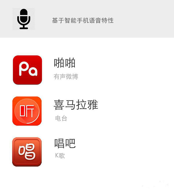
There are also flashlight apps based on the front-facing flash feature, and drawing apps based on the touchscreen feature. Others include functions like shake and scan, which are difficult to implement on traditional PCs.
Therefore, when creating mobile products, you should make full use of the characteristics of smartphones.
II. Differences in user usage habits
The differences in mobile thinking are concentrated in this stage. The physical differences of devices lead to differences in user usage habits, so the thinking of product designers needs to undergo a transformation at this stage.
Let's first analyze the evolution of the following products.
- Blog → Weibo → Instagram

It can be seen that from PC to mobile, products have become lighter and thinner.

Why does this change happen?

Because in mobile scenarios, the user's IQ is very low! They may even be illiterate!
On the WEB side, users devote most of their attention and energy to the PC. In mobile scenarios, however, users only allocate a small amount of attention to your application. For example, you might read a news APP on a crowded morning subway; you have to constantly pay attention to the people around you and whether the train has arrived at your stop, so the attention you allocate to your APP is actually very little.
So now you should know what mobile thinking is:
Design products for the low-IQ!