CSS Grid Container
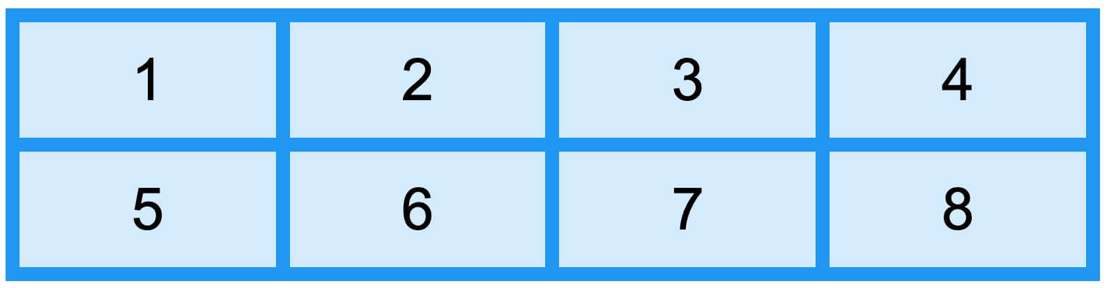
Grid Container
To make an HTML element a grid container, you can setdisplayProperty set togridorinline-grid。
Grid items composed of columns and rows are placed inside the grid container.
grid-template-columns property
The grid-template-columns property defines the number of columns in the grid layout, and it can also set the width of each column.
The property value is a space-separated list, where each value defines the width of the corresponding column.
If you want the grid layout to contain 4 columns, you need to set the widths of the 4 columns. If all columns have the same width, you can set it toauto。
The following example sets up a grid layout with 4 columns:
Example
Try it Yourself »
Note:If you have more than 4 grid items in a 4-column grid, the grid layout will generate a new row to place that item.
grid-template-columnsThe property can also be used to specify the width of columns.
Example
Try it Yourself »
grid-template-rows property
The grid-template-rows property sets the height of each row.
The property value is a space-separated list, where each value defines the height of the corresponding row:
justify-content property
The justify-content property is used to align the grid within the container, specifying how to allocate space between and around the items along the flex container's main axis (or the grid row axis).
Note:The total width of the grid must be less than the width of the container for the justify-content property to take effect.
justify-contentFor detailed content, refer to:CSS justify-content property
align-content property
align-contentThe property is used to set how grid items are aligned vertically within the container.
Note:The total height of the grid items must be less than the height of the container for the align-content property to take effect.
Example
Try it Yourself »
Example
Try it Yourself »
Example
Try it Yourself »