CSS Grid Layout
A grid is a set of intersecting horizontal and vertical lines that define the columns and rows of the grid.
CSS provides a grid-based layout system with rows and columns, making it easier to design web pages without having to use floats and positioning.
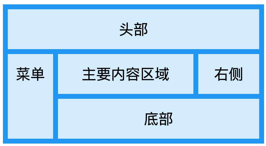
The following is a simple web page layout that uses grid layout, containing six columns and three rows:
Browser Support
Currently, the latest browser versions all support grid layout.
| 57.0 | 16.0 | 52.0 | 10 | 44 |
Grid Element
Grid layout consists of a parent element and one or more child elements.
Example
Try it Yourself »
display property
When an HTML element sets its display property to grid or inline-grid, it becomes a grid container, and all direct child elements of this element become grid items.
Grid Track
We pass throughgrid-template-columnsandgrid-template-rowsProperties to define columns and rows in the grid.
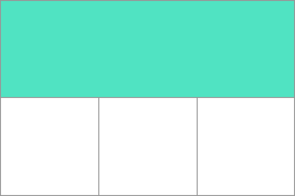
These properties define the tracks of the grid. A grid track is the space between any two lines in the grid.
In the image below, you can see a track with a green box — the first row track of the grid. The second row has three white box tracks.
In the following example, we usegrid-template-columnsProperty creates four columns in the grid container:
Example
Try it Yourself »
In the following example, we usegrid-template-rowsThe property sets the height of rows in the grid container:
fr unit
Tracks can be defined using any length unit.
The grid introducesfrUnits to help us create flexible grid tracks. One fr unit represents one equal share of the available space in the grid container.
The following example defines a grid definition that will create three equal-width tracks, which grow and shrink with the available space.
Grid Cell
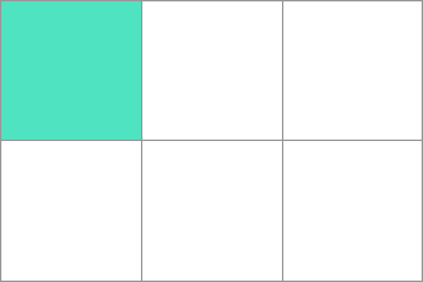
A grid cell is the smallest unit within a grid element, conceptually similar to a cell in a table. Now looking back at our earlier example, once a grid element is defined within a parent element, its child elements will be arranged in each predefined grid cell. In the image below, I will highlight the first grid cell.
Grid Area
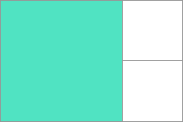
Grid items can extend one or more cells in the row or column direction and create a grid area. The shape of a grid area should be a rectangle - that is, you cannot create a grid area shaped like an "L". The highlighted grid area in the image below extends across 2 columns and 2 rows.
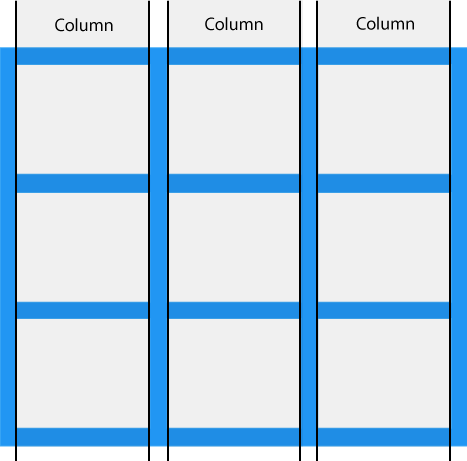
grid columns
The vertical direction of grid items is called a column.
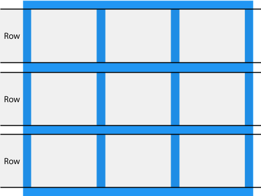
grid row
The horizontal direction of grid items is called a row.
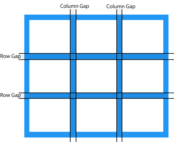
Grid Gap
Grid gap (Column Gap) refers to the horizontal or vertical spacing between two grid cells.
You can use the following properties to adjust the gap size:
- grid-column-gap
- grid-row-gap
- grid-gap
The following example usesgrid-column-gapProperty to set the grid gap between columns:
The following example usesgrid-row-gapProperty to set the grid gap between rows:
grid-gapThe property is a shorthand for the `grid-row-gap` and `grid-column-gap` properties:
grid-gapThe property can set both row spacing and column spacing:
grid line
The intersections between columns and between rows are called grid lines.
Grid creates numbered grid lines for us to position each grid item.
For example, in the grid below with three columns and two rows, there are four vertical grid lines (marked by gray circles) and three horizontal grid lines (marked by black circles).
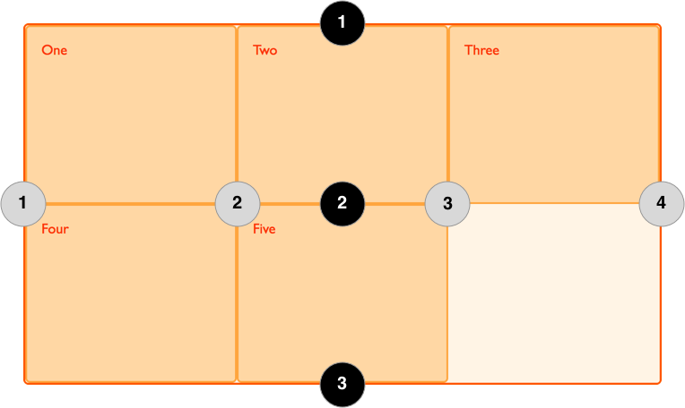
Grid items can refer to these line numbers when positioned.
The image below defines four vertical grid lines and four horizontal grid lines:
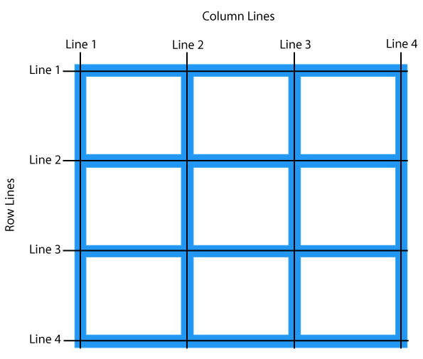
The numbering order of grid lines depends on the writing mode of the document. In languages written from left to right, grid line number 1 is on the far left. In languages written from right to left, grid line number 1 is on the far right.
Next, I used the `grid-column-start`, `grid-column-end`, `grid-row-start`, and `grid-row-end` properties to demonstrate how to use grid lines.
In the following example, we set a grid element's grid lines to start at the first column and end at the third column:
In the following example, we set a grid element's grid lines to start at the first row and end at the third row:
CSS Grid Properties
| Property | Description |
|---|---|
| column-gap | Specifies the gap between columns |
| gap | row-gapandcolumn-gapThe shorthand property of |
| grid | grid-template-rows, grid-template-columns, grid-template-areas, grid-auto-rows, grid-auto-columns, andgrid-auto-flowThe shorthand property of |
| grid-area | Specify the name of the grid element, or it can also begrid-row-start, grid-column-start, grid-row-end, andgrid-column-endThe shorthand property of |
| grid-auto-columns | Refers to the default column size |
| grid-auto-flow | Specify how the auto-placement algorithm works, precisely specifying how items that are automatically placed in the grid are arranged. |
| grid-auto-rows | Refers to the default row size |
| grid-column | grid-column-startandgrid-column-endThe shorthand property of |
| grid-column-end | Specifies the end position of the grid element's column |
| grid-column-gap | Specifies the gap size of the grid item |
| grid-column-start | Specifies the start position of the grid element's column |
| grid-gap | grid-row-gapandgrid-column-gapThe shorthand property of |
| grid-row | grid-row-startandgrid-row-endThe shorthand property of |
| grid-row-end | Specifies the end position of the grid element's row |
| grid-row-gap | Specifies the row gap of the grid item |
| grid-row-start | Specifies the start position of the grid element's row |
| grid-template | grid-template-rows, grid-template-columnsandgrid-areasThe shorthand property of |
| grid-template-areas | Specify how rows and columns are displayed, using named grid items. |
| grid-template-columns | Specify the size of the columns, as well as the number of columns set in the grid layout. |
| grid-template-rows | Specifies the size of rows in the grid layout |
| row-gap | Specifies the gap between two rows |
other extensionsNext, we can useCSS Grid Layout Mini-Gameto test what we've learned.