CSS Grid Elements
CSS Grid Elements
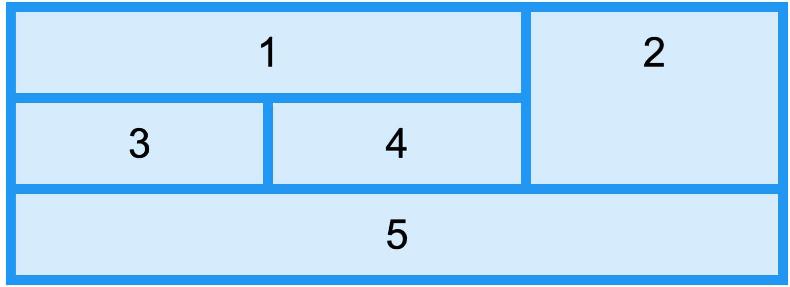
The grid container contains one or more grid items.
By default, each column and row of the grid container has one grid item. We can also set grid items to span multiple columns or rows; rows and columns have line numbers.
grid-column Property
The grid-column property defines the start and end positions of a grid item's columns.
Note:grid-column is a shorthand property for the grid-column-start and grid-column-end properties.
We can set grid items by referencing line numbers, or use the keyword "span" to define the number of columns the item will span.
The following example sets "item1" to start at column 1 and end before column 5:
The following example sets "item1" to span 3 columns:
The following example sets "item2" to span 3 columns:
grid-row property
The grid-row property defines the start and end positions of a grid item's rows.
Note:grid-row is the shorthand property for the grid-row-start and grid-row-end properties.
We can set grid items by referencing line numbers, or use the keyword "span" to define the number of rows the item will span.
The following example sets "item1" to start at row 1 and end before row 4:
The following example sets "item1" to span two rows:
grid-area property
grid-area propertyYes grid-row-start, grid-column-start, grid-row-end And grid-column-end PropertyofAbbreviation。
The following example sets "item8" to start at row 1 and column 2, and end at row 5 and column 6.
The following example sets "item8" to start at row 2 and column 1, and span 2 rows and 3 columns.
Grid element naming
The grid-area property can be used to name grid items.
Named grid items can be referenced through the container's grid-template-areas property.
The following example names item1 "myArea" and spans five columns:
Example
Try it Yourself »
Each row is enclosed in single quotes' 'Define, separated by spaces.
.A number represents a grid item without a name.
Example
Try it Yourself »
To define two rows, place them in another set of single quotes.' 'Defines the columns of the second row.
The following example sets "item1" to span 2 rows and 2 columns:
Example
Try it Yourself »
Name all grid items and create a webpage template:
Example
Try it Yourself »
Order of grid elements
Grid layout allows us to place grid items anywhere we like.
The first element in the HTML code does not necessarily have to appear as the first item in the grid.
Example
Try it Yourself »
You can use media queries to rearrange the order at specified screen sizes.
Example
Try it Yourself »