Every year, web design is advancing rapidly, with new designs appearing almost every day. I can imagine that 2015 will see the best websites, including many trends already predicted in 2014. As these trends become a reality around 2015, now is the time for us to predict the new trends that may emerge in 2015. Everyone is reflecting on 2014 and looking forward to 2015. Let's take a look at the web design trends that might appear in 2015.
Scrolling Navigation Is Becoming More Popular
Most new websites today tend to have longer pages and navigate by scrolling. As mobile devices become increasingly popular, scrolling through content on a display is becoming more common, replacing clicking, especially on the device's home page. For users, getting information by scrolling is clearly simpler than constantly clicking buttons.
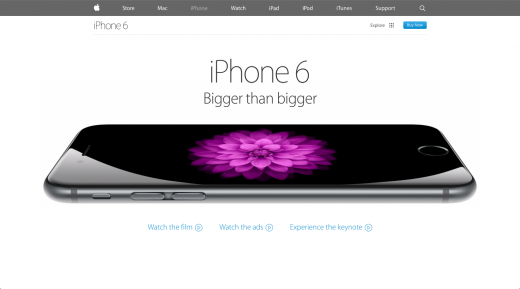
The homepage is not the only place where scrolling navigation is becoming increasingly popular. As extremely long scrolling websites (i.e., one-page sites) become more popular, the benefits of scrolling are growing, and this pattern has begun to appear in many places beyond the homepage, such as about pages and product pages, all of which have become simple ways to display various content. For example, Apple's iPhone 6 website uses scrolling navigation in many sections to showcase the product's various features and performance. In addition, the iPhone 6 website also adds smooth animations to make the scrolling experience visually more attractive.
Storytelling + Interaction
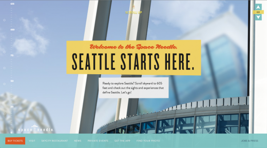
For a website, having amazing content is always critical, and using that content to tell a story is a major advantage. Web design in 2015 will likely focus on how to tell stories to users. For example, the Space Needle (the iconic landmark in Seattle, USA) website is very beautiful, introducing facts about the Space Needle through storytelling, supported by a scrolling design. Space Needle also demonstrates another trend in 2015 — interaction. Web design is adding more interactive and animated elements to help present content in unique and engaging ways. Adding interactivity and animation to web design can bring an element of surprise to your website. For instance, the Impossible Bureau website is highly interactive and responds to your scrolling and hovering.
Absence of Hero Background Images
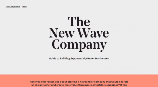
In the past few years, hero background images have been very popular in web design, often with text captions on top, and they are the first thing most visitors see when browsing a website. With hero background images being so popular, how can your website stand out? Take the opposite approach. Some websites that have appeared recently are going against the trend by not using hero background images. I guess they are doing this not only because they don't want to follow the trend, but also because they are seeking to improve their website's performance and speed. The New Wave Company website embodies these characteristics. It welcomes visitors with a large title, with big text centered on the page, but there is no large background image behind the title. This is an elegant approach and is no less effective than other popular website designs that use large background images.
Remove Unnecessary Design Elements
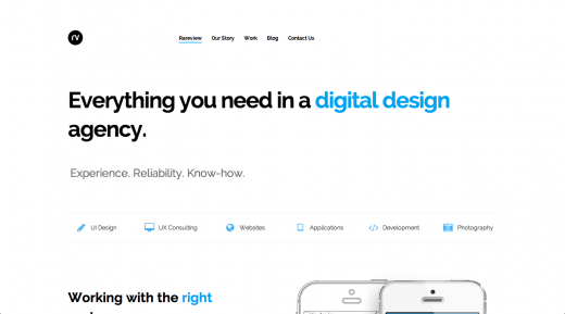
There is a design philosophy that a website design is complete when all non-essential elements have been removed. In 2015, I think we will see this philosophy better reflected, as more websites are trying to simplify their design by removing unnecessary design elements. The removal of large background images on the New Wave Company website is one of the best examples. Another great example of removing unnecessary design elements to ensure a clean website is the Rareview Digital Agency website, which also does not use large background image headers to greet visitors. Designers have actually eliminated many design elements that are popular on current websites, such as background colors, numerous images, and complex layouts. Instead, they choose a clearer, simpler website design that stands out among current websites that focus on design, images, and colors.
Fixed-Width Centered Website Layout
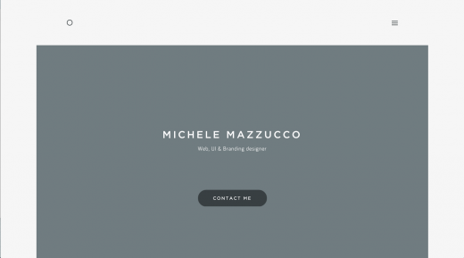
In the past few years, most websites have used a full-width layout that allows images or visual extensions to be fully displayed across the entire browser viewport. Before this trend became popular, most websites were fixed-width, with content centered on the page, and you could see the edges of the site on both sides. The fixed-width trend seems to be making a comeback in a more modern way, except that the website and its content are no longer at the edges of the viewport; some websites choose a maximum width to ensure their content remains centered in the viewport. This is the case with Michele Mazzucco's website.
Professional High-Quality Custom Photography
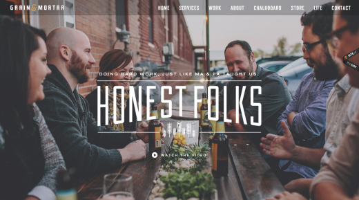
Stock photos still have a place in design, but for most of the latest websites, stock photos are being replaced by high-quality professional photography, usually unique and custom-shot for the website. Using custom photography is a greater step forward in design than merely selecting stock photos; it makes your website unique, and other websites cannot use the same photos. For example, the custom photos on the Grain and Mortar website are used in its hero section, which gives a personalized effect because the people and office scenes in the photos are real at Grain and Mortar; after all, there are no stock photos of fake office spaces!
Pop-Up/Slide-Out App-Style Menus
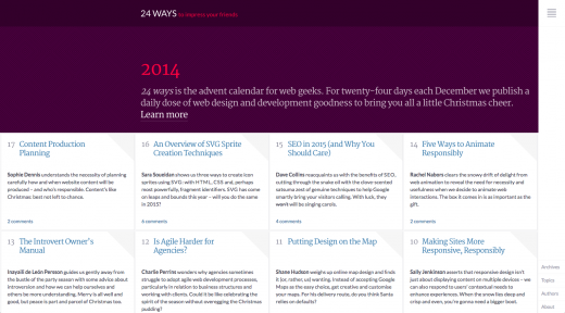
Responsive web design has been popular for a while, but until recently, most web design focused on making websites look better on desktop devices, while merely acceptable on phones or tablets. Regardless of device, responsive web design is moving toward a better experience. We are seeing this design element shift to mobile devices and be used more broadly. For example, 24ways and Rawnet both demonstrate this concept by adding app-like responsive menus to the entire website, not just devices with smaller viewports. In this case, these two sites choose vertical menus aligned left or right, rather than a horizontal menu at the top, making them behave more like pop-up/slide-out app menus. This technique allows web apps and responsive design to be used on smaller viewports.
Hidden Main Menu
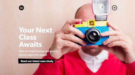
This is very similar to the pop-up/slide-out app menus discussed above. I expect more websites may hide the main menu from first-time visitors. These hidden menus are only revealed when the visitor is ready to move and click the corresponding icon. This responsive design technique is beginning to appear in website design, not just in smaller viewports. Brian Hoff Design's new website is the best example. He uses the hamburger icon in the top right corner of the website to hide navigation until the visitor clicks it. Over the past two years, this behavior has gradually been accepted, and visitors are used to doing this on web apps or mobile apps. He applies this pattern to his website, which helps ensure the site is simple and fully functional regardless of viewport size.
Very Large Fonts
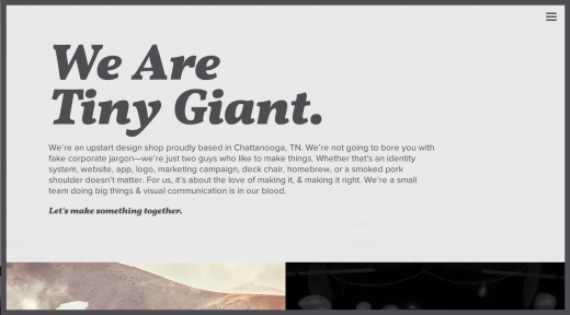
In 2014, typography played an important role in many website designs, and I see no sign of this trend changing in the short term. But in 2015, I see headings and fonts on websites getting bigger and bigger. To exaggerate, even planes in the sky might be able to see the type on the ground. When you visit Tiny Giant's website, you'll see very large fonts. This is essentially a statement that is hard to miss. Large typography will continue to play an important role in web design in 2015 as a way to enhance visual hierarchy for visitors. Visitors see the largest fonts first because they grab your attention first.
Performance and Speed
Many design trends are driven by the need to make websites load faster and consume less bandwidth. Most of the trends discussed in this article may require reducing the size of websites to find faster loading methods for users on mobile phones, tablets, or slower networks. Web designers and developers are increasingly aware of the weight of their websites and how users interact with them. Responsive web design has helped alleviate these concerns. Factors such as slow network speeds and device types force designers and developers to pay close attention to file and website size, and website loading speeds vary under different network conditions. Unsurprisingly, 2015 demands seamless websites that load faster and have no lag.

Source: Tencent Technology