CSS cubic-bezier() Function
Example
Different speed transition effects from start to end:
Try it Yourself »
Definition and usage
The cubic-bezier() function defines a cubic Bezier curve.
The Bezier curve is defined by four points P0, P1, P2, and P3. P0 and P3 are the start and end points of the curve. P0 is (0,0) and represents the initial time and initial state, while P3 is (1,1) and represents the final time and final state.
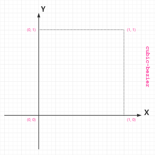
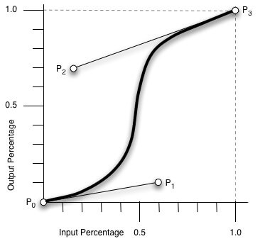
From the figure above, what we need to know is the value range of cubic-bezier:
P0:默认值 (0, 0)
P1:动态取值 (x1, y1)
P2:动态取值 (x2, y2)
P3:默认值 (1, 1)
What we need to focus on is the values of points P1 and P2. The value range of the X axis is 0 to 1; when the value exceeds this range, cubic-bezier will become invalid. There is no specified range for the Y axis values, and of course there is no need for them to be too large.
The most direct understanding is to place a straight line in a coordinate axis with a range of only 1, and take two points from the middle to pull it (the value range of the X axis is [0, 1], while the Y axis is arbitrary). The resulting curve is the animation speed curve.
cubic-bezier() can be used foranimation-timing-functionandtransition-timing-functionProperty.
Supported version: CSS3
Browser Support
The numbers in the table indicate the first browser version number that supports this function.
| Function | |||||
|---|---|---|---|---|---|
| cubic-bezier() | 4.0 | 10.0 | 4.0 | 3.1 | 10.5 |
CSS Syntax
cubic-bezier(x1,y1,x2,y2)
| Value | Description |
|---|---|
| x1,y1,x2,y2 | Required. Numeric values. x1 and x2 need to be numbers between 0 and 1. |
other extensions