Responsive Web Design -Grid View
What is a grid view?
Many web pages are designed based on a grid, which means the web pages are laid out in columns.

Using a grid view helps us design web pages. This makes it easier to add elements to the web page.
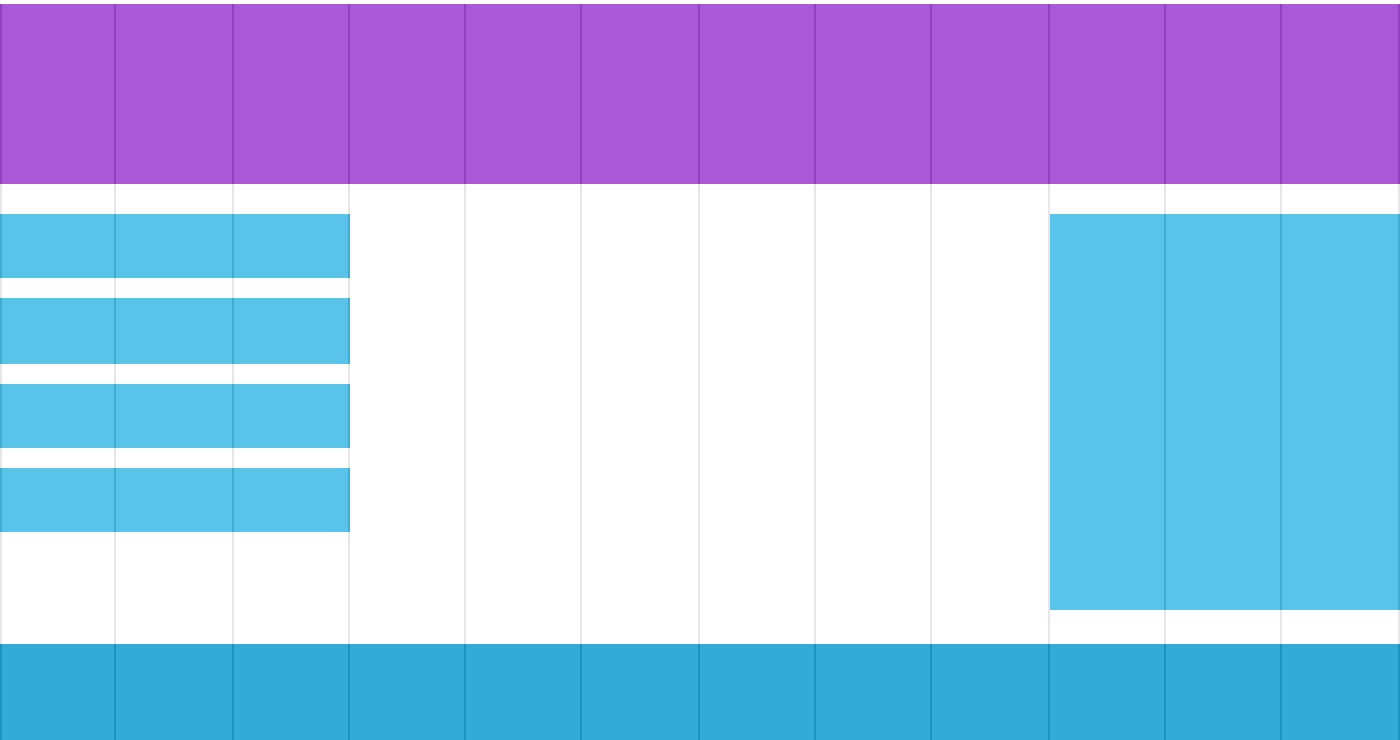
A responsive grid view usually has 12 columns, is 100% wide, and automatically stretches and shrinks when the browser window is resized.
Creating a Responsive Grid View
Next, let's create a responsive grid view.
First, make sure all HTML elements havebox-sizingThe attribute is set toborder-box。
Ensure margins and borders are included in the element's width and height.
Add the following code:
* {
    box-sizing: border-box;
}
Click here for more box-sizing content:CSS3 box-sizing Property。
The following example demonstrates a simple responsive web page with two columns:
The above example contains two columns.
A 12-column grid system can better control a responsive web page.
First, we can calculate the percentage of each column: 100% / 12 columns = 8.33%.
Specify a class in each column,class="col-"Used to define how many spans each column has:
CSS:
.col-2 {width: 16.66%;}
.col-3 {width: 25%;}
.col-4 {width: 33.33%;}
.col-5 {width: 41.66%;}
.col-6 {width: 50%;}
.col-7 {width: 58.33%;}
.col-8 {width: 66.66%;}
.col-9 {width: 75%;}
.col-10 {width: 83.33%;}
.col-11 {width: 91.66%;}
.col-12 {width: 100%;}
Try it Yourself »
All columns float left, with a padding of 15px:
CSS:
float: left;
padding: 15px;
border: 1px solid red;
}
Each row is wrapped with a <div>. The total number of columns should add up to 12:
<div class="col-3">...</div>
<div class="col-9">...</div>
</div>
Rows in the columns float left, and add clearing of floats:
CSS:
content: "";
clear: both;
display: block;
}
We can add some styles and colors to make it look better:
Example
font-family: "Lucida Sans", sans-serif;
}
.header {
background-color: #9933cc;
color: #ffffff;
padding: 15px;
}
.menu ul {
list-style-type: none;
margin: 0;
padding: 0;
}
.menu li {
padding: 8px;
margin-bottom: 7px;
background-color :#33b5e5;
color: #ffffff;
box-shadow: 0 1px 3px rgba(0,0,0,0.12), 0 1px 2px rgba(0,0,0,0.24);
}
.menu li:hover {
background-color: #0099cc;
}
Try it Yourself »